suicide |
Resource Center Links
This Month's Contests | Hosts Looking for Hostees | Hostees looking for Hosts | BigBookofResources
Submission Guidelines
  |

 Sep 21 2008, 10:27 PM
Post
#1
|
|
 wondrously free.  Group: Member Posts: 134 Joined: Feb 2006 Member No: 380,103  |
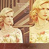
http://smangii.deviantart.com/art/suicide-98639192
Read the artist's comments :) Ahh, procrastination XD Any feedback appreciated. |
|
|
|


|
Sep 21 2008, 10:54 PM
Post
#2
|
|
 Senior Member Group: Staff Alumni Posts: 1,815 Joined: Jun 2006 Member No: 423,396 |
I like it, like I've loved practically all your work.
Hm, but somehow it doesn't speak "suicide" to me. For such a title, I'd probably imagine some solid, voluminous abstract shape gradually breaking down or decomposing. But still, I like. ^__^ |
|
|
|

|
Sep 21 2008, 11:06 PM
Post
#3
|
|
|
wondrously free. Group: Member Posts: 134 Joined: Feb 2006 Member No: 380,103 |
Thanks XD
I don't really put much effort into naming a piece, usually it has something to do with either what I'm listening or what the picture looks like to me, if it has a subject. |
|
|
|
|
Sep 21 2008, 11:28 PM
Post
#4
|
|
|
Senior Member Group: Staff Alumni Posts: 1,815 Joined: Jun 2006 Member No: 423,396 |
Ooh, haha.
Hm, I'm pretty sure you've made some kind of design like how I've described in my previous post .. ? If you haven't, I'd love to see what you could make with it. xD |
|
|
|
|
Sep 21 2008, 11:36 PM
Post
#5
|
|
 yan lin♥ Group: Staff Alumni Posts: 14,129 Joined: Apr 2004 Member No: 13,627 |
your inspiration was procrastination. that's probably why it doesn't reflect suicide for me at all.
|
|
|
|


| *absinthe* |
Sep 22 2008, 12:38 AM
Post
#6
|
|
Guest |
It's really nice. But to me, I don't think it reflects suicide at all because of the colors. When I think suicide, I don't think about bright, pastel-ish colors.
|
|
|
|
|
Sep 22 2008, 03:40 PM
Post
#7
|
|
 Senior Member Group: Staff Alumni Posts: 2,435 Joined: Feb 2007 Member No: 506,205 |
The title throws me off. I was expecting something dark and scary but I got bright and happy. 'Twas slightly disappointing.
But besides that, it's nice. :D |
|
|
|


|
Sep 22 2008, 04:52 PM
Post
#8
|
|
 Senior Member Group: Administrator Posts: 8,629 Joined: Jan 2007 Member No: 498,468 |
I like it but like everyone else said, I don't see how the title & your vector go hand in hand. I was expecting dark colors. But good job.

|
|
|
|

|
1 User(s) are reading this topic (1 Guests and 0 Anonymous Users)
0 Members: