Flyer For Local Band. |
Resource Center Links
This Month's Contests | Hosts Looking for Hostees | Hostees looking for Hosts | BigBookofResources
Submission Guidelines
  |

 Aug 6 2008, 03:24 PM Aug 6 2008, 03:24 PM
Post
#1
|
|
 Senior Member  Group: Official Member Posts: 1,288 Joined: Oct 2007 Member No: 585,380 |
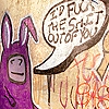
I made a flyer to promote a locals band Hot Topic In-store proformance.
And i am really happy with it, but theres just something missing or something with it. Could you maybe give me a couple suggestions to make it a little better and maybe give your opinoins? |
|
|
|


|
Aug 6 2008, 03:29 PM
Post
#2
|
|
 Jooleeah <3 Group: Official Designer Posts: 687 Joined: Jun 2008 Member No: 662,481 |
Add some textures to that plain blue/black background. The address at the bottom looks a little stretched.
|
|
|
|


|
Aug 6 2008, 03:36 PM
Post
#3
|
|
 Senior Member Group: Staff Alumni Posts: 2,435 Joined: Feb 2007 Member No: 506,205 |
I'm not too crazy about this, to be honest. I'd definately ditch the border...It's odd. I love the way the text for the band's name and all that looks, but then the time and address are boring and stretchy. I think you could use a different color for the background, also. The baby blue doesn't really go with the whole look.
|
|
|
|


|
Aug 6 2008, 05:03 PM
Post
#4
|
|
 Amberific. Group: Staff Alumni Posts: 12,913 Joined: Jul 2004 Member No: 29,772 |
Get rid of the Arial or whatever generic font that is at the top and the bottom. I'd also work with the settings on the shadow to make it less stark. (I've always been a fan of subtle-r shadows.) Maybe do some brushes over the edge of the photo, too, so it doesn't look like too simple a cut and paste job. I don't think that be border needs to go, instead, change the color, like the poster above me said. Maybe a midnight blue, a dark green, or a darkish pumice-y grey.
|
|
|
|

|
Aug 6 2008, 05:09 PM
Post
#5
|
|
 DDR \\ I'm Dee :) Group: Mentor Posts: 8,662 Joined: Mar 2006 Member No: 384,020 |
I'd say change the font and make the background darker. The shadow around the picture seems a bit too strong.
|
|
|
|

|
Aug 6 2008, 06:18 PM
Post
#6
|
|
 Oh Wow ... Group: Official Designer Posts: 688 Joined: Sep 2006 Member No: 468,522 |
QUOTE(karmakiller @ Aug 6 2008, 03:09 PM)  I'd say change the font and make the background darker. The shadow around the picture seems a bit too strong. Yeah I agree, except i think the background is fine. Textures // brushes; even if low opacity would add some spice to it. |
|
|
|

|
Aug 6 2008, 07:20 PM
Post
#7
|
|
 poison Group: Official Member Posts: 4,806 Joined: Mar 2008 Member No: 629,020 |
I like it except for the font in the top right corner and below the picture
|
|
|
|

|
Aug 8 2008, 10:57 AM
Post
#8
|
|
 Senior Member Group: Staff Alumni Posts: 1,815 Joined: Jun 2006 Member No: 423,396 |
I'm not feelin' the fonts used in here, particularly the ones used for the address and the date. You should probably use something more unique / professional-looking than what seems to be Arial. Also, the squished text at the bottom really doesn't look too great, not to mention unreadable.
While it does look plain overall, the colors aren't bad. |
|
|
|

|
Aug 9 2008, 02:10 PM
Post
#9
|
|
 (((((((((っ・ω・)っ zoooooooom~ Group: Member Posts: 59 Joined: Aug 2008 Member No: 675,193 |
Hmm... the text & photo are kind of just floating awkwardly, so I suggest adding colors (textures or brushes) to the background to make it less plain. And try using different fonts (try dafont.com); using overused ones on a flyer can look really tacky.
|
|
|
|

|
Aug 10 2008, 06:56 PM
Post
#10
|
|
 Two can keep a secret if one of them is dead. Group: Staff Alumni Posts: 2,682 Joined: Jun 2005 Member No: 156,187 |
very bland... would totally skip it.
i agree different fonts can help and a lack of border and some texture in the back is a major help how about different pics of the band, and blending them into one to catch the eye. Bright neon colors are the hottest thing now so some paint splats in that color can catch the eye but not needed. get inventive and avoid the plain tacky looks often used. |
|
|
|

|
1 User(s) are reading this topic (1 Guests and 0 Anonymous Users)
0 Members: