Help with Blends, in PS CS3 |
  |

 Mar 17 2008, 12:58 PM Mar 17 2008, 12:58 PM
Post
#1
|
|
 Carpe Noctem  Group: Official Designer Posts: 183 Joined: Nov 2007 Member No: 592,657 |
I'm REALLY wanting to make blends like this by Nikkiness from the HP Boards: 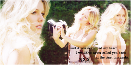 But the problem is I haven't done many before and I don't really know a good technique to doing them. I've looked over a few of the tutorials on blends on this site but none of them really tell me how to get the effect I like (example above). This is what I got when I tried:  What I dis is I resized the images and then laid them on top of each other, then I took the eraser and erased the parts that were overlapping. My question is: Are there anmy tutorials or tips & tricks that you could give me? |
|
|
|


|
Mar 17 2008, 02:58 PM
Post
#2
|
|
 awestinnn Group: Member Posts: 624 Joined: Aug 2006 Member No: 460,069 |
What kind of effect are you looking for? The blends don't even look similar.
|
|
|
|

|
Mar 17 2008, 06:01 PM
Post
#3
|
|
 YUNJAESU<3 Group: Official Member Posts: 1,291 Joined: Oct 2007 Member No: 585,275 |
The reason why it's not working is because the image that she used that's the biggest was already a close up, so therefore it's bigger than the other images. She just overlapped them and erase them. The other two were faraway photos so that's why they're smaller. I'm pretty sure she didn't resize it herself (although she could have easily done it, it wouldn't look as naturally put.
|
|
|
|


|
Mar 17 2008, 09:52 PM
Post
#4
|
|
|
t-t-t-toyaaa Group: Official Member Posts: 19,821 Joined: Apr 2004 Member No: 11,270 |
My suggestions is to spread out your photos more so you have more space. Yours came out a little too cramped together. Also that big black blob, I don't know where that came from , if it was the eraser or not but you should try to fix it. Keep trying to get it down and you'd get the technique down. For me using the lasso + feathering worked out a little better than erasng. Only thing is you need to be careful on how much you feather it.
|
|
|
|


|
Mar 17 2008, 09:57 PM
Post
#5
|
|
 hello : ) Group: Official Member Posts: 4,227 Joined: Apr 2004 Member No: 13,139 |
I agree with what Toya said. Try using the lasso + feather instead of erasing. Although erasing does come in handy at times, when I make blends, I don't use it as often.
|
|
|
|

|
Mar 19 2008, 02:52 PM
Post
#6
|
|
 in a matter of time Group: Staff Alumni Posts: 7,151 Joined: Aug 2005 Member No: 191,357 |
Depends on what kind of blending you want to achieve...the first blend isn't so much made by "blending" the images together, but it's more of a cut-out. You can see that the backgrounds don't blend together, instead they share the same background. If you're a beginner I'd just stick with using the eraser brush. It's a whole lot easier. There's not much use to use feathering except for a small amount (maybe 5 px), but you can achieve that kind of look easily with a softer brush.
If you really want to get precise, the pen tool is the best bet, but it's time-consuming and sort of hard to work with. However, if you actually want to mesh two images together, you'll have to use feathering of at least 10 px. For a large image it may go up to 50 px, but it's something that you'll have to try out. I'm also curious, what is that black blob? |
|
|
|

|
Mar 19 2008, 03:35 PM
Post
#7
|
|
 Kissing for yesterday. Group: Official Designer Posts: 465 Joined: Sep 2007 Member No: 569,813 |
the images you have chosen don't flow. choose a set of images which almost tell a story in one image.
like, say you had a female. one looking down at the floor, one looking over her shoulder and then looking behind her back. you would need to place these in such a way so it flows showing a "still movement", if that makes sense? theyre normally the best ones. so it would be nice to move these images about until you think they flow. once this is done, you blend them together with the eraser, and if with a woman there is any hair which looks ultimately flat, take a new canvas sized 50x50, and then dot about a small brush. highlight this image with the selection tool, and then click on edit -> define brush preset and click OK. then go into your blend, click on the smudge tool and choose this brush. then whisp it accross the hair for a flyaway effect. this works nicely for guys as well but its bad to over do it i guess. then start working more on the layers and merging them, perhaps add some masks and draw a black to white gradient accross it [this is what i did in my most recent div banner so the skirt of the dress flows]. then add in some brushses, text, a little bit of glow and you're done. does that help...there's way too much information there i swear. |
|
|
|

|
Mar 20 2008, 12:00 AM
Post
#8
|
|
 AIDS at RAVES. Group: Official Designer Posts: 2,386 Joined: Dec 2007 Member No: 598,878 |
yea try using the lasso, I usually set my feathering to about 2px
|
|
|
|

|
Mar 20 2008, 01:12 PM
Post
#9
|
|
 Senior Member Group: Member Posts: 786 Joined: Dec 2006 Member No: 488,341 |
Quick rundown on what I would have done.
Screen the pictures once or twice, merge them all together, duplicate again and blur it and soft light. Mess with opacity until desired effect. I use the brush tool to blend my pictures. |
|
|
|

|
Mar 20 2008, 01:54 PM
Post
#10
|
|
|
Carpe Noctem Group: Official Designer Posts: 183 Joined: Nov 2007 Member No: 592,657 |
QUOTE(gigiopolis @ Mar 19 2008, 12:52 PM)  I'm also curious, what is that black blob? In the pictures he is cleaning a window, and that black blod is the rag. XD hahaha thank you to everyone who posted! I will try it out a few ways and see what works well. THese are kind of the effects I really want to do:      I love this sig makers work! It's all amazing. |
|
|
|
|
Mar 21 2008, 07:24 AM
Post
#11
|
|
|
Kissing for yesterday. Group: Official Designer Posts: 465 Joined: Sep 2007 Member No: 569,813 |
if you want those effets look at the CB tutorials section for photoshop, then choose ones which give different effects.
perhaps find a website which offers photoshop actions for you to use freely also, as these will give the desired effect instantly with no hassle. basically, practise makes perfect and you've got to keep working at it. |
|
|
|
|
Mar 22 2008, 02:28 PM
Post
#12
|
|
|
Carpe Noctem Group: Official Designer Posts: 183 Joined: Nov 2007 Member No: 592,657 |
How's this?

|
|
|
|
|
Mar 22 2008, 02:39 PM
Post
#13
|
|
|
Kissing for yesterday. Group: Official Designer Posts: 465 Joined: Sep 2007 Member No: 569,813 |
this is nice.
however. and im being very blunt, it doesn't look like anything ultimately "sepcial" you've really improved, chosen good photographs and the blending is nice. however, the text kind of spoils it. its far too centered. choose a different font, place it in a corner and use different sizes for the name and text beneath it. |
|
|
|
|
Mar 22 2008, 02:51 PM
Post
#14
|
|
|
Carpe Noctem Group: Official Designer Posts: 183 Joined: Nov 2007 Member No: 592,657 |
Thank you for the (speedy) feedback!
Ok, I'll tinker around with different fonts and stuff. The font I used for his anme is my favorite font hahaha. I need to stop using it. Also I wanted to know how one gets the color around the text like in the banners above? |
|
|
|
|
Mar 22 2008, 03:05 PM
Post
#15
|
|
|
Kissing for yesterday. Group: Official Designer Posts: 465 Joined: Sep 2007 Member No: 569,813 |
you right click then text layer.
rasterize. (this flattens the image) then right click again and select blending mode/options. then click on the "stroke" selection which will be on the tabs in the box which will come up. play about with the settings and change the colour. then you'll get the stroke effect :D |
|
|
|
|
Mar 22 2008, 03:27 PM
Post
#16
|
|
|
in a matter of time Group: Staff Alumni Posts: 7,151 Joined: Aug 2005 Member No: 191,357 |
^ You don't need to rasterize. Only rasterize as a LAST RESORT. If you find a typo, then you'll have to start all over again.
 Make sure your text layer is selected, then go to that button on the bottom of your Layers palette that says "fx" (it's highlighted in the image). Then pick the last one, "Stroke", and from there you can choose your desired colour and thickness, etc. |
|
|
|
|
Mar 27 2008, 02:33 AM
Post
#17
|
|
|
GD. <3 Group: Staff Alumni Posts: 1,222 Joined: Aug 2005 Member No: 198,566 |
You need to work on spacing out your images, and creating continuity in the background.
If you notice, all the blends you provided as blends you'd like to create don't have images overlapping and have either the same or similar backgrounds. It's much harder to blend an image with a white background, with an image with a black background vs blending an image with similar backgrounds. You'll also notice that the set of images the blends above have are from the same photo shoot. That generally helps with blending since the background will be similar, and the lighting will generally be the same, and the feel of the pictures will help create unity. You really need to be selective with the images you select when blending. As for techniques, I usually just slap all the images together as different layers, set all the images as overlay, mess around with the positioning, set the layers back to normal, and erase the areas I don't want. After that, you can apply whatever effects you'd like to the image. |
|
|
|

|
1 User(s) are reading this topic (1 Guests and 0 Anonymous Users)
0 Members: