beginning of my digi scrapbook., (: |
Resource Center Links
This Month's Contests | Hosts Looking for Hostees | Hostees looking for Hosts | BigBookofResources
Submission Guidelines

 Jan 13 2008, 08:59 PM Jan 13 2008, 08:59 PM
Post
#1
|
|
 whtever  Group: Member Posts: 150 Joined: Dec 2007 Member No: 603,643 |
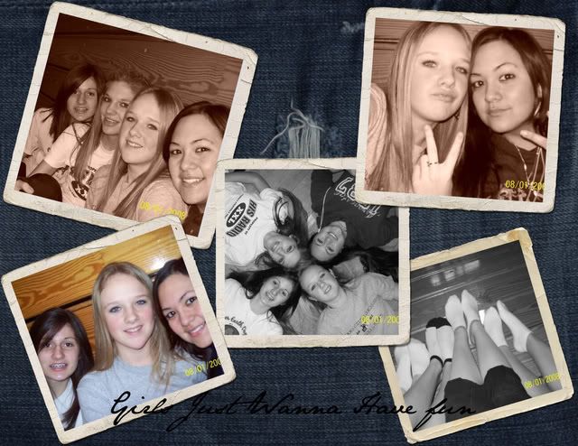
since i love to take pictures and design things, i thought i would make my very own digital scrapbook. This is the first page i've made and wanted to put it on here. It's a work-n-progress but i like it (:
|
|
|
|


Posts in this topic
 smashedcodes beginning of my digi scrapbook. Jan 13 2008, 08:59 PM
 MissHygienic Cuuuuute. The text is a little hard to read (maybe... Jan 13 2008, 09:00 PM smashedcodes thanks (: yea I wanted to change the color but I a... Jan 13 2008, 09:02 PM Jennifer Aw really cute, I love the borders around the imag... Jan 14 2008, 03:19 AM smashedcodes here's another one that i'm going to be wo... Jan 14 2008, 02:27 PM omgomgKATHY i like the first one best. Jan 14 2008, 06:58 PM Alvin I think I like the first one the best. It seems to... Jan 14 2008, 08:11 PM
 smashedcodes QUOTE(Alvin @ Jan 14 2008, 08:11 PM) I th... Jan 14 2008, 09:03 PM freeflow Look's cool. I agree about the first one being... Jan 14 2008, 08:30 PM
  |
1 User(s) are reading this topic (1 Guests and 0 Anonymous Users)
0 Members: