old wrk |
Resource Center Links
This Month's Contests | Hosts Looking for Hostees | Hostees looking for Hosts | BigBookofResources
Submission Guidelines
  |

 Oct 20 2007, 03:27 PM Oct 20 2007, 03:27 PM
Post
#1
|
|
 Senior Member  Group: Member Posts: 60 Joined: Oct 2006 Member No: 474,645 |
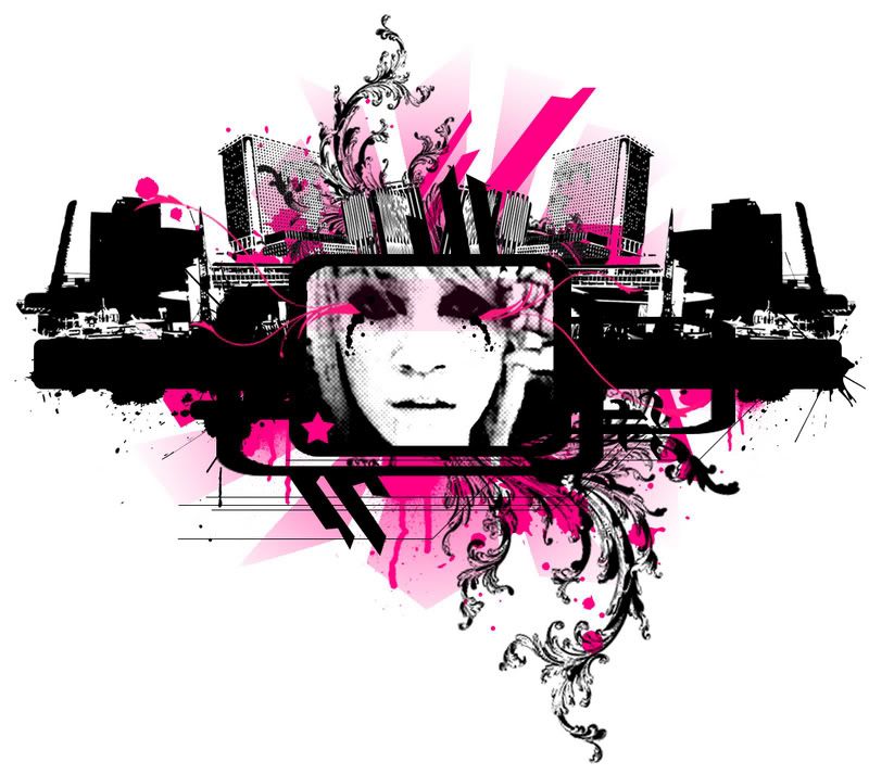
Im not sure if i have showed this off before. Wut do you think?
|
|
|
|


|
Oct 20 2007, 03:42 PM
Post
#2
|
|
 Senior Member Group: Staff Alumni Posts: 1,815 Joined: Jun 2006 Member No: 423,396 |
It looks just a little blurry, but the concept and execution is awesome. I love the color choice, too.
|
|
|
|


|
Oct 21 2007, 12:52 AM
Post
#3
|
|
 ٩(●̮̮̃̃)۶ Group: Official Member Posts: 1,403 Joined: Apr 2004 Member No: 12,173 |
Ah agree with the post above me. Don't know if your intention for the middle image is supposed to be blurry. The swirl brushes that come out aren't sharp either, like everything else. Nice concept though.
|
|
|
|

|
Oct 21 2007, 04:06 AM
Post
#4
|
|
 <3 Group: Official Member Posts: 1,369 Joined: Jun 2007 Member No: 539,187 |
I like it, but I agree about the bluriness. If it was supposed to come out like that, then well I guess you achieved the look you wanted, but if it was meant to be crisp.. then I dont know, it's not great
 But I love the colours and concept of it |
|
|
|


|
1 User(s) are reading this topic (1 Guests and 0 Anonymous Users)
0 Members: