VECTOR // Reborn |
Resource Center Links
This Month's Contests | Hosts Looking for Hostees | Hostees looking for Hosts | BigBookofResources
Submission Guidelines

 Jul 13 2007, 03:24 PM Jul 13 2007, 03:24 PM
Post
#1
|
|
 stop staring >_>  Group: Member Posts: 497 Joined: Aug 2006 Member No: 455,389 |
|
|
|
|


 |
Replies
(1 - 24)
| *davinci* |
Jul 13 2007, 03:30 PM
Post
#2
|
|
Guest |
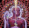
Wow, this is really great, especially considering your inspiration for this. :) I like the orange straps around the silhouettes. I think the white spots are just a tad too bright. Otherwise, your use of textures is great!
|
|
|
|
|
Jul 13 2007, 03:39 PM
Post
#3
|
|
 Senior Member Group: Official Member Posts: 7,149 Joined: Aug 2005 Member No: 213,509 |
SOOOOH PRetteh. I love the theme, the silhouettes are well done. The sky is so pretty.
|
|
|
|

| *SinfullySweet* |
Jul 13 2007, 03:44 PM
Post
#4
|
|
Guest |
I love it. Its a really nice vector. I can never do any vectors at all

|
|
|
|
|
Jul 13 2007, 04:31 PM
Post
#5
|
|
|
(. .) Group: Official Member Posts: 2,367 Joined: Jun 2004 Member No: 20,089 |
pretty pretty! i was a little disturbed 'cause the bottom right of the piece is kinda creepy ;X. but it's awesome!
|
|
|
|

|
Jul 13 2007, 04:39 PM
Post
#6
|
|
 (Allison) Group: Human Posts: 420 Joined: Apr 2006 Member No: 395,668 |
Wow, this is amazing.
It's gorgeous, seriously. Good job. =] |
|
|
|


|
Jul 13 2007, 04:53 PM
Post
#7
|
|
 ;) Group: Staff Alumni Posts: 9,573 Joined: Feb 2005 Member No: 99,124 |
Whoa! This is just simply impeccable! I think you did a very good job on this.

|
|
|
|


|
Jul 13 2007, 05:14 PM
Post
#8
|
|
|
stop staring >_> Group: Member Posts: 497 Joined: Aug 2006 Member No: 455,389 |
QUOTE(synkro @ Jul 13 2007, 05:31 PM)  pretty pretty! i was a little disturbed 'cause the bottom right of the piece is kinda creepy ;X. but it's awesome! hahah i think my friends said the same thing. the guy is gonna grab your legs at night. BEWARE! ahha |
|
|
|
| *The Markster* |
Jul 13 2007, 05:25 PM
Post
#9
|
|
Guest |
That's awesome, Trancie.
I would tell you on AIM right now, but I gotta practice. Haha. |
|
|
|
|
Jul 13 2007, 05:28 PM
Post
#10
|
|
|
stop staring >_> Group: Member Posts: 497 Joined: Aug 2006 Member No: 455,389 |
QUOTE(The Markster @ Jul 13 2007, 06:25 PM) That's awesome, Trancie. I would tell you on AIM right now, but I gotta practice. Haha. nerd! |
|
|
|
|
Jul 13 2007, 07:44 PM
Post
#11
|
|
 What the fack. Group: Official Member Posts: 6,164 Joined: Mar 2004 Member No: 8,519 |
Very appealing to the eye. I love it.

|
|
|
|

|
Jul 13 2007, 08:54 PM
Post
#12
|
|
 This bitch better work! Group: Staff Alumni Posts: 13,681 Joined: Jul 2004 Member No: 28,095 |
i realllllly love the red things wrapping over the people on the left. it's so cool & creative.
and the font & just the overall feel is so nice. i love it. :) really good quality |
|
|
|

|
Jul 14 2007, 02:34 PM
Post
#13
|
|
 Senior Member Group: Member Posts: 1,011 Joined: Jun 2007 Member No: 533,410 |
very nice work
ii can digg it =] |
|
|
|

|
Jul 16 2007, 01:36 PM
Post
#14
|
|
|
stop staring >_> Group: Member Posts: 497 Joined: Aug 2006 Member No: 455,389 |
thankss =)
|
|
|
|
|
Jul 17 2007, 09:24 AM
Post
#15
|
|
 ^ I might look scary but i'm the nicest person in cb! Group: Member Posts: 1,364 Joined: Feb 2004 Member No: 4,979 |
it look really good when the image size is small but when i view the actual size the blending is no that great.
|
|
|
|

|
Jul 17 2007, 10:41 AM
Post
#16
|
|
|
stop staring >_> Group: Member Posts: 497 Joined: Aug 2006 Member No: 455,389 |
QUOTE(mysticalazxn @ Jul 17 2007, 10:24 AM) it look really good when the image size is small but when i view the actual size the blending is no that great. yay! your the first one who actually criticize it  XD. but what blending are you talkin about? O_o XD. but what blending are you talkin about? O_o
|
|
|
|
|
Jul 17 2007, 10:06 PM
Post
#17
|
|
 sang loves hayden. Group: Staff Alumni Posts: 3,373 Joined: Feb 2004 Member No: 5,687 |
It actually looks really good! I really like the red lines or w.e there suppose to be around the silhouettes.
|
|
|
|

| *mzkandi* |
Jul 17 2007, 10:29 PM
Post
#18
|
|
Guest |
Awww...wowow! This looks amazing! Great job.

|
|
|
|
| *ersatz* |
Jul 17 2007, 10:37 PM
Post
#19
|
|
Guest |
The quote looks like the kind of font mix-up that a little girl would use on her pink, sparkly Myspace. I don't know; just the fonts used and the way it looks. And I don't like Century Gothic anyway, for that reason. It just reminds me of inexperience with graphics (not that it is you; just a reminder). The cross could have been photoshopped a bit with lighting techniques and whatnot because it looks sort of cut out. The orange stripes were very creative, but you can tell that you just used that one shape and made it smaller and bigger and stuff. You should have rotated it once in a while a slight bit so it actually looked like it was draping over the bodies. Your vectoring skills are great though; I love the idea. The "sky" looks really cool, and I like how the girl (?) in the middle is the only one with defined clothes.
|
|
|
|
|
Jul 18 2007, 05:26 AM
Post
#20
|
|
 Newbie Group: Member Posts: 9 Joined: Jul 2007 Member No: 545,977 |
thats cool! love the layered effect of the background behind the simplicity of the silhouettes. nice work.
|
|
|
|

|
Jul 18 2007, 07:24 AM
Post
#21
|
|
|
^ I might look scary but i'm the nicest person in cb! Group: Member Posts: 1,364 Joined: Feb 2004 Member No: 4,979 |
criticism
the reason that i said small is better because 1)n the font to the right didn't blend in that well. And the vecotr of human look missplaced (maybe if you overlay it). Other than that i love the bg blending is 10/10. |
|
|
|
|
Jul 18 2007, 08:57 AM
Post
#22
|
|
|
stop staring >_> Group: Member Posts: 497 Joined: Aug 2006 Member No: 455,389 |
QUOTE(ersatz @ Jul 17 2007, 11:37 PM) The quote looks like the kind of font mix-up that a little girl would use on her pink, sparkly Myspace. I don't know; just the fonts used and the way it looks. And I don't like Century Gothic anyway, for that reason. It just reminds me of inexperience with graphics (not that it is you; just a reminder). The cross could have been photoshopped a bit with lighting techniques and whatnot because it looks sort of cut out. The orange stripes were very creative, but you can tell that you just used that one shape and made it smaller and bigger and stuff. You should have rotated it once in a while a slight bit so it actually looked like it was draping over the bodies. Your vectoring skills are great though; I love the idea. The "sky" looks really cool, and I like how the girl (?) in the middle is the only one with defined clothes. lol agreed with almost everything. except the bold part it was actually done strand by strand =). thanks for criticism. Lol. about the font, century gothic is actually my favorite font (you see them in everything i made) XD. the changed of font was meant to emphasize certain line. =) ^-^ thanks again. |
|
|
|
|
Jul 18 2007, 08:59 AM
Post
#23
|
|
|
stop staring >_> Group: Member Posts: 497 Joined: Aug 2006 Member No: 455,389 |
QUOTE(mysticalazxn @ Jul 18 2007, 08:24 AM) criticism the reason that i said small is better because 1)n the font to the right didn't blend in that well. And the vecotr of human look missplaced (maybe if you overlay it). Other than that i love the bg blending is 10/10. urm.. im kinda confuse. vector human look misplaced.  if i overlayed it.. she wouldnt look like she's standing anymore, more like she's being printed into the bg O_o. if i overlayed it.. she wouldnt look like she's standing anymore, more like she's being printed into the bg O_o.----------- eghh someone join my post together please, sorry didnt mean to double post XD |
|
|
|
| *IVIike* |
Jul 20 2007, 08:19 PM
Post
#24
|
|
Guest |
holy crap trancie... this is the best thing i have seen from you. I love everything about it especially the red ribbon things..
|
|
|
|
|
Jul 20 2007, 09:36 PM
Post
#25
|
|
 d@niel Group: Member Posts: 1,267 Joined: Jan 2005 Member No: 91,453 |
QUOTE(synkro @ Jul 13 2007, 05:31 PM) pretty pretty! i was a little disturbed 'cause the bottom right of the piece is kinda creepy ;X. but it's awesome! yea, at first, the pic at the bottom right looked a little strange...but overall good job |
|
|
|

 |
1 User(s) are reading this topic (1 Guests and 0 Anonymous Users)
0 Members: