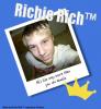
what are your thoughts on this picture |
Resource Center Links
This Month's Contests | Hosts Looking for Hostees | Hostees looking for Hosts | BigBookofResources
Submission Guidelines
  |

 Jun 19 2007, 09:03 PM Jun 19 2007, 09:03 PM
Post
#1
|
|
 Newbie  Group: Member Posts: 5 Joined: Apr 2006 Member No: 398,845 |
i want to know what you guys think about this picture (more of the actual composure and stuff not the words) and just give some output, anything you would have done different, and what you really like about it. i just am trying to get better at all this stuff, so i want to get some input by artistic people.
thanks. 
|
|
|
|


|
Jun 19 2007, 11:19 PM
Post
#2
|
|
 Two can keep a secret if one of them is dead. Group: Staff Alumni Posts: 2,682 Joined: Jun 2005 Member No: 156,187 |
well it looks awesome although the brushes in the background look pretty blurry
other then that it looks like a average teen letter not that its a bad thing... it looks pretty good and the font used makes it all the better never done something like that before so i have no idea on how i could make this better... or how i would of done it but all i can say is to leave the brush size as is to avoid blurry brushes |
|
|
|


|
Jun 19 2007, 11:25 PM
Post
#3
|
|
 Senior Member Group: Member Posts: 816 Joined: Jun 2007 Member No: 531,188 |
Well, it's very sweet. But I'd add more color. Any color. And...bigger? Is it really that size?

|
|
|
|

|
Jun 19 2007, 11:30 PM
Post
#4
|
|
 i less than three you. Group: Member Posts: 278 Joined: May 2007 Member No: 525,773 |
Veryyy sweet!
I'd add more color. |
|
|
|

|
Jun 20 2007, 03:02 AM
Post
#5
|
|
 (Allison) Group: Human Posts: 420 Joined: Apr 2006 Member No: 395,668 |
I like it!
My only complaints: 1) As others said, more color. 2) The lack of "I" being capitalized...But that would bother me. So disregard that. |
|
|
|

|
1 User(s) are reading this topic (1 Guests and 0 Anonymous Users)
0 Members: