my new farey butterfly layout |
Resource Center Links
This Month's Contests | Hosts Looking for Hostees | Hostees looking for Hosts | BigBookofResources
Submission Guidelines
  |

 Dec 10 2006, 10:05 PM Dec 10 2006, 10:05 PM
Post
#1
|
|
 Senior Member  Group: Member Posts: 33 Joined: Dec 2006 Member No: 486,162 |
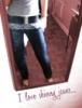
 Since my profile is private here is a screencap of my layout ^_^ Don't mind the fuzziness I saved the screencap in paint as a JPEG. The actual image is a PNG and much better quality. |
|
|
|


|
Dec 10 2006, 10:06 PM
Post
#2
|
|
|
Senior Member Group: Official Member Posts: 3,459 Joined: Dec 2005 Member No: 328,021 |
Aww, it's cute. The only thing I don't like is how large the brush swirls are, but that's just me. Overall, nice job!

|
|
|
|

|
Dec 10 2006, 10:09 PM
Post
#3
|
|
|
Senior Member Group: Member Posts: 33 Joined: Dec 2006 Member No: 486,162 |
Yah most of the time I don't like the big swirly brushes but I think I do on this. It's supposed to look...hmm girly?? I guess that's the word for it. But I end up changing my layout alot lol so it wont be there for too long.
Thanks ^_^ |
|
|
|
|
Dec 10 2006, 10:11 PM
Post
#4
|
|
|
t-t-t-toyaaa Group: Official Member Posts: 19,821 Joined: Apr 2004 Member No: 11,270 |
I think its amazing.
|
|
|
|


|
Dec 10 2006, 10:26 PM
Post
#5
|
|
|
Senior Member Group: Member Posts: 33 Joined: Dec 2006 Member No: 486,162 |
QUOTE(toyo loco @ Dec 10 2006, 10:11 PM)  I think its amazing. Thankies 
|
|
|
|
|
Dec 12 2006, 06:51 AM
Post
#6
|
|
 J0@nna<3 Group: Member Posts: 203 Joined: Feb 2006 Member No: 378,818 |
WHOOAAA
|
|
|
|
| *WHIMSICAL 0NE* |
Dec 12 2006, 01:58 PM
Post
#7
|
|
Guest |
I think it's unique
 I really wish I could see the actual page. Hah. I really wish I could see the actual page. Hah.I somewhat agree with the brushes being big, but for me it seems like there's more of on the bottom than the top. That's just me being anal. Don't listen to it. lol. I really like it
|
|
|
|
|
Dec 13 2006, 02:22 AM
Post
#8
|
|
|
Senior Member Group: Member Posts: 33 Joined: Dec 2006 Member No: 486,162 |
thanx guys ^_^
|
|
|
|
| *Infinite.* |
Dec 13 2006, 08:04 PM
Post
#9
|
|
Guest |
Eh Its different, I rather see it on a actual myspace..
The colors are nice and its really simple, you should have made the top blue and the background blue the same color though.. |
|
|
|
|
Dec 13 2006, 08:46 PM
Post
#10
|
|
|
Senior Member Group: Member Posts: 33 Joined: Dec 2006 Member No: 486,162 |
well technically they are the same color.... I took the hex code from psp and put it into the code and it turned out that color lol
|
|
|
|
|
Dec 19 2006, 08:08 PM
Post
#11
|
|
 Member Group: Member Posts: 14 Joined: Sep 2006 Member No: 466,484 |
The fairies are good. How long did it take to create this.
|
|
|
|
|
Jan 3 2007, 10:32 PM
Post
#12
|
|
 Uh-Lar-Ray! Group: Member Posts: 110 Joined: Mar 2005 Member No: 108,897 |
It's so pretty! <3
|
|
|
|

|
1 User(s) are reading this topic (1 Guests and 0 Anonymous Users)
0 Members: