The Beach, ^-^ |
Resource Center Links
This Month's Contests | Hosts Looking for Hostees | Hostees looking for Hosts | BigBookofResources
Submission Guidelines
  |

 May 23 2006, 04:08 PM May 23 2006, 04:08 PM
Post
#1
|
|
 Senior Member  Group: Member Posts: 147 Joined: Mar 2006 Member No: 383,108 |
|
|
|
|


|
May 23 2006, 05:21 PM
Post
#2
|
|
 Kimberly Group: Member Posts: 1,961 Joined: Apr 2005 Member No: 121,599 |
Nice idea. I like how you organized each section.
Only thing is though, the image is blurred. 
|
|
|
|


|
May 23 2006, 05:23 PM
Post
#3
|
|
 What the fack. Group: Official Member Posts: 6,164 Joined: Mar 2004 Member No: 8,519 |
Yeah the banner isn't of good quality, but other than that, I like it.

|
|
|
|

|
May 23 2006, 06:17 PM
Post
#4
|
|
|
Senior Member Group: Member Posts: 71 Joined: May 2006 Member No: 406,332 |
I like it except some parts look low quality.
|
|
|
|
|
May 23 2006, 06:48 PM
Post
#5
|
|
 O_C Group: Member Posts: 77 Joined: May 2006 Member No: 408,234 |
 Nice music. Nice music. But yes, some of the test images and the header image is really bad quality. And not really criticism but I'm seeing that header font absolutely everywhere these days. |
|
|
|
|
May 23 2006, 09:33 PM
Post
#6
|
|
|
Senior Member Group: Member Posts: 147 Joined: Mar 2006 Member No: 383,108 |
thx for the replies! :-) lol sry the pics are low quality. I was working on the pics on Paintshop Pro. I probably should've done the images on Photoshop. :-/ Any way i can un-blur it?
|
|
|
|
|
May 23 2006, 09:58 PM
Post
#7
|
|
|
Senior Member Group: Member Posts: 71 Joined: May 2006 Member No: 406,332 |
QUOTE(Smacker @ May 23 2006, 7:33 PM)  thx for the replies! :-) lol sry the pics are low quality. I was working on the pics on Paintshop Pro. I probably should've done the images on Photoshop. :-/ Any way i can un-blur it? It doesn't really matter what you use. Both are good programs. Just don't stretch images. |
|
|
|
|
May 23 2006, 10:19 PM
Post
#8
|
|
|
Senior Member Group: Member Posts: 147 Joined: Mar 2006 Member No: 383,108 |
okie thx man. :-D
|
|
|
|
| *StanleyThePanda* |
May 23 2006, 10:28 PM
Post
#9
|
|
Guest |
The image quality is a little low, and the colors are really dark.
Dark colors dont really go with beach themes, unless its sunset. But its pretty okay. |
|
|
|
|
May 23 2006, 10:43 PM
Post
#10
|
|
|
t-t-t-toyaaa Group: Official Member Posts: 19,821 Joined: Apr 2004 Member No: 11,270 |
^ I pretty much agree. The low quality thing was already mentioned. I think you changed the image? Its a tad bit low. Most importantly dark colors with the beach doesn't go much, But its good still. Nice song.
QUOTE thx for the replies! :-) lol sry the pics are low quality. I was working on the pics on Paintshop Pro. I probably should've done the images on Photoshop. :-/ Any way i can un-blur it? Well there might be a tutorial on unbluring etc at http://good-tutorials.com but I would just try using a tutorial on touching up images then make sure when you save it go to file > save for web. (theres a tutorial on saving for good quality around here). Yea but I still like it. |
|
|
|

|
May 23 2006, 10:58 PM
Post
#11
|
|
|
Senior Member Group: Member Posts: 147 Joined: Mar 2006 Member No: 383,108 |
QUOTE(toyo loco @ May 23 2006, 8:43 PM) ^ I pretty much agree. The low quality thing was already mentioned. I think you changed the image? Its a tad bit low. Most importantly dark colors with the beach doesn't go much, But its good still. Nice song. Well there might be a tutorial on unbluring etc at http://good-tutorials.com but I would just try using a tutorial on touching up images then make sure when you save it go to file > save for web. (theres a tutorial on saving for good quality around here). Yea but I still like it. thx. :-D |
|
|
|
| *This Confession* |
May 24 2006, 01:47 AM
Post
#12
|
|
Guest |
looks nice.
hmm once you add more friends i think it will fit more.. because the friends only fill up about half |
|
|
|
|
May 24 2006, 03:47 AM
Post
#13
|
|
|
Senior Member Group: Member Posts: 147 Joined: Mar 2006 Member No: 383,108 |
QUOTE(This Confession @ May 23 2006, 11:47 PM) looks nice. hmm once you add more friends i think it will fit more.. because the friends only fill up about half thx. ^-^ I'll add more friend pics when i feel like it. :-) |
|
|
|
|
May 24 2006, 03:51 AM
Post
#14
|
|
|
O_C Group: Member Posts: 77 Joined: May 2006 Member No: 408,234 |
I like the new Gecko image. Definitely a good cut and paste job if you did cut and paste. Way too many people these days cut something and end up leaving one pixel of white.
|
|
|
|
|
May 25 2006, 02:05 AM
Post
#15
|
|
|
Senior Member Group: Member Posts: 147 Joined: Mar 2006 Member No: 383,108 |
QUOTE(original copy @ May 24 2006, 1:51 AM) I like the new Gecko image. Definitely a good cut and paste job if you did cut and paste. Way too many people these days cut something and end up leaving one pixel of white. hehe glad u like the gecko image. ^_^ |
|
|
|
|
May 25 2006, 09:33 AM
Post
#16
|
|
 Newbie Group: Member Posts: 9 Joined: Oct 2005 Member No: 281,213 |
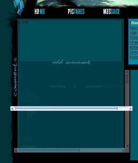
This is what I see in the comment area using firefox. Looks like theres a layer over it and the width doesn't match up or something.
|
|
|
|
|
May 25 2006, 05:08 PM
Post
#17
|
|
 What's my name? Janette. and ily. <3 Group: Member Posts: 2,139 Joined: Apr 2006 Member No: 391,911 |
Comments are impossible to see in FireFox.
Only a little bit better in IE. |
|
|
|
|
May 26 2006, 07:50 PM
Post
#18
|
|
 It's anything but cute. Group: Member Posts: 403 Joined: Jul 2005 Member No: 185,571 |
Love the song. Good job. Not a fan of that lizard though.

|
|
|
|
|
May 26 2006, 11:48 PM
Post
#19
|
|
|
Senior Member Group: Member Posts: 147 Joined: Mar 2006 Member No: 383,108 |
QUOTE(oneandonlytammie @ May 26 2006, 5:50 PM) Love the song. Good job. Not a fan of that lizard though. awww...dont like geckos? |
|
|
|
|
May 26 2006, 11:50 PM
Post
#20
|
|
 Senior Member Group: Member Posts: 136 Joined: Jan 2006 Member No: 366,312 |
looks pretty good man, a bit blurry near the edges of the banner, but nice style and such . .. good job! looks cool
|
|
|
|
|
May 27 2006, 10:54 AM
Post
#21
|
|
|
Senior Member Group: Member Posts: 147 Joined: Mar 2006 Member No: 383,108 |
QUOTE(the Pro mac @ May 26 2006, 9:50 PM) looks pretty good man, a bit blurry near the edges of the banner, but nice style and such . .. good job! looks cool Ty :-) |
|
|
|
|
1 User(s) are reading this topic (1 Guests and 0 Anonymous Users)
0 Members: