A few of my graphics... |
Resource Center Links
This Month's Contests | Hosts Looking for Hostees | Hostees looking for Hosts | BigBookofResources
Submission Guidelines
  |

 Apr 16 2006, 01:35 AM Apr 16 2006, 01:35 AM
Post
#1
|
|
 Senior Member  Group: Member Posts: 384 Joined: Jul 2004 Member No: 32,595 |
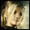
Please rate these. I made them for another forum. CnC Thanks!
(Feel free to use the avatars, but do not claim them as your own) 1  2.  3.  4.  5.     
|
|
|
|


|
Apr 16 2006, 01:43 AM
Post
#2
|
|
 the name is ada. Group: Official Member Posts: 4,688 Joined: Dec 2005 Member No: 334,608 |
1.9
2.7 3.7 4.6 5)All together..I give it a 7. I think your graphics are really nice. |
|
|
|
|
Apr 16 2006, 02:09 PM
Post
#3
|
|
 Senior Member Group: Official Member Posts: 7,149 Joined: Aug 2005 Member No: 213,509 |
THOSE ARE AMAZING.
1.10 2.8 3.8 4.8 5.10 |
|
|
|

|
Apr 16 2006, 07:40 PM
Post
#4
|
|
 I intend to live forever-so far, so good. Group: Member Posts: 2,820 Joined: Mar 2005 Member No: 115,137 |
i dont like to rate =( i find it difficult and itdoesnt do much but ill give you some constructive critism lol i like the fourth one a lot, the text look awesome, maybe add a texture on low opacity to make it look more complete. actually all of them could use an extra 'spice' lol butnot much, just add a lil bit of brushes or even somehting like the dotted line thingy you have on the 4th one would look cool. For the first icon, the border thingy doesn't match lol but the rest are amazing. the blending of all of them are Great with a capital G. they are all really good =]
|
|
|
|

|
Apr 16 2006, 08:22 PM
Post
#5
|
|
 Pocketful of Sunshine Group: Staff Alumni Posts: 8,690 Joined: Nov 2005 Member No: 289,004 |
1. 9, I like the colors
2. 8 3. 6 4. 4, too simple 5. 8 Average: 7 |
|
|
|


|
Apr 16 2006, 08:45 PM
Post
#6
|
|
 My name is really Matt... if you care. Group: Member Posts: 1,442 Joined: Oct 2005 Member No: 258,234 |
#4=best
|
|
|
|
| *My Cinderella.* |
Apr 18 2006, 12:14 PM
Post
#7
|
|
Guest |
I love the 3rd banner.
 You should submit them if you haven't done so already. You should submit them if you haven't done so already.
|
|
|
|
| *Zatanna* |
Apr 18 2006, 12:25 PM
Post
#8
|
|
Guest |
Oh I LOVE #2 (althought I might have wanted to use images that were just a little different as far as her facial expressions go) They're all beautiful. :)
|
|
|
|
|
Apr 18 2006, 09:11 PM
Post
#9
|
|
 Bada-bing, bada-boom. Group: Member Posts: 452 Joined: Jan 2005 Member No: 86,111 |
Lahhhhhhv numero cuatro. <3 The simplicity of it is so beautiful. &&I love Liv Tyler, you did her justice. All of your graphics are realy pretty, like, really. ;]
|
|
|
|
|
Apr 21 2006, 05:09 PM
Post
#10
|
|
 CertifiedMusic Group: Member Posts: 58 Joined: Apr 2006 Member No: 395,636 |
I love love love love love number 4 and I like number 1
|
|
|
|
|
Apr 21 2006, 05:21 PM
Post
#11
|
|
 Fryd ev ed ec risyh? Group: Member Posts: 139 Joined: Apr 2006 Member No: 393,584 |
Pretty freaking sweet!!!
 I love the Disney ones. |
|
|
|
| *ranniel* |
Apr 22 2006, 12:01 PM
Post
#12
|
|
Guest |
I don't need to rate them. They're all well done. Wonderful job!

|
|
|
|
|
May 4 2006, 11:56 PM
Post
#13
|
|
|
Senior Member Group: Member Posts: 384 Joined: Jul 2004 Member No: 32,595 |
Thanks for all the cc. :]
|
|
|
|
| *This Confession* |
May 5 2006, 02:25 AM
Post
#14
|
|
Guest |
average of all
a 7. i only like the icons... other stuff not so much. |
|
|
|
| *Uronacid* |
May 5 2006, 10:34 AM
Post
#15
|
|
Guest |
1. I love it, it relaly captures amanda's personality... everything is still easy to see and yet its nice and pixely :D i would say. Its not that difficult to create, but it still looks awsome. :D
2. Erf.... not my style, its very simple... extremely simple... maybe its just a personal preference... but i also don't like the actor... i think she sucks, infact i work for a movie company, and i give my opinions of actors all the time... she, well... you picked a good movie... i'll give you that, lord of the rings is turning piont in her career... just like elija wood... shes not very good in any other movies... also, if you think about it she reallyu didn't act muh >.>... i just dont see this actor as anything special... i dont see amanda bynes as anything special either, but i like how amanda bynes has a colorful additude... :) this actor on the other hand... Liv Tylers never been in any really good movies (aside from arrmageddon, but we all know the acting wasn't that good. it was just a fun story... accually even the story was pretty bad.... )... accualy i think her best acting was done when she danced for her father in a bikini on one of his music videos.... well, asside from that... this one is just to simple... its the of the same picture blended together.... i would give it a 4... 3. I think that this picture is well.... hmmm, i think it needs a border or something.... its still good, but it needs a border... 4. Hmmmm.... this one, i think its simple, but really it needs to be.. i guess if your a fan of the play then... you really can go wrong with this as your sig... if your not a fan its difficult to appriciat... :) for fans: 8 out of 10 for non-fans: 4 - 10 5. - a. I love the rugged edges, it reminds me of the final scene in garden state. and how difficult it is to let go and escape from your problems... its really enspiring - b. Its cool, makes me want to goto disney land... :D - c. It's good if you... erm... like books... - d. Hmmmm.... i dont know what this means XD - e. I hate snow white, shes acts like shes always on drugs... :P - f. I like mulan, shes a strong character who has alot of flaws... but she learns from her mistakes XD |
|
|
|
| *StanleyThePanda* |
May 5 2006, 02:28 PM
Post
#16
|
|
Guest |
I love the 2nd one the best. and the icons are great too

|
|
|
|
|
1 User(s) are reading this topic (1 Guests and 0 Anonymous Users)
0 Members: