"beyond", -a banner- |
Resource Center Links
This Month's Contests | Hosts Looking for Hostees | Hostees looking for Hosts | BigBookofResources
Submission Guidelines

 Mar 8 2006, 07:10 PM Mar 8 2006, 07:10 PM
Post
#1
|
|
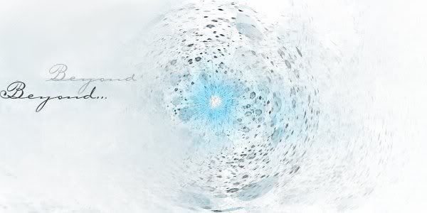
 ...who created this mess...?  Group: Member Posts: 451 Joined: Feb 2005 Member No: 97,244 |
It's been a really long time since I've made anything. I made this from scratch (I didn't edit an image like I usually do) a while ago using GIMP.
|
|
|
|


Posts in this topic
 xblueradiance "beyond" Mar 8 2006, 07:10 PM
 skp86 Very interesting definetly nothing like i've s... Mar 8 2006, 07:35 PM ranniel Very unique. I like it just the way it is. I just ... Mar 8 2006, 08:13 PM Teesa ^Agreed. It looks nice and simplistic. Just add a ... Mar 8 2006, 08:15 PM ecargnmyst wow..very cool crater look..make a tutorial! =... Mar 8 2006, 10:17 PM neko-lian very nice! ^^ I like it a lot... good job. Mar 9 2006, 11:29 AM Zatanna This looks very nice. Reminds me of the planet Ho... Mar 9 2006, 11:34 AM Jeng pretty colors. and very. CooL. i agree with them a... Mar 9 2006, 02:47 PM REBELnDISGUISE its different. i like it Mar 9 2006, 03:12 PM StanleyThePanda Very different and unique. I think it would look b... Mar 9 2006, 03:18 PM
 xbabyboo Unique..
Love it.
I don`t think that font real... Mar 9 2006, 10:34 PM
xbabyboo Unique..
Love it.
I don`t think that font real... Mar 9 2006, 10:34 PM  |
1 User(s) are reading this topic (1 Guests and 0 Anonymous Users)
0 Members: