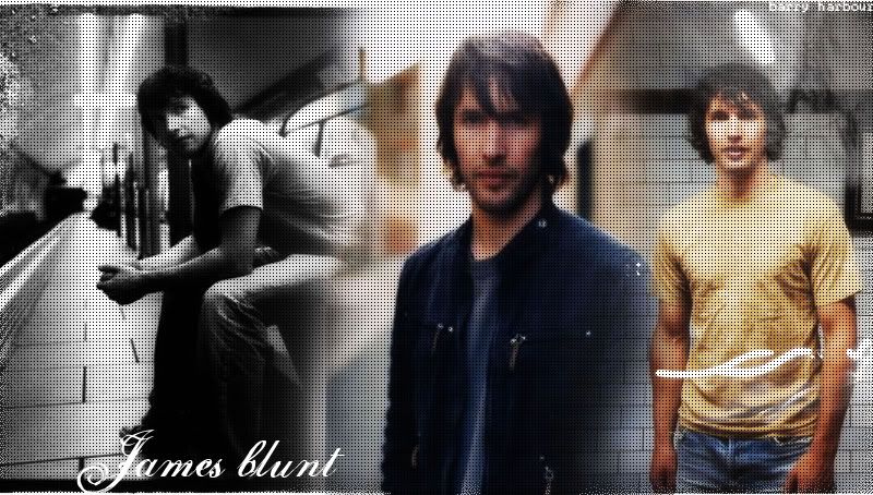
simple james blunt blend |
Resource Center Links
This Month's Contests | Hosts Looking for Hostees | Hostees looking for Hosts | BigBookofResources
Submission Guidelines
  |

 Apr 3 2006, 05:32 PM Apr 3 2006, 05:32 PM
Post
#1
|
|
 When the sun sleeps.  Group: Member Posts: 532 Joined: Nov 2005 Member No: 289,628  |
thumbed
|
|
|
|




|
Apr 3 2006, 05:36 PM
Post
#2
|
|
 show me a garden thats bursting to life Group: Staff Alumni Posts: 12,303 Joined: Mar 2005 Member No: 115,987 |
I hateeee those squares.
Everything else is okay. :) |
|
|
|


|
Apr 3 2006, 05:49 PM
Post
#3
|
|
 Senior Member Group: Member Posts: 3,055 Joined: Jul 2005 Member No: 174,796 |
In my opinion it's okay
I hate the square/pattern/whatever things they totally block the pictures. But part of the arm is cut off in the middle picture. And it's better to use pictures that have similar colors or just add a gradient instead. And I don't exactly like the font....sorry if I'm being harsh |
|
|
|

|
Apr 3 2006, 05:57 PM
Post
#4
|
|
|
When the sun sleeps. Group: Member Posts: 532 Joined: Nov 2005 Member No: 289,628 |
Uhh no haha ur not harsh. I mean i know its not great, thats why its simple I just havent put anything up in awhile and this is the only new thing i have so i decided to put it up.
|
|
|
|
|
Apr 3 2006, 06:24 PM
Post
#5
|
|
 3,565, you n00bs ain't got nothin' on me. Group: Official Member Posts: 3,761 Joined: Feb 2004 Member No: 3,565 |
it's not a very clean blend and the boxes make you not able to see anything. the black and white and then the color thing doesnt work. blunt should be capitalized (hehe) and the font doesnt suit the picture.
|
|
|
|

| *chaneun* |
Apr 3 2006, 06:49 PM
Post
#6
|
|
Guest |
The pictures don't match at all.
|
|
|
|
|
Apr 3 2006, 06:57 PM
Post
#7
|
|
 the name is ada. Group: Official Member Posts: 4,688 Joined: Dec 2005 Member No: 334,608 |
His butt bothers me on the first picture.The pattern needs to go.
 You should of made the text bigger.It looks alright. You should of made the text bigger.It looks alright.
|
|
|
|
| *ranniel* |
Apr 3 2006, 07:18 PM
Post
#8
|
|
Guest |
If your feather blending or at least how you're doing your blending, use pictures that DO match, and don't used a texture/pattern like that. It looks ok though.
|
|
|
|
|
Apr 4 2006, 11:36 PM
Post
#9
|
|
 Bada-bing, bada-boom. Group: Member Posts: 452 Joined: Jan 2005 Member No: 86,111 |
It's alright. Those squares don't feel right and the pictures don't match.
But I do love Mr. Blunt. |
|
|
|

|
Apr 5 2006, 04:37 PM
Post
#10
|
|
 Senior Member Group: Official Member Posts: 7,149 Joined: Aug 2005 Member No: 213,509 |
lower the opacity of the pattern ALOT.the images should be all in color since 2 of them are. fairly blended.but good.
|
|
|
|

|
Apr 5 2006, 10:26 PM
Post
#11
|
|
 My name is really Matt... if you care. Group: Member Posts: 1,442 Joined: Oct 2005 Member No: 258,234 |
hate the squares, hate the guy u blending (his singing and music videos are blasphemy to music)
but the blend is nice |
|
|
|
|
Apr 6 2006, 10:28 PM
Post
#12
|
|
 I intend to live forever-so far, so good. Group: Member Posts: 2,820 Joined: Mar 2005 Member No: 115,137 |
it would look really cool if you greyscaled all the pictures. and blended more around the shapes of the ppl, not mainly in straight lines
its a good blend tho. good job |
|
|
|

|
Apr 7 2006, 09:01 AM
Post
#13
|
|
 yan lin♥ Group: Staff Alumni Posts: 14,129 Joined: Apr 2004 Member No: 13,627 |
The blending isn't too bad, but your pictures contrast too much. Also, the pattern thing you have on top blocks out most of the picture.
|
|
|
|

|
Apr 7 2006, 09:48 AM
Post
#14
|
|
|
When the sun sleeps. Group: Member Posts: 532 Joined: Nov 2005 Member No: 289,628 |
Ohh..well the pattern didnt bother me when i made it. You all do know its a thumbnail right?
|
|
|
|
|
Apr 9 2006, 11:46 PM
Post
#15
|
|
|
3,565, you n00bs ain't got nothin' on me. Group: Official Member Posts: 3,761 Joined: Feb 2004 Member No: 3,565 |
QUOTE(ikn0wurm0m @ Apr 7 2006, 10:48 AM)  Ohh..well the pattern didnt bother me when i made it. You all do know its a thumbnail right? yes, and if you click it it's still there. and too dark. |
|
|
|
|
Apr 10 2006, 12:46 AM
Post
#16
|
|
 Alice Group: Member Posts: 216 Joined: Apr 2004 Member No: 10,185 |
I don't like that square thing at all...it's alright.
|
|
|
|
|
Apr 12 2006, 01:57 PM
Post
#17
|
|
 Senior Member Group: Member Posts: 124 Joined: Feb 2006 Member No: 370,115 |
i hate the square things too, & i think all the images should have color, or all the images should not, not just one. but thats my opinion. other then that its cute.xx |
|
|
|
| *Libertie* |
Apr 14 2006, 11:35 AM
Post
#18
|
|
Guest |
Meh.. People don't like the dot pattern, but I think if you used a soft eraser and took it off his face/body so it doesn't cover him up, it'd look okay. Also turn down the opacity on it so it doesn't stand out so much (the idea is blend, so you don't want anything to stick out too much). Parts of him are transparent and it looks weird, but overall I don't think it's bad. *shrug* :)
|
|
|
|
|
1 User(s) are reading this topic (1 Guests and 0 Anonymous Users)
0 Members: