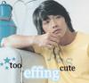
My First Photoshop Design, Ft. Lisa Lopes |
Resource Center Links
This Month's Contests | Hosts Looking for Hostees | Hostees looking for Hosts | BigBookofResources
Submission Guidelines

 Feb 25 2006, 01:07 PM Feb 25 2006, 01:07 PM
Post
#1
|
|
|
KEEP 0N DREAM``N  Group: Member Posts: 82 Joined: Dec 2005 Member No: 332,251 |
 It was kinda complicated. I had to mess around with it alot. I still gotta get some brushes though. |
|
|
|


 |
Replies
(1 - 12)
|
Feb 25 2006, 01:19 PM
Post
#2
|
|
 Julia Tested, Mother Approved Group: Member Posts: 61 Joined: Jul 2005 Member No: 188,066 |
It looks really nice, except (in my opinion) I don't like the overlay colors. And you should try to get better quality photos. Also, her shirt looks like a big white patch that's been cut out. I think it's the overlay colors, so try lowering the opacity levels. The white stripes at the bottom left hand corner take away from the image, so try not putting so many things that'll detract from what you want people to focus on. Great job!

|
|
|
|
|
Feb 25 2006, 01:41 PM
Post
#3
|
|
 Senior Member Group: Member Posts: 3,055 Joined: Jul 2005 Member No: 174,796 |
^agreed
|
|
|
|

|
Feb 25 2006, 04:30 PM
Post
#4
|
|
 Senior Member Group: Official Member Posts: 7,149 Joined: Aug 2005 Member No: 213,509 |
you dont need the brushes in it or that effect in the left hand bottom corner.good job though. :] nice blend
|
|
|
|

|
Feb 26 2006, 12:22 AM
Post
#5
|
|
 & my dreams fall down Group: Member Posts: 1,173 Joined: Nov 2005 Member No: 291,336 |
I love it!!
 
|
|
|
|

| *lil_chubby_cheeks2* |
Feb 26 2006, 12:24 AM
Post
#6
|
|
Guest |
QUOTE(xheartsyoumex @ Feb 25 2006, 10:19 AM)  It looks really nice, except (in my opinion) I don't like the overlay colors. And you should try to get better quality photos. Also, her shirt looks like a big white patch that's been cut out. I think it's the overlay colors, so try lowering the opacity levels. The white stripes at the bottom left hand corner take away from the image, so try not putting so many things that'll detract from what you want people to focus on. Great job! yeahh and in the right pic, on her arm is that thing a tattoo ora bush you used? |
|
|
|
| *ranniel* |
Feb 26 2006, 01:17 AM
Post
#7
|
|
Guest |
it looks good for your first design.

|
|
|
|
|
Feb 26 2006, 01:23 AM
Post
#8
|
|
 This bitch better work! Group: Staff Alumni Posts: 13,681 Joined: Jul 2004 Member No: 28,095 |
please edit your signature. it is too big.
 & btw, it is EXCELLENT for your first. :] |
|
|
|


|
Feb 26 2006, 01:35 AM
Post
#9
|
|
|
define our lives for us. Group: Staff Alumni Posts: 11,656 Joined: Aug 2004 Member No: 43,293 |
wow, that's nice for your first. I just think the stars look too.. out of the picture. Like it's the wrong kind of stars or something.
 but that's lovely. |
|
|
|

|
Feb 26 2006, 05:28 PM
Post
#10
|
|
 the name is ada. Group: Official Member Posts: 4,688 Joined: Dec 2005 Member No: 334,608 |
Colors=beautiful
image=nice I don`t like font though. |
|
|
|
|
Feb 27 2006, 11:59 AM
Post
#11
|
|
 yay for hugs :) Group: Member Posts: 132 Joined: Apr 2005 Member No: 126,872 |
i really like it :)
but i agree with the shirt looking like it's been cut out it's pretty good for your first <3 rosy |
|
|
|
|
Mar 1 2006, 04:40 PM
Post
#12
|
|
 ladybugs are hot <3 Group: Member Posts: 1,169 Joined: Jan 2005 Member No: 93,802 |
QUOTE(xheartsyoumex @ Feb 25 2006, 1:19 PM) It looks really nice, except (in my opinion) I don't like the overlay colors. And you should try to get better quality photos. Also, her shirt looks like a big white patch that's been cut out. I think it's the overlay colors, so try lowering the opacity levels. The white stripes at the bottom left hand corner take away from the image, so try not putting so many things that'll detract from what you want people to focus on. Great job! agreed |
|
|
|
|
Mar 1 2006, 05:41 PM
Post
#13
|
|
 im NO ordinary! akO ay taO! Group: Member Posts: 385 Joined: Dec 2005 Member No: 314,294 |
^^ i second that...
|
|
|
|
 |
1 User(s) are reading this topic (1 Guests and 0 Anonymous Users)
0 Members: