Opinions on blend, :) |
Resource Center Links
This Month's Contests | Hosts Looking for Hostees | Hostees looking for Hosts | BigBookofResources
Submission Guidelines
  |

 Feb 15 2006, 10:08 PM Feb 15 2006, 10:08 PM
Post
#1
|
|
|
Newbie  Group: Member Posts: 4 Joined: Dec 2005 Member No: 333,801 |
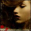
I made these two blends of my friend. Which one do you think is better? Any tips are also appreciated. : ) P.S. I just got Photoshop last week, so sorry if it looks too newbie-like.
1)  2)  Thanks! |
|
|
|


|
Feb 15 2006, 11:22 PM
Post
#2
|
|
 lolz?! Group: Member Posts: 96 Joined: Feb 2006 Member No: 376,709 |
Ehh does this belong in Digital Art?
[Edit;;] The brushes seem pretty cheap if you ask me. THe blending is alright but I sort of don't like the colors either. Thumbnails? |
|
|
|
|
Feb 15 2006, 11:28 PM
Post
#3
|
|
 My name is really Matt... if you care. Group: Member Posts: 1,442 Joined: Oct 2005 Member No: 258,234 |
^yes it does, some1 will move it soon
|
|
|
|
|
Feb 15 2006, 11:30 PM
Post
#4
|
|
 Are You Kidding? Group: Member Posts: 1,714 Joined: Sep 2005 Member No: 237,747 |
ya, its suppose to be in the digital art section.
I dont know which on i like. I like the colors u used. I dont like the asian writing going on her face in the 2nd one. The 1st one i dont know about the brush thingys in the middle. Other then that there're alright. |
|
|
|
|
Feb 16 2006, 01:07 AM
Post
#5
|
|
 You'll find me in your dreams. Group: Official Member Posts: 8,536 Joined: Mar 2005 Member No: 114,010 |
The lending kinda sucks. &the text has zero to do with the blend. Fairly stupid to use it then, if you ask me.
-> Moved to Digital Art. |
|
|
|

|
Feb 16 2006, 01:22 AM
Post
#6
|
|
 the name is ada. Group: Official Member Posts: 4,688 Joined: Dec 2005 Member No: 334,608 |
The text is soo small.
The brushes don`t really match? It`s alright.. |
|
|
|
|
Feb 16 2006, 03:08 PM
Post
#7
|
|
 Senior Member Group: Official Member Posts: 7,149 Joined: Aug 2005 Member No: 213,509 |
i agree with them, the brushes dont fit.the chinese writing on the second one bugs me.i like the border on the second one though x; and the font on the first one doesnt fit.
|
|
|
|

|
Feb 16 2006, 03:36 PM
Post
#8
|
|
 Senior Member Group: Member Posts: 3,055 Joined: Jul 2005 Member No: 174,796 |
The blending is good but i don't like the fonts or brushes you used, and I'm not too sure about the gradient
|
|
|
|

|
Feb 16 2006, 10:19 PM
Post
#9
|
|
 Newbie Group: Member Posts: 7 Joined: Mar 2005 Member No: 117,046 |
The chinese characters do not match with the 2nd poster. The color of the 2nd poster is better than the 1st poster and also the border. So I would prefer the 2nd poster. Just don't add those brushes. I think you should try downloading more brushes. The last pix on the right doesn't really blend in with the other pictures.
|
|
|
|
|
Feb 16 2006, 10:41 PM
Post
#10
|
|
|
Newbie Group: Member Posts: 4 Joined: Dec 2005 Member No: 333,801 |
I see what ya'll mean. I don't like the picture on the right much either, but I used what I was given.
 What would you suggest about the brushes? Where to get some good ones or just how to use them differently. And I don't quite understand the word 'cheap'. What would you suggest about the brushes? Where to get some good ones or just how to use them differently. And I don't quite understand the word 'cheap'.  Thanks for the help though. :] Thanks for the help though. :]Also, why are all my capital letters showing up lowercase even though they're typed uppercase? I'm a stickler for punctuation and whatnot, so it bothers me. |
|
|
|
| *salcha* |
Feb 16 2006, 10:59 PM
Post
#11
|
|
Guest |
Blunt.
cheap = sucks |
|
|
|
|
Feb 16 2006, 11:02 PM
Post
#12
|
|
|
Newbie Group: Member Posts: 7 Joined: Mar 2005 Member No: 117,046 |
Best site to dl brushes is LiveJournal. http://community.livejournal.com/100x100_brushes/
They got new brushes and styles. Download it and mess around with it. |
|
|
|
|
Feb 17 2006, 06:48 PM
Post
#13
|
|
|
RJL<3 Group: Member Posts: 1,194 Joined: Dec 2004 Member No: 71,019 |
well let me just say good blending. but the pictures are blurry, the colors arent the best, and the brushes aren't placed very well and are random. just try using higher quality pictures, use a different gradient, and rethink what brushes would look nice. still good for a beginner though!
 nice job. nice job.
|
|
|
|

| *swtcherriipie* |
Feb 18 2006, 12:40 PM
Post
#14
|
|
Guest |
niice blending.
|
|
|
|
|
1 User(s) are reading this topic (1 Guests and 0 Anonymous Users)
0 Members: