another blend, ft. Ashlee simpson |
Resource Center Links
This Month's Contests | Hosts Looking for Hostees | Hostees looking for Hosts | BigBookofResources
Submission Guidelines
  |

 Feb 12 2006, 10:47 AM Feb 12 2006, 10:47 AM
Post
#1
|
|
 Senior Member  Group: Member Posts: 3,055 Joined: Jul 2005 Member No: 174,796 |
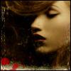
I think this one is cool
 I love the colors,the pattern, and everything. But my psp is messed up so for some reason when I try to put on a brush it rotates it and makes not one image but two,three, four, and etc. So if you could help me w/ that it's be great. thumbed   c&c are welcome =] |
|
|
|


|
Feb 12 2006, 11:05 AM
Post
#2
|
|
 the name is ada. Group: Official Member Posts: 4,688 Joined: Dec 2005 Member No: 334,608 |
It looks good!
I don`t like the color blue you used though. 
|
|
|
|
|
Feb 12 2006, 11:59 AM
Post
#3
|
|
|
Senior Member Group: Member Posts: 3,055 Joined: Jul 2005 Member No: 174,796 |
^thx
it's actually suppposed to be purple though.... |
|
|
|
|
Feb 12 2006, 12:01 PM
Post
#4
|
|
 lolz?! Group: Member Posts: 96 Joined: Feb 2006 Member No: 376,709 |
I think you are really getting better at your blends :]
Yeah the purple looks like blue >.< I just love the stroked text. 
|
|
|
|
|
Feb 12 2006, 12:13 PM
Post
#5
|
|
|
Senior Member Group: Member Posts: 3,055 Joined: Jul 2005 Member No: 174,796 |
^thankyou =]
you don't know how happy that makes me feel =D |
|
|
|
|
Feb 12 2006, 07:05 PM
Post
#6
|
|
 Senior Member Group: Official Member Posts: 7,149 Joined: Aug 2005 Member No: 213,509 |
this one is pretty good. no brushes in the corners.maybe make the hearts a bit darker.and use a diff color on the font or lower the opacity.
|
|
|
|

|
1 User(s) are reading this topic (1 Guests and 0 Anonymous Users)
0 Members: