Another blend!-Vintage beauty, ft. once again Alexis Bledel |
Resource Center Links
This Month's Contests | Hosts Looking for Hostees | Hostees looking for Hosts | BigBookofResources
Submission Guidelines

 Feb 11 2006, 04:50 PM Feb 11 2006, 04:50 PM
Post
#1
|
|
 Senior Member  Group: Member Posts: 3,055 Joined: Jul 2005 Member No: 174,796 |
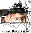
Yes, another blend.
A bit simpler this time thumbed   comments & critisism |
|
|
|


 |
Replies
(1 - 13)
|
Feb 11 2006, 05:44 PM
Post
#2
|
|
 mac & zee. Group: Member Posts: 243 Joined: Feb 2006 Member No: 376,265 |
It's Roarie! Very nice. I love the background and the brushes you used.
|
|
|
|
|
Feb 11 2006, 05:46 PM
Post
#3
|
|
 Senior Member Group: Member Posts: 170 Joined: Jan 2006 Member No: 351,851 |
I really like the font that u used.
|
|
|
|
|
Feb 11 2006, 05:57 PM
Post
#4
|
|
 Milo Kamalani Group: Human Posts: 954 Joined: Oct 2005 Member No: 274,798 |
OH GOD STOP USING BLACK BRUSHES AND FONTS.
You just 'put them in' like they're just supposed to be there, too. Put some art into it. Have passion, feeling, and meaning in what you're doing. If you don't everything you make will end up looking the same, which is not a good thing. Also the whole point of a blend is to make things 'flow' together. I see no flow. Other than that, it's nice. |
|
|
|


| *Zatanna* |
Feb 11 2006, 06:11 PM
Post
#5
|
|
Guest |
Ack, I'm not sure she's been using the software that long. Give her a little break. It took me quite a while before I branched out with different colors, brushes, fonts, etc.
Steffie - The images are softer than I've typically seen from you, which is really good. =) The font is very pretty and although I don't agree with Stephire's tone, I agree with her that the black doesn't work and you should use a softer color on the font and brush for this. Think of it as a matching outfit. Would you wear brown shoes with black pants? Sometimes that's how I think about the digital canvas. |
|
|
|
|
Feb 11 2006, 06:12 PM
Post
#6
|
|
 My name is really Matt... if you care. Group: Member Posts: 1,442 Joined: Oct 2005 Member No: 258,234 |
you are obsessed huh?
well i give it a 7/10 |
|
|
|
|
Feb 11 2006, 06:30 PM
Post
#7
|
|
|
Senior Member Group: Member Posts: 3,055 Joined: Jul 2005 Member No: 174,796 |
QUOTE(Zatanna @ Feb 11 2006, 7:11 PM) Ack, I'm not sure she's been using the software that long. Give her a little break. It took me quite a while before I branched out with different colors, brushes, fonts, etc. Steffie - The images are softer than I've typically seen from you, which is really good. =) The font is very pretty and although I don't agree with Stephire's tone, I agree with her that the black doesn't work and you should use a softer color on the font and brush for this. Think of it as a matching outfit. Would you wear brown shoes with black pants? Sometimes that's how I think about the digital canvas.  yeah I've only had psp X for a couple of days QUOTE Think of it as a matching outfit ^and that's a nice way of thinking of it thx. Instaed pf blavk fonts I started using different colors w/ a soft glow =] QUOTE(add1cted2f1re @ Feb 11 2006, 7:12 PM) you are obsessed huh? well i give it a 7/10 ^Haha yeah I am obsessed =] |
|
|
|
|
Feb 11 2006, 06:35 PM
Post
#8
|
|
 uhmm. Group: Member Posts: 101 Joined: Jan 2006 Member No: 367,929 |
very pretty, i luhv the colors. what font is that ? :]
|
|
|
|
|
Feb 11 2006, 07:21 PM
Post
#9
|
|
|
Senior Member Group: Member Posts: 3,055 Joined: Jul 2005 Member No: 174,796 |
^it's carpenter icg
|
|
|
|
|
Feb 11 2006, 09:51 PM
Post
#10
|
|
 say maydayism. Group: Staff Alumni Posts: 7,447 Joined: Jun 2004 Member No: 26,344 |
Hey... I think that's pretty awesome, considering that you only had PSP for a few days or so.

|
|
|
|

|
Feb 11 2006, 11:25 PM
Post
#11
|
|
 the name is ada. Group: Official Member Posts: 4,688 Joined: Dec 2005 Member No: 334,608 |
I like it!
It`s soo cute! |
|
|
|
|
Feb 11 2006, 11:35 PM
Post
#12
|
|
 You'll find me in your dreams. Group: Official Member Posts: 8,536 Joined: Mar 2005 Member No: 114,010 |
CarpenterICG looks better all lowercase.
 The texture would be better flipped, the stuff on her face just doesn't go. And leave more of the arm. the middle picture is, like, "huh? what happened to her arm there?". The texture would be better flipped, the stuff on her face just doesn't go. And leave more of the arm. the middle picture is, like, "huh? what happened to her arm there?".Take time to work on your art, don't just slap brushes on there. Don't just pick any font and don't just pick any text, any layer mode. You theme should be crystally apparent, which I don't see clearly here. |
|
|
|

|
Feb 12 2006, 12:02 AM
Post
#13
|
|
 Are You Kidding? Group: Member Posts: 1,714 Joined: Sep 2005 Member No: 237,747 |
Its nice. I like the texture. But i agree it should be flipped. I dont like the brush. Other then that its alright.
|
|
|
|
|
Feb 12 2006, 06:11 PM
Post
#14
|
|
 Senior Member Group: Official Member Posts: 7,149 Joined: Aug 2005 Member No: 213,509 |
QUOTE(Stephire @ Feb 11 2006, 5:57 PM) OH GOD STOP USING BLACK BRUSHES AND FONTS. You just 'put them in' like they're just supposed to be there, too. Put some art into it. Have passion, feeling, and meaning in what you're doing. If you don't everything you make will end up looking the same, which is not a good thing. Also the whole point of a blend is to make things 'flow' together. I see no flow. Other than that, it's nice. x; I AGREE x; meh. great blending and pattern used. use a diff color font and brush, a different brush other than swirlies x;.i like the images though and great colros in the background |
|
|
|

 |
1 User(s) are reading this topic (1 Guests and 0 Anonymous Users)
0 Members: