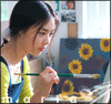
rachel mcadams, blend 1st |
Resource Center Links
This Month's Contests | Hosts Looking for Hostees | Hostees looking for Hosts | BigBookofResources
Submission Guidelines
  |

 Dec 29 2005, 08:31 PM Dec 29 2005, 08:31 PM
Post
#1
|
|
 My peanut.  Group: Member Posts: 948 Joined: Jul 2005 Member No: 187,456 |
 cc please |
|
|
|


|
Dec 29 2005, 08:34 PM
Post
#2
|
|
 You'll find me in your dreams. Group: Official Member Posts: 8,536 Joined: Mar 2005 Member No: 114,010 |
The random rainbow looks rather stupid and the empty white space to the right of the second picture is pretty pointless too. You should space the pictures apart, not squash them all together. I think if you added a few brushes and a border it could be far improved.
|
|
|
|


|
Dec 29 2005, 08:35 PM
Post
#3
|
|
 I listen to bands that don't even exist yet... Group: Member Posts: 330 Joined: Sep 2005 Member No: 249,189 |
^^ well that was kinda hash (so much for creative critisism)
It look interesting but the point of a blend is to have multiple images that sorta fade into each other. When the picture has a white background it kinda defeats the purpose unlest used right |
|
|
|


|
Dec 29 2005, 08:35 PM
Post
#4
|
|
 ^ignore. read> Maria. Group: Member Posts: 710 Joined: Dec 2005 Member No: 323,799 |
its really nice and simple... but that rainbow and the blank kinda bugs me :P
|
|
|
|
|
Dec 29 2005, 08:39 PM
Post
#5
|
|
|
My peanut. Group: Member Posts: 948 Joined: Jul 2005 Member No: 187,456 |
QUOTE(fishcake-y @ Dec 29 2005, 7:34 PM) The random rainbow looks rather stupid and the empty white space to the right of the second picture is pretty pointless too. You should space the pictures apart, not squash them all together. I think if you added a few brushes and a border it could be far improved.   Well.. It was my FIRST blend. Im having trouble figuring out how to get a backround on GIMP.... I like the rainbow transition.. I can improve it.. and its my first one so I understand that its not "Perfection" 
|
|
|
|
|
Dec 29 2005, 08:40 PM
Post
#6
|
|
|
You'll find me in your dreams. Group: Official Member Posts: 8,536 Joined: Mar 2005 Member No: 114,010 |
I thought C/C stood for constructive criticism? It's not like I'm saying "This completely sucks and you should never touch digital art again". I just state what I think is wrong with a piece and then tell how to improve it. Which is much more helpful to an artist than the "it's nice. i lyke it." that seems to overflow this forum. -shrug-
|
|
|
|
| *Zatanna* |
Dec 29 2005, 10:06 PM
Post
#7
|
|
Guest |
I think it looks lovely, especially for a first time blend. The rainbow doesn't bug me so much, but the transition between the different opacities (from left to right) could be a bit more subtle.
|
|
|
|
| *Retro_Love* |
Dec 29 2005, 11:27 PM
Post
#8
|
|
Guest |
Uhh the rainbow line is there why? See the first picture? Its close to the edge. Thats good. But look at the 2nd image. There is a big empty space on her right. Like Fishcake said you should add some brushes ^_^
|
|
|
|
|
Dec 30 2005, 02:08 AM
Post
#9
|
|
 the name is ada. Group: Official Member Posts: 4,688 Joined: Dec 2005 Member No: 334,608 |
The rainbow should be everywhere.I think that`ll make it look better.Other than that it`s really cute! Oh you should add an image of her on the right empty side.

|
|
|
|
|
Dec 30 2005, 10:15 AM
Post
#10
|
|
 Senior Member Group: Member Posts: 3,055 Joined: Jul 2005 Member No: 174,796 |
The rainbow does look a bit weird.
Plus it looks pretty plain. Brushes/textures/patterns are your friends 
|
|
|
|

|
Dec 30 2005, 10:46 AM
Post
#11
|
|
 i am mean. fear me. Group: Member Posts: 178 Joined: Nov 2005 Member No: 300,587 |
looks too plain and the rainbow looks really pointless and stupid.
i think you can do better for a first |
|
|
|
|
Dec 30 2005, 11:44 AM
Post
#12
|
|
 Call me C.Annie Group: Member Posts: 366 Joined: Mar 2005 Member No: 115,994 |
I agree with fishcake-y. It looks completley off and not blend like. You should move the second picture more to the left and get rid of the rainbow. Try adding brushes/textures/patterns and changing the color of the background to make the picture more exciting. And I just noticed theres still the background on the second picture. You should cut the picture out and make the opacity of the second picture higher to match the other one. It looks kinda off.
|
|
|
|
|
Dec 30 2005, 01:55 PM
Post
#13
|
|
 Diana =] Group: Member Posts: 1,318 Joined: Jul 2005 Member No: 174,147 |
It's too plain. The rainbow is quite random.
|
|
|
|
|
Dec 30 2005, 02:12 PM
Post
#14
|
|
 I love you Group: Member Posts: 194 Joined: Mar 2005 Member No: 116,447 |
it's a really nice and simple, but I have to agree with everyone about the rainbow and the blank space
|
|
|
|

|
Dec 30 2005, 02:36 PM
Post
#15
|
|
 who ma bitch? you ma bitch, bitch. Group: Member Posts: 1,920 Joined: Oct 2004 Member No: 55,278 |
QUOTE(fishcake-y @ Dec 29 2005, 5:34 PM) The random rainbow looks rather stupid and the empty white space to the right of the second picture is pretty pointless too. You should space the pictures apart, not squash them all together. I think if you added a few brushes and a border it could be far improved. ditto but its okey for your first |
|
|
|
|
1 User(s) are reading this topic (1 Guests and 0 Anonymous Users)
0 Members: