Some Posters I Made, Bored in Graphic Arts Class |
Resource Center Links
This Month's Contests | Hosts Looking for Hostees | Hostees looking for Hosts | BigBookofResources
Submission Guidelines
  |

 Oct 17 2010, 03:59 AM Oct 17 2010, 03:59 AM
Post
#1
|
|
|
BBM: 310ED181  Group: Member Posts: 613 Joined: Jul 2008 Member No: 671,976 |
(Very Old) Bush Poster from who knows when.
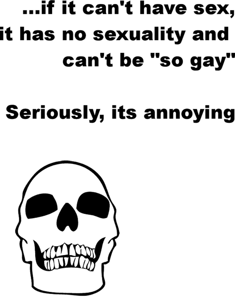
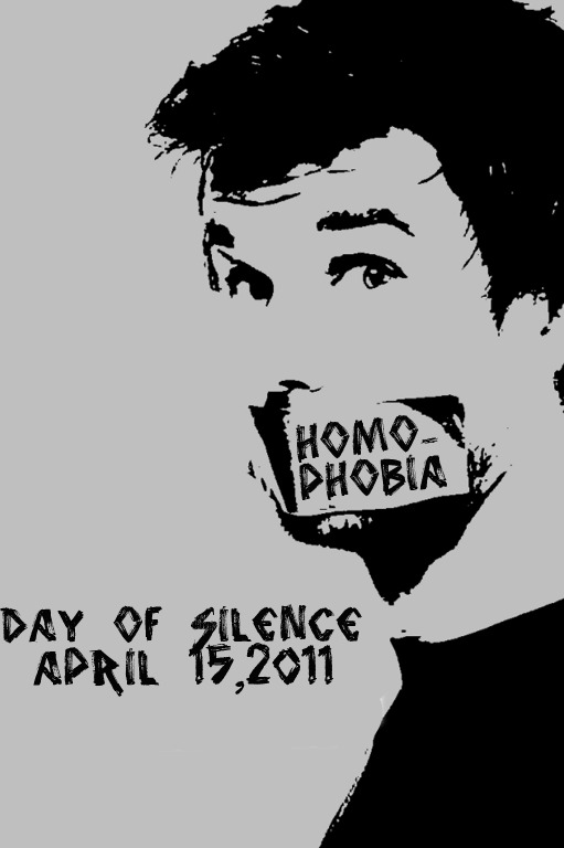
Poster for this year's day of silence this one kinda speaks for itself |
|
|
|


|
Oct 17 2010, 09:48 AM
Post
#2
|
|
|
Senior Member Group: Staff Alumni Posts: 4,665 Joined: Aug 2008 Member No: 676,364 |
Nice.
|
|
|
|


|
Oct 17 2010, 09:56 AM
Post
#3
|
|
 (′ ・ω・`) Group: Official Designer Posts: 6,179 Joined: Dec 2004 Member No: 72,477 |
the graphics seem fine, but the typography is quite bad.
for the first one, im not sure why the background of 'dumbf*ck' is not the same as the one for the graphic. make it the same, it really throws it off. for the second one, the angle of rotation of the word "homophobia" and the tape is different, which really irks me. the font choice and lettering size and spacing is not too good either. maybe make it more bold, and close the line space. last one, arial, yuck. the obvious spelling error of "its", it should've been "it's". the line spacing is also a bit too big. i think you were going for the modernism style, but it ended up looking empty and unoriginal. |
|
|
|

|
Oct 17 2010, 10:06 AM
Post
#4
|
|
|
BBM: 310ED181 Group: Member Posts: 613 Joined: Jul 2008 Member No: 671,976 |
For "day of silence": what font should I use, I'm really new at this
|
|
|
|
|
Oct 17 2010, 11:01 AM
Post
#5
|
|
|
(′ ・ω・`) Group: Official Designer Posts: 6,179 Joined: Dec 2004 Member No: 72,477 |
try frutiger or helvetica. big, bold, small line space
|
|
|
|
|
Oct 17 2010, 11:29 AM
Post
#6
|
|
|
BBM: 310ED181 Group: Member Posts: 613 Joined: Jul 2008 Member No: 671,976 |
damn. two fonts that don't come with windows. closest thing i have is *cringe* arial...
EDIT: updated |
|
|
|

|
Oct 17 2010, 11:45 AM
Post
#7
|
|
|
(′ ・ω・`) Group: Official Designer Posts: 6,179 Joined: Dec 2004 Member No: 72,477 |
^holy shit whatever were you thinking? you just made the poster infinitely worse. you still haven't fixed the angle of rotation, and now you've used two grunge fonts when you've got a clean graphic. those two fonts should never appear in the same place together. try animal or bandana or gasmask. if youre gonna do that grunge look, add some grungy textures. but either way dont use those two fonts, you just lowered its legibility.
|
|
|
|
|
Oct 17 2010, 01:24 PM
Post
#8
|
|
 ;p Group: Member Posts: 280 Joined: May 2004 Member No: 17,685 |
QUOTE ^holy shit whatever were you thinking? you just made the poster infinitely worse. lol |
|
|
|

|
Oct 17 2010, 01:38 PM
Post
#9
|
|
|
BBM: 310ED181 Group: Member Posts: 613 Joined: Jul 2008 Member No: 671,976 |
my 3rd attempt; this time using animal (bandana wouldn't cooperate with the date)
EDIT: angle of rotation should be fixed |
|
|
|
|
2 User(s) are reading this topic (2 Guests and 0 Anonymous Users)
0 Members: