
Life is like... |
Resource Center Links
This Month's Contests | Hosts Looking for Hostees | Hostees looking for Hosts | BigBookofResources
Submission Guidelines
  |
 Jun 24 2010, 11:48 PM Jun 24 2010, 11:48 PM
Post
#1
|
|
 Sniff, sniff, hooray!  Group: Member Posts: 71 Joined: Mar 2006 Member No: 388,396 |
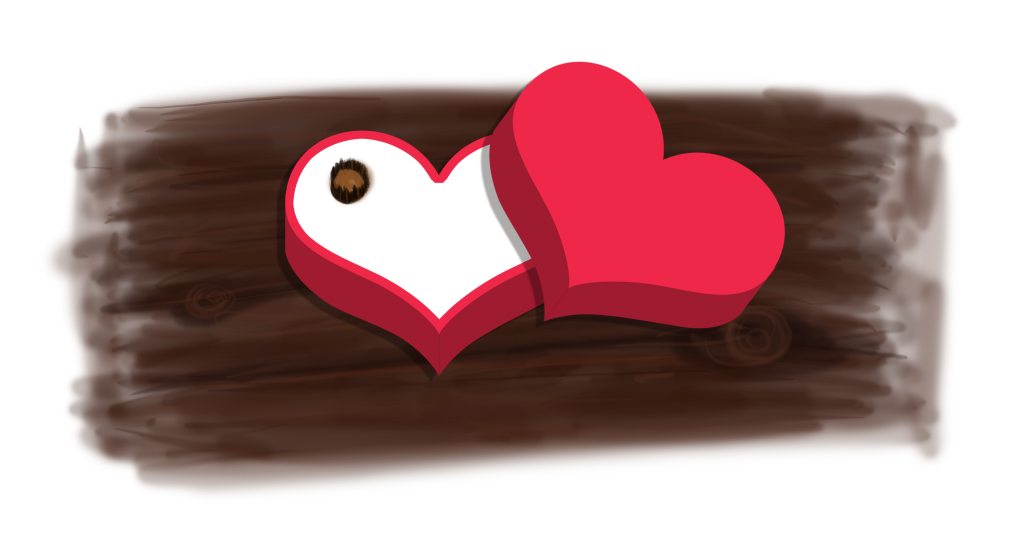
A box of chocolates!
 So I got bored and decided to do this just for fun. It's obviously not done yet, but what do you guys think of it so far? update: Final product! yay!  So I tried what spambot suggested. Does it look more natural? c&c is appreciated. |
|
|
|


|
Jun 25 2010, 12:58 PM
Post
#2
|
|
 Mel Blanc was allergic to carrots. Group: Official Designer Posts: 6,371 Joined: Aug 2008 Member No: 676,291 |
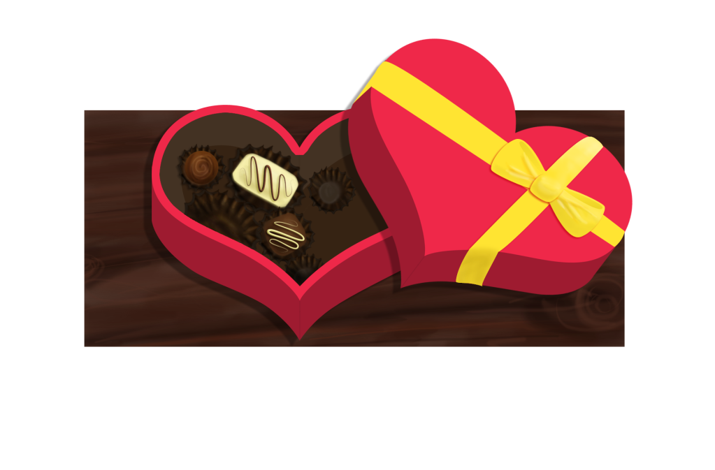
Oh, wow. This looks cool! Although, the wood(?) background is a bit iffy to me. The box and the chocolate looks awesome, though.
How did you make this, if you don't mind me asking? |
|
|
|


|
Jun 25 2010, 01:12 PM
Post
#3
|
|
 Senior Member Group: Administrator Posts: 8,629 Joined: Jan 2007 Member No: 498,468 |
Haha it looks cute. I can't wait to see the final product with the details and all.
|
|
|
|

|
Jun 25 2010, 03:09 PM
Post
#4
|
|
|
Sniff, sniff, hooray! Group: Member Posts: 71 Joined: Mar 2006 Member No: 388,396 |
Thanks guys :)
Yeah... I'm still working on the wood...  haha hahaOh, I made it in photoshop. |
|
|
|
|
Jun 26 2010, 02:23 PM
Post
#5
|
|
|
Senior Member Group: Administrator Posts: 8,629 Joined: Jan 2007 Member No: 498,468 |
Omg those chocolates look so good and real lol. I like the final outcome though!
|
|
|
|
|
Jun 26 2010, 02:57 PM
Post
#6
|
|
|
Mel Blanc was allergic to carrots. Group: Official Designer Posts: 6,371 Joined: Aug 2008 Member No: 676,291 |
Oh my, looks awesome! I'm still not really feelin' the wood, though. Maybe because it looks really flat compared to the detailed, three-dimensional chocolates and box. Otherwise, great job!

|
|
|
|
|
Jun 26 2010, 06:02 PM
Post
#7
|
|
|
Sniff, sniff, hooray! Group: Member Posts: 71 Joined: Mar 2006 Member No: 388,396 |
QUOTE(manny-the-dino @ Jun 26 2010, 03:23 PM)  Omg those chocolates look so good and real lol. I like the final outcome though! Thanks! I was craving chocolate the whole time I was making this haha. QUOTE(Mikeplyts @ Jun 26 2010, 03:57 PM) Oh my, looks awesome! I'm still not really feelin' the wood, though. Maybe because it looks really flat compared to the detailed, three-dimensional chocolates and box. Otherwise, great job! Yeah... I wasn't really sure how to incorporate a wooden table without taking away from the box and chocolates, but thanks! |
|
|
|
|
Jun 26 2010, 07:45 PM
Post
#8
|
|
 Sex, Blood, & RocknRoll Group: People Staff Posts: 5,305 Joined: Nov 2007 Member No: 596,480 |
I would suggest free handing your shadows instead of using the drop shadow effect. It will make it look more natural/realistic.
|
|
|
|

|
Jun 26 2010, 08:28 PM
Post
#9
|
|
|
Sniff, sniff, hooray! Group: Member Posts: 71 Joined: Mar 2006 Member No: 388,396 |
Okay, I'll try that. Thanks!
|
|
|
|
|
Jun 27 2010, 08:11 PM
Post
#10
|
|
 show me a garden thats bursting to life Group: Staff Alumni Posts: 12,303 Joined: Mar 2005 Member No: 115,987 |
A-freaking-dorable!
|
|
|
|

|
Jun 27 2010, 10:57 PM
Post
#11
|
|
|
rawr? Group: Official Member Posts: 2,705 Joined: Nov 2005 Member No: 285,858 |
i want some! pretty good, although the background kinda blends in with the chocolate in the box.
|
|
|
|

|
Jun 27 2010, 11:41 PM
Post
#12
|
|
|
Sniff, sniff, hooray! Group: Member Posts: 71 Joined: Mar 2006 Member No: 388,396 |
QUOTE(technicolour @ Jun 27 2010, 09:11 PM) A-freaking-dorable! Haha thanks :) QUOTE(LittleMissSunshine @ Jun 27 2010, 11:57 PM) i want some! pretty good, although the background kinda blends in with the chocolate in the box. Yeah, it does, buuut I didn't know what else to do lol. :P Thanks for the input! |
|
|
|
|
Jun 29 2010, 09:38 PM
Post
#13
|
|
|
Mel Blanc was allergic to carrots. Group: Official Designer Posts: 6,371 Joined: Aug 2008 Member No: 676,291 |
It looks a lot more natural now, according to your latest edit. Oh, and if I could make a suggestion, how about trying removing the wood altogether? It doesn't seem to work very well here, and since this has a nice, smooth, vector-like feel to it, how about a sleek little gradient in the background? Like, a white to a pretty light gray would look nifty.
|
|
|
|
|
Jun 29 2010, 09:51 PM
Post
#14
|
|
|
Sex, Blood, & RocknRoll Group: People Staff Posts: 5,305 Joined: Nov 2007 Member No: 596,480 |
It just has a weird contrast. The candy/wood has a painted feel while the box (esp. the top/bow) has a very cartoony feel. The rapper to the left throws me off the most.
The candy and box look good individually, though. |
|
|
|
|
Jun 30 2010, 09:37 PM
Post
#15
|
|
|
Sniff, sniff, hooray! Group: Member Posts: 71 Joined: Mar 2006 Member No: 388,396 |
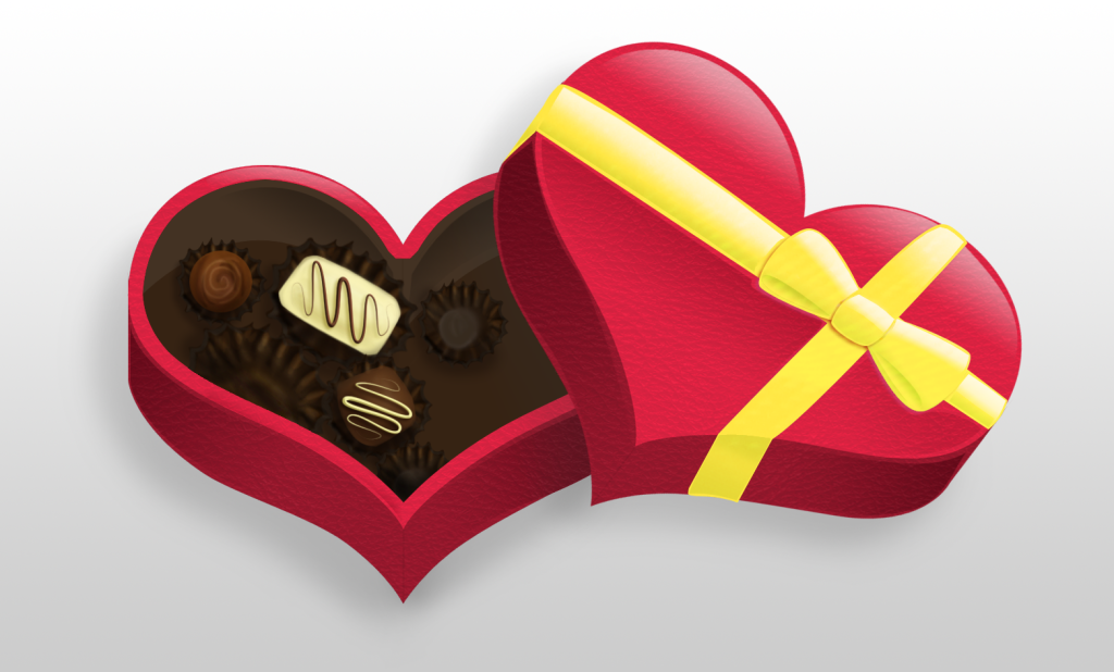
So I went with the white-to-gray gradient that Mike suggested, and I like it more than that random chunk of wood :P.
I also tried to make that chocolate piece look more vectored for a more consistent look, buuut I don't really think it's working... haha. |
|
|
|
|
Jun 30 2010, 10:01 PM
Post
#16
|
|
|
Mel Blanc was allergic to carrots. Group: Official Designer Posts: 6,371 Joined: Aug 2008 Member No: 676,291 |
Ha, nice job.
|
|
|
|
|
Jun 30 2010, 10:38 PM
Post
#17
|
|
|
Senior Member Group: Staff Alumni Posts: 4,665 Joined: Aug 2008 Member No: 676,364 |
Yeah, the gradient really helped it out. =)
|
|
|
|


|
Jul 1 2010, 09:52 PM
Post
#18
|
|
 사랑해 ~ 我愛你 ♥ Group: Design Staff Posts: 825 Joined: Jan 2007 Member No: 492,587 |
Looking good :) The bow bothers me a bit though, it seems like it's facing forward while the rest of the box cover is facing a slightly higher angle... it may be just me, though.
|
|
|
|

|
Jul 1 2010, 11:25 PM
Post
#19
|
|
|
Sniff, sniff, hooray! Group: Member Posts: 71 Joined: Mar 2006 Member No: 388,396 |
Thanks guys
 QUOTE(jiyong @ Jul 1 2010, 10:52 PM) Looking good :) The bow bothers me a bit though, it seems like it's facing forward while the rest of the box cover is facing a slightly higher angle... it may be just me, though. No, I see it too. It looks flat to me :/. Maybe if I put openings at the bottom of the bow it'll give it more dimension. |
|
|
|
|
Jul 1 2010, 11:30 PM
Post
#20
|
|
|
Mel Blanc was allergic to carrots. Group: Official Designer Posts: 6,371 Joined: Aug 2008 Member No: 676,291 |
QUOTE(Saraaaah @ Jul 2 2010, 12:25 AM) No, I see it too. It looks flat to me :/. Maybe if I put openings at the bottom of the bow it'll give it more dimension. Hrm, actually. I think I see it as well. I'm thinking that the vertical strip has the wrong angle at the bottom. It should be more to the left, in my opinion. |
|
|
|
|
Jul 2 2010, 11:11 AM
Post
#21
|
|
|
사랑해 ~ 我愛你 ♥ Group: Design Staff Posts: 825 Joined: Jan 2007 Member No: 492,587 |
QUOTE(Saraaaah @ Jul 1 2010, 09:25 PM) No, I see it too. It looks flat to me :/. Maybe if I put openings at the bottom of the bow it'll give it more dimension. Given the angle of the box, you might not want to have openings at the top anyways, just at the bottom. |
|
|
|
|
Jul 2 2010, 03:28 PM
Post
#22
|
|
|
Sniff, sniff, hooray! Group: Member Posts: 71 Joined: Mar 2006 Member No: 388,396 |
QUOTE(Mikeplyts @ Jul 2 2010, 12:30 AM) Hrm, actually. I think I see it as well. I'm thinking that the vertical strip has the wrong angle at the bottom. It should be more to the left, in my opinion. Oh yeah, I think it should be too, now that you mention it. QUOTE(jiyong @ Jul 2 2010, 12:11 PM) Given the angle of the box, you might not want to have openings at the top anyways, just at the bottom. That's true... I'll work on it. |
|
|
|
|
Jul 2 2010, 10:41 PM
Post
#23
|
|
 Senior Member Group: Staff Alumni Posts: 2,435 Joined: Feb 2007 Member No: 506,205 |
I like this. Maybe instead of trying to make the candy look more vectored you should try to give the box a more painted look. Since it's not very detailed you could probably just add some texture and mess up the blending a bit.
|
|
|
|

|
Jul 4 2010, 11:17 PM
Post
#24
|
|
|
Sniff, sniff, hooray! Group: Member Posts: 71 Joined: Mar 2006 Member No: 388,396 |
So I changed the opening of the ribbon, moved the bottom of the ribbon to the left a bit, and added a leather texture. Thanks for your advice so far, guys :)
|
|
|
|
|
Jul 5 2010, 12:51 AM
Post
#25
|
|
|
Mel Blanc was allergic to carrots. Group: Official Designer Posts: 6,371 Joined: Aug 2008 Member No: 676,291 |
Hrm, it almost looks perfect!
I think that leather texture was a pretty good idea, but I'd tone it down a bit. And I think you may have misinterpreted what I said. I meant to kind of rotate it to the left (or right, whatever. I was looking at the bottom). But yeah, lookin' good!
|
|
|
|
|
1 User(s) are reading this topic (1 Guests and 0 Anonymous Users)
0 Members: