icons, opinions please :) |
Resource Center Links
This Month's Contests | Hosts Looking for Hostees | Hostees looking for Hosts | BigBookofResources
Submission Guidelines
  |

 Sep 3 2005, 08:49 PM Sep 3 2005, 08:49 PM
Post
#1
|
|
|
Newbie  Group: Member Posts: 2 Joined: Sep 2005 Member No: 224,720 |
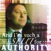
I saw my friends posting on this board and I figured I could definetly use feedback on icons I've made, constructive critisim is awesome and if you think they're terrible, I'd like to know that too. Any comments are more than welcome.
|
|
|
|


|
Sep 3 2005, 08:59 PM
Post
#2
|
|
 i lost weight with Mulder! Group: Official Designer Posts: 4,070 Joined: Jan 2005 Member No: 79,019 |
they're really nice
|
|
|
|

|
Sep 3 2005, 08:59 PM
Post
#3
|
|
 N!CK Group: Member Posts: 148 Joined: May 2005 Member No: 144,660 |
LOVE THEM ALL! nice colors and useage of fonts.. except one.. the 6th one is says "Sir somthing" i dunno whta it says, so u might wanna make it so its a little easier to read.. or maybe i'm loking at it weird. but besides that.. AWSOME!

|
|
|
|

|
Sep 3 2005, 10:18 PM
Post
#4
|
|
 I intend to live forever-so far, so good. Group: Member Posts: 2,820 Joined: Mar 2005 Member No: 115,137 |
wow those are really nice icons
|
|
|
|

|
Sep 3 2005, 10:29 PM
Post
#5
|
|
 Senior Member Group: Member Posts: 5,585 Joined: Aug 2004 Member No: 38,082 |
I love the effects on it and the colors. Looks real LJish.
|
|
|
|
|
Sep 3 2005, 10:32 PM
Post
#6
|
|
 I love you more than sex appeal. Group: Member Posts: 3,045 Joined: Oct 2004 Member No: 52,932 |
It's nice. I like the colorization on the top 2nd one from the left.
|
|
|
|
|
Sep 3 2005, 11:11 PM
Post
#7
|
|
 Sunlight--shine on me. Group: Member Posts: 433 Joined: Jun 2005 Member No: 149,201 |
oh wow! absolutely lovely icons!! My favorites are the 2nd and third for color and blend modes. Even though the third is one of my favorites I must say that it's hard to read the text at the bottom---if you take the very bottom text off but leave "Endlessly" and "Hopelessly" that'd be cool. Do you let people use your icons or do you just make them to use yourself?? Cause they are cool!
Cya round. Molz |
|
|
|
|
Sep 4 2005, 04:51 AM
Post
#8
|
|
 Senior Member Group: Member Posts: 636 Joined: Nov 2004 Member No: 59,646 |
i'd say they're really nice. ^^ good job
|
|
|
|
|
Sep 4 2005, 08:37 PM
Post
#9
|
|
|
Newbie Group: Member Posts: 2 Joined: Sep 2005 Member No: 224,720 |
QUOTE(XAfter_ShockX @ Sep 3 2005, 8:59 PM) LOVE THEM ALL! nice colors and useage of fonts.. except one.. the 6th one is says "Sir somthing" i dunno whta it says, so u might wanna make it so its a little easier to read.. or maybe i'm loking at it weird. but besides that.. AWSOME!  You are very right, The end of that icon's text is suppose to say "Didymus" but the text is difficult to read. QUOTE(EriaNight @ Sep 3 2005, 11:11 PM) Do you let people use your icons or do you just make them to use yourself?? Cause they are cool! Cya round. Molz I've never posted them anywhere before. I mainly icon for the sake of iconing. Never really know where to post things. Thank you all for comments :-D |
|
|
|
|
Sep 4 2005, 08:46 PM
Post
#10
|
|
 Senior Member Group: Member Posts: 62 Joined: Aug 2005 Member No: 209,622 |
the colors are nice good job!
|
|
|
|
|
Sep 4 2005, 11:30 PM
Post
#11
|
|
 What a hypocrite. Group: Member Posts: 2,754 Joined: Apr 2005 Member No: 128,150 |
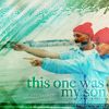
Yay, icons, now that's what we need more of in the Digital Art section.
I love the 'This one was my son' icon. It sets a melancholy mood to it, but I like it. |
|
|
|
|
Sep 5 2005, 12:17 AM
Post
#12
|
|
 Laugh til' it hurts Group: Member Posts: 107 Joined: Aug 2005 Member No: 199,709 |
I like them. The colors seem to fit perfetly with each icon. Great job!
|
|
|
|
|
Sep 5 2005, 12:23 AM
Post
#13
|
|
 ;) Group: Staff Alumni Posts: 9,573 Joined: Feb 2005 Member No: 99,124 |
Wow. I really like them. They all look very cool. Nice job!
|
|
|
|


|
Sep 5 2005, 12:44 AM
Post
#14
|
|
 GREEENROCKS Group: Member Posts: 1,393 Joined: Apr 2004 Member No: 10,624 |
they rock. i really like #1,2, 3, & 7 =)
|
|
|
|
|
1 User(s) are reading this topic (1 Guests and 0 Anonymous Users)
0 Members: