Heart |
Resource Center Links
This Month's Contests | Hosts Looking for Hostees | Hostees looking for Hosts | BigBookofResources
Submission Guidelines
  |

 May 18 2009, 08:25 AM May 18 2009, 08:25 AM
Post
#1
|
|
 Onen i-Estel Edain, ú-chebin estel anim.  Group: Official Designer Posts: 425 Joined: May 2008 Member No: 653,128 |
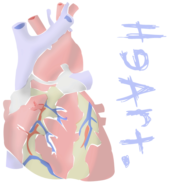
Uhmm..
So I TRIED using the pen tool in Photoshop I don't really think it worked out all that good... |
|
|
|


|
May 18 2009, 02:15 PM
Post
#2
|
|
 Senior Member Group: Administrator Posts: 8,629 Joined: Jan 2007 Member No: 498,468 |
Hmm I don't think it looks that bad, tbh. I just think it would look better if you filled in all the shapes. Meaning get rid of the white spaces around some of the shapes. But I like it. The colors are good. The font is... eh. I don't really like fonts that contain backward letters. But it's nice, really.

|
|
|
|


|
May 18 2009, 04:21 PM
Post
#3
|
|
 Senior Member Group: Staff Alumni Posts: 2,435 Joined: Feb 2007 Member No: 506,205 |
I actually kinda like the white spaces. To me it makes it more artsy and less real. The only thing that bothers me is the overlapping parts.
|
|
|
|

|
May 18 2009, 09:21 PM
Post
#4
|
|
 Senior Member Group: Member Posts: 786 Joined: Dec 2006 Member No: 488,341 |
^agree
I like it though, kind of abstract :) |
|
|
|

|
May 19 2009, 01:16 AM
Post
#5
|
|
|
Onen i-Estel Edain, ú-chebin estel anim. Group: Official Designer Posts: 425 Joined: May 2008 Member No: 653,128 |
Haha thanks for the comments
The white spaces and overlapping things came from me getting bored with it ._." I don't really have a long attention span when American Idol is on TV xDDDD |
|
|
|
| *Janette* |
May 19 2009, 02:46 AM
Post
#6
|
|
Guest |
This actually looks pretty cool imo (: I like the soft colors you chose as opposed to bright and vivid red/blue/green[?]
|
|
|
|
|
May 19 2009, 07:43 AM
Post
#7
|
|
|
Onen i-Estel Edain, ú-chebin estel anim. Group: Official Designer Posts: 425 Joined: May 2008 Member No: 653,128 |
QUOTE(Janette @ May 19 2009, 03:46 PM)  This actually looks pretty cool imo (: I like the soft colors you chose as opposed to bright and vivid red/blue/green[?] There's no green ._. It's just a muddy kind of yellow |
|
|
|
|
May 19 2009, 09:47 AM
Post
#8
|
|
 Senior Member Group: Official Designer Posts: 5,880 Joined: Nov 2007 Member No: 593,382 |
I think you should fill in the spaces. Doesn't look like it would take to long.
The shading looks great though. Also, work on the circle up top. |
|
|
|


|
May 19 2009, 03:51 PM
Post
#9
|
|
 Mel Blanc was allergic to carrots. Group: Official Designer Posts: 6,371 Joined: Aug 2008 Member No: 676,291 |
I think it looks pretty nice as well. I think you should just fix the overlapping and kind of seperated the shapes some. I also agree with Nat that I'm not a big fan of the font you used on this one. Otherwise, good job.

|
|
|
|

|
May 19 2009, 03:55 PM
Post
#10
|
|
 Tick tock, Bill Group: Administrator Posts: 8,764 Joined: Dec 2005 Member No: 333,948 |
Reminds me of something I might see on a threadless shirt. haha
Very cute. :) |
|
|
|

|
May 19 2009, 04:04 PM
Post
#11
|
|
|
Member Group: Member Posts: 22 Joined: Apr 2009 Member No: 722,748 |
It's nice. I just hate the font.
|
|
|
|
| *Janette* |
May 19 2009, 07:17 PM
Post
#12
|
|
Guest |
QUOTE(xzkdxrawrx @ May 19 2009, 05:43 AM) There's no green ._. It's just a muddy kind of yellow Oh, well that then. |
|
|
|
|
1 User(s) are reading this topic (1 Guests and 0 Anonymous Users)
0 Members: