what do u think? |
  |

 Mar 25 2004, 08:13 PM Mar 25 2004, 08:13 PM
Post
#1
|
|
|
Lord Of the Onion Rings  Group: Member Posts: 77 Joined: Jan 2004 Member No: 2,288 |
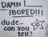
check this out... i made it a bit ago...
here |
|
|
|


| *kryogenix* |
Mar 25 2004, 08:37 PM
Post
#2
|
|
Guest |
hard to read the text
|
|
|
|
|
Mar 25 2004, 08:50 PM
Post
#3
|
|
 advanced newbie... S2 Group: Member Posts: 3,504 Joined: Jan 2004 Member No: 752 |
its nice, but hard to read text. and also, the image might be better if your face (or whoevers face) was in a different blending...
 but its overall, very very nice. i give you props for such simplicity yet creativity. but its overall, very very nice. i give you props for such simplicity yet creativity.
|
|
|
|
|
Mar 25 2004, 09:09 PM
Post
#4
|
|
|
questions make me blue. Group: Member Posts: 2,608 Joined: Feb 2004 Member No: 3,796 |
i cant read da text at all..
try to make da text bigger and maybe make da text white..?? its a test right?? so try to improve next time.. it looks like its not completed..?  i know you can do better than that.. |
|
|
|
|
Mar 25 2004, 09:31 PM
Post
#5
|
|
 durian Group: Staff Alumni Posts: 13,124 Joined: Feb 2004 Member No: 3,860 |
besides the text, it looks cool =) nice job hehees
|
|
|
|


|
Mar 25 2004, 09:37 PM
Post
#6
|
|
 BOO! Group: Member Posts: 136 Joined: Feb 2004 Member No: 4,542 |
Your face doesn't seem to go there, and as everyone says the text is a little hard to see. Overall it looks nice.
|
|
|
|
|
Mar 29 2004, 05:06 AM
Post
#7
|
|
 soyoungy Group: Member Posts: 356 Joined: Feb 2004 Member No: 4,342 |
QUOTE(kryogenix @ Mar 25 2004, 8:37 PM) hard to read the text i agree... it iz a lil hard to read.. |
|
|
|

|
Apr 1 2004, 03:00 AM
Post
#8
|
|
|
i'm susan Group: Official Member Posts: 13,875 Joined: Feb 2004 Member No: 5,029 |
QUOTE(ThePrincessofTKD @ Mar 25 2004, 9:09 PM) i cant read da text at all.. try to make da text bigger and maybe make da text white..?? its a test right?? so try to improve next time.. it looks like its not completed..? i know you can do better than that.. i truly agree^^;; hehe make some white font~!! |
|
|
|

|
Apr 3 2004, 03:42 PM
Post
#9
|
|
|
Senior Member Group: Member Posts: 47 Joined: Feb 2004 Member No: 3,975 |
I'd put the text in a light shade of grey...were you trying to make a watermark effect with the text?
|
|
|
|
|
2 User(s) are reading this topic (2 Guests and 0 Anonymous Users)
0 Members: