New Myspace Layout - Loudsur13 V8.0 |
Resource Center Links
This Month's Contests | Hosts Looking for Hostees | Hostees looking for Hosts | BigBookofResources
Submission Guidelines
  |

 Oct 12 2009, 03:42 PM Oct 12 2009, 03:42 PM
Post
#1
|
|
 Nothing But The DOG In Me.  Group: Member Posts: 189 Joined: Mar 2005 Member No: 117,860 |
Just Recently Published It, Its All Flash & PHP, Every Graphic Done In Photoshop & Swift 3D.
Check It Out & Tell Me What You Think. Loudsur13 v8.0 |
|
|
|


|
Oct 12 2009, 08:33 PM
Post
#2
|
|
 사랑해 ~ 我愛你 ♥ Group: Design Staff Posts: 825 Joined: Jan 2007 Member No: 492,587 |
Navigation is off. Also, leaves + stripes + pawprints + floral elements + bricks + graffiti-type font... Clashes a little. I like the video idea. Edit: nvm about the navigation, it fixed itself after I refreshed a few times. But it's still a different colour than the rest of the bar, on my screen. |
|
|
|


|
Oct 12 2009, 08:56 PM
Post
#3
|
|
 kthxbai Group: Official Designer Posts: 2,832 Joined: Feb 2008 Member No: 621,203 |
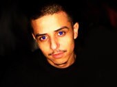
QUOTE(elletricity @ Oct 12 2009, 08:33 PM)  Thank you for the screenshot. I was just about to say "It looks just like the default." I hate this new feature Myspace added. geyyyy. The dude's eye looks weird. Why is it so blue? The image below the dude has beautiful greens and that yellowy color of the bricks. Why did you choose black and white as your color scheme? I'm not sure how cool it is to have illegal drugs all over your layout. How do the paw prints tie in? Can't really read the text. "LoudSuri3"? "He you nint a do6 you nint shit"? |
|
|
|

|
Oct 12 2009, 09:36 PM
Post
#4
|
|
 Sex, Blood, & RocknRoll Group: People Staff Posts: 5,305 Joined: Nov 2007 Member No: 596,480 |
The thing that looks off to me the most are the weed plants next to the bags, they just stick out a lot. Also, the dog prints are a little eh.
I like how everything loads. Looks good to me. |
|
|
|

|
Oct 12 2009, 10:21 PM
Post
#5
|
|
|
Nothing But The DOG In Me. Group: Member Posts: 189 Joined: Mar 2005 Member No: 117,860 |
QUOTE(elletricity @ Oct 12 2009, 06:33 PM) Navigation is off. Also, leaves + stripes + pawprints + floral elements + bricks + graffiti-type font... Clashes a little. I like the video idea. Edit: nvm about the navigation, it fixed itself after I refreshed a few times. But it's still a different colour than the rest of the bar, on my screen. must be the browser, i made it compatible with IE & FF, havent tested on others QUOTE(emberfly @ Oct 12 2009, 06:56 PM) Thank you for the screenshot. I was just about to say "It looks just like the default." I hate this new feature Myspace added. geyyyy. • The dude's eye looks weird. Why is it so blue? • The image below the dude has beautiful greens and that yellowy color of the bricks. Why did you choose black and white as your color scheme? • I'm not sure how cool it is to have illegal drugs all over your layout. • How do the paw prints tie in? • Can't really read the text. "LoudSuri3"? "He you nint a do6 you nint shit"? It says Loudsur13, like my URL & name and under that it says "If You Aint A D.O.G You Aint Shit, i gus the fonts a bit hard to read BTW theres more than that 1 page, just hover over the text on the bottom that says "Bitches Whatever, Dogz Forever", and it rollovers into the menu
Reason for edit: Please edit your posts instead of triple posting. - Gabrielle (Elletricity)
|
|
|
|
|
Oct 12 2009, 10:59 PM
Post
#6
|
|
 AIDS at RAVES. Group: Official Designer Posts: 2,386 Joined: Dec 2007 Member No: 598,878 |
is this just a regular profile or an artist profile? I couldnt (and didnt) want to read anything because of the undesirable font, I thought it was a myspace profile advocating pot or something. The focus on pot overwhelms the entire profile, just put couple marijuana leaves here and there but not everywhere :]
|
|
|
|


|
Oct 13 2009, 04:15 PM
Post
#7
|
|
 Senior Member Group: Administrator Posts: 8,629 Joined: Jan 2007 Member No: 498,468 |
I like the flash. Looks really cool but...
QUOTE(elletricity @ Oct 12 2009, 06:33 PM) Also, leaves + stripes + pawprints + floral elements + bricks + graffiti-type font... Clashes a little. Other than that, I'd make the font in your bio bigger because I had to squint my eyes to read it. Came out nice. 
|
|
|
|

|
Oct 13 2009, 04:39 PM
Post
#8
|
|
|
kthxbai Group: Official Designer Posts: 2,832 Joined: Feb 2008 Member No: 621,203 |
QUOTE(synatribe @ Oct 12 2009, 10:59 PM) I thought it was a myspace profile advocating pot or something. The focus on pot overwhelms the entire profile, just put couple marijuana leaves here and there but not everywhere :] Or none at all works, too! 
|
|
|
|
|
Oct 13 2009, 04:48 PM
Post
#9
|
|
 /人◕‿‿◕人\ Group: Official Member Posts: 8,283 Joined: Dec 2007 Member No: 602,927 |
You're Only Supposed To Capitalize The First Word In Every Sentence.
Anyway, the layout itself is well made. Animations are nice and fluid, everything loads quickly, nothing seems out of place as a result of poor coding. Your entire layout focuses more on pot than on anything else. I'm not against smoking weed or anything, but I don't think you should plaster it all over the place because it makes you look edgy and cool or whatever. Pawprints have nothing to do with pot, stripes, floral patterns, or graffiti text, but I understand what your idea in putting it there was. I think it was a bad idea. |
|
|
|

|
Oct 13 2009, 04:50 PM
Post
#10
|
|
|
kthxbai Group: Official Designer Posts: 2,832 Joined: Feb 2008 Member No: 621,203 |
I still don't understand his eye.
|
|
|
|
|
Oct 20 2009, 04:41 PM
Post
#11
|
|
|
Nothing But The DOG In Me. Group: Member Posts: 189 Joined: Mar 2005 Member No: 117,860 |
QUOTE(emberfly @ Oct 13 2009, 02:50 PM) I still don't understand his eye. well its like that because I'm gonna make it change colors in flash, more noticeable when its a brighter color |
|
|
|
|
Oct 20 2009, 05:04 PM
Post
#12
|
|
 Mel Blanc was allergic to carrots. Group: Official Designer Posts: 6,371 Joined: Aug 2008 Member No: 676,291 |
QUOTE(Buttsex @ Oct 13 2009, 05:48 PM) You're Only Supposed To Capitalize The First Word In Every Sentence, Unless There's A Language, Title, Or Name In The Sentence. |
|
|
|

|
Oct 23 2009, 04:50 AM
Post
#13
|
|
 Onen i-Estel Edain, ú-chebin estel anim. Group: Official Designer Posts: 425 Joined: May 2008 Member No: 653,128 |
The edges are a little choppy and it's really... square like at the bottom. Change the fonts - they're really hard to read and if no one can read them there's no point to the text being there.
|
|
|
|

|
1 User(s) are reading this topic (1 Guests and 0 Anonymous Users)
0 Members: