Rough Draft Layout, For my website |
Resource Center Links
This Month's Contests | Hosts Looking for Hostees | Hostees looking for Hosts | BigBookofResources
Submission Guidelines
  |

 Sep 27 2009, 12:29 PM Sep 27 2009, 12:29 PM
Post
#1
|
|
 Member  Group: Member Posts: 13 Joined: Sep 2009 Member No: 747,069 |
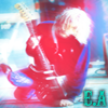
UPDATE 2: Alright - I fixed the lens-flare and completely got rid of the footer and I think those are the last changes im making for tonight, im pretty exhausted from my weekend and the flu doesnt help much

Reason for edit: Please use [thumb] tags instead of [img] tags when posting large images. - Mike
|
|
|
|


|
Sep 27 2009, 06:41 PM
Post
#2
|
|
 i like boobies, yes I do. I like boobies - how 'bout you? Group: Member Posts: 620 Joined: Jun 2008 Member No: 662,457 |
First off, don't use the same pictures twice. Secondly, there's no theme, so it just looks like you picked random photos and smashed them on there.
Third, though most people don't do this (which is, imo, stupid), you should use a proper, designed footer. |
|
|
|


|
Sep 27 2009, 07:41 PM
Post
#3
|
|
|
Member Group: Member Posts: 13 Joined: Sep 2009 Member No: 747,069 |
Alright, thanks. Im gonna start all over. I agree, it needs a theme. This is just something I came up with at around 4 AM on a Friday night.
|
|
|
|
|
Sep 27 2009, 10:34 PM
Post
#4
|
|
 Senior Member Group: Administrator Posts: 8,629 Joined: Jan 2007 Member No: 498,468 |
For your first version, I totally agree with HeartOfPandora. Plus the coloring made a lot of the images darker. And they were low in image quality. As for your second version, you should take off the white orb in-between "electric additions" because it's distracting. Also the footer is too much. I mean you have a bunch of lines going on in the header, so adding even more lines to the bottom isn't a good idea. And I dk, I feel like you should use a better and more exciting font for your navigation.
|
|
|
|

|
Sep 27 2009, 10:41 PM
Post
#5
|
|
 kthxbai Group: Official Designer Posts: 2,832 Joined: Feb 2008 Member No: 621,203 |
QUOTE(electricaddiction @ Sep 27 2009, 12:29 PM)  The picture I used had a lot of noise on it and it wasnt really good in quality. Not trying to sound harsh, but if you already knew the image was unusable, why did you use it? |
|
|
|


|
Sep 27 2009, 10:43 PM
Post
#6
|
|
 Sex, Blood, & RocknRoll Group: People Staff Posts: 5,305 Joined: Nov 2007 Member No: 596,480 |
Header looks fine, imo. I pretty much second everything that Nat (manny the dino) said.
|
|
|
|

|
Sep 27 2009, 10:53 PM
Post
#7
|
|
|
Member Group: Member Posts: 13 Joined: Sep 2009 Member No: 747,069 |
QUOTE(emberfly @ Sep 27 2009, 10:41 PM) Not trying to sound harsh, but if you already knew the image was unusable, why did you use it? It wasn't "unusable", I mean, its fixable, its just frustrating me. And its alright, its not harsh. QUOTE As for your second version, you should take off the white orb in-between "electric additions" because it's distracting. Also the footer is too much. I mean you have a bunch of lines going on in the header, so adding even more lines to the bottom isn't a good idea. And I dk, I feel like you should use a better and more exciting font for your navigation. Yeah, I was thinking the same about the lens-flare but I wasnt sure. And everything else is quite true. Thankssss |
|
|
|
|
Sep 28 2009, 03:43 PM
Post
#8
|
|
 사랑해 ~ 我愛你 ♥ Group: Design Staff Posts: 825 Joined: Jan 2007 Member No: 492,587 |
^ Was about to point that out, lol. "ADICTION" should be "ADDICTION".
I'm not loving your font choice. I'd stick to one of those fonts for both the nav and header, or use a simpler font for the nav. That being said, neither of the fonts match very well with your image. I love the colours in your header but nothing seems to... well, match. The fonts don't match, and the stark black w/white gradient and the bright pinks and neons don't match. |
|
|
|

|
Sep 28 2009, 04:12 PM
Post
#9
|
|
|
kthxbai Group: Official Designer Posts: 2,832 Joined: Feb 2008 Member No: 621,203 |
QUOTE(A1Bassline @ Sep 28 2009, 03:34 PM) (mispelled by the way) Misspelled* |
|
|
|
|
Oct 10 2009, 02:07 PM
Post
#10
|
|
|
Senior Member Group: Member Posts: 51 Joined: May 2009 Member No: 726,982 |
thats cool (:
|
|
|
|
|
Oct 14 2009, 12:41 PM
Post
#11
|
|
 Funride.org Group: Member Posts: 326 Joined: Jul 2007 Member No: 542,299 |
It really has no theme too it. And the navigation placement is lousy, not to be rude.
I would suggest that you move the text altogether. And the content area is (a bit) boring. The layout just doesn't flow in general, imo. |
|
|
|

|
Oct 14 2009, 07:46 PM
Post
#12
|
|
|
Newbie Group: Member Posts: 3 Joined: Oct 2009 Member No: 749,159 |
Why not take the navigation from top right and place underneath the header. Also the name of the layout, Electric addiction should be placed top left with perhaps a white color instead of black? .. also the footer idea sounds great, that would if pictures dont work for your visitors they can always click on the text links in the footer. Finally that border underneath and above the header should be changed IMO. Perhaps make it a clean white line instead of that grey gradient.
make sure u update us once u will out the content area :) good luck |
|
|
|
|
1 User(s) are reading this topic (1 Guests and 0 Anonymous Users)
0 Members: