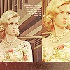
first attempt at blend |
Resource Center Links
This Month's Contests | Hosts Looking for Hostees | Hostees looking for Hosts | BigBookofResources
Submission Guidelines
  |
 Aug 30 2009, 04:24 PM Aug 30 2009, 04:24 PM
Post
#1
|
|
 Kiddie Crack. :)     Group: Member Posts: 150 Joined: Dec 2007 Member No: 597,025 |
any critique? first try at a blend. not all that happy w/ it and im already tired of it but.. any input on how to make it better/whats nice/what's not would be much appreciated. thankss:D<3 |
|
|
|
 Aug 30 2009, 04:27 PM Aug 30 2009, 04:27 PM
Post
#2
|
|
 사랑해 ~ 我愛你 ♥      Group: Design Staff Posts: 825 Joined: Jan 2007 Member No: 492,587 |
I love those brushes you used, and the colours, but it would be nice not to have the patterns over her face. Use a soft brush eraser or something over her face on that layer.
|
|
|
|
 Aug 30 2009, 04:40 PM Aug 30 2009, 04:40 PM
Post
#3
|
|
 Kiddie Crack. :)     Group: Member Posts: 150 Joined: Dec 2007 Member No: 597,025 |
alright *done*
thanks. btw, the space on the right is there bc i mightt make this into a layout. |
|
|
|
 Aug 30 2009, 04:47 PM Aug 30 2009, 04:47 PM
Post
#4
|
|
 사랑해 ~ 我愛你 ♥      Group: Design Staff Posts: 825 Joined: Jan 2007 Member No: 492,587 |
If you want more people to critique you, you should post an updated version of the blend
|
|
|
|
 Aug 30 2009, 05:39 PM Aug 30 2009, 05:39 PM
Post
#5
|
|
 Kiddie Crack. :)     Group: Member Posts: 150 Joined: Dec 2007 Member No: 597,025 |
|
|
|
|
 Aug 30 2009, 05:40 PM Aug 30 2009, 05:40 PM
Post
#6
|
|
 사랑해 ~ 我愛你 ♥      Group: Design Staff Posts: 825 Joined: Jan 2007 Member No: 492,587 |
She means to shift the images to the right, the top images. Oh and now you have some other textures on her face. Just stay away from textures on faces in general.
|
|
|
|
 Aug 30 2009, 05:46 PM Aug 30 2009, 05:46 PM
Post
#7
|
|
 사랑해 ~ 我愛你 ♥      Group: Design Staff Posts: 825 Joined: Jan 2007 Member No: 492,587 |
Lol, maybe it's just me then. Any textures at all on faces distract, imo. It does look better :D
|
|
|
|
 Aug 30 2009, 05:51 PM Aug 30 2009, 05:51 PM
Post
#8
|
|
 Senior Member        Group: Administrator Posts: 8,629 Joined: Jan 2007 Member No: 498,468 |
I think your edit looks better but it still kind of bugs me that you have a white paisley brush on her neck in the second image at the top. But it's pretty!
|
|
|
|
 Aug 30 2009, 06:09 PM Aug 30 2009, 06:09 PM
Post
#9
|
|
 Kiddie Crack. :)     Group: Member Posts: 150 Joined: Dec 2007 Member No: 597,025 |
better? thing is; i feel like if i move the image on the left too close, its like, hiding behind the other picture's hair, and i'd have to move everything closer together, but i think it looks better like..more spaced out that like that? idk.. is there anything else that i need to change? :) i toned down the brush a bit, too. |
|
|
|
 Aug 30 2009, 06:42 PM Aug 30 2009, 06:42 PM
Post
#10
|
|
 Senior Member       Group: Staff Alumni Posts: 2,435 Joined: Feb 2007 Member No: 506,205 |
That's really pretty for a first blend. It is a bit awkward in spots (the bottom two pictures, specifically). I don't like when body parts get cut off in a weird way. Also, the pinwheel/spiral/flower/whatever brush on the left side really throws it all off for me. Everything else is elegant-ish and it doesn't really fit.
|
|
|
|
 Aug 30 2009, 11:28 PM Aug 30 2009, 11:28 PM
Post
#11
|
|
 Senior Member        Group: Administrator Posts: 8,629 Joined: Jan 2007 Member No: 498,468 |
Your edit looks better.
|
|
|
|
 Aug 30 2009, 11:46 PM Aug 30 2009, 11:46 PM
Post
#12
|
|
 Senior Member       Group: Staff Alumni Posts: 1,815 Joined: Jun 2006 Member No: 423,396 |
def not bad at all for a first blend. i do like the colors and brushes you used.
|
|
|
|
 Sep 4 2009, 09:37 AM Sep 4 2009, 09:37 AM
Post
#13
|
|
 Newbie  Group: Member Posts: 7 Joined: Aug 2009 Member No: 742,402 |
Why pictures are not displayed?
|
|
|
|
 Sep 5 2009, 07:12 AM Sep 5 2009, 07:12 AM
Post
#14
|
|
 Mel Blanc was allergic to carrots.        Group: Official Designer Posts: 6,371 Joined: Aug 2008 Member No: 676,291 |
Looks nice for a first blend, I like it. The colors and brushes are pretty good. Your edits are also a lot better, but I agree with Christy, move the top left one just a wee bit more to the right.
|
|
|
|
  |
1 User(s) are reading this topic (1 Guests and 0 Anonymous Users)
0 Members:


