markster doesn't blend |
Resource Center Links
This Month's Contests | Hosts Looking for Hostees | Hostees looking for Hosts | BigBookofResources
Submission Guidelines
  |
 Aug 7 2009, 10:19 PM Aug 7 2009, 10:19 PM
Post
#1
|
|
 Senior Member       Group: Staff Alumni Posts: 1,815 Joined: Jun 2006 Member No: 423,396 |
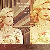
for some reason, i decided to try to make a blend today, which is something i never never never do. and yeahhh, this is what came out, after cutting up and mashing in some photos of hyori lee.
okay i initially decided to make a clean simple border around the whole image, like dis: but when i enlarged the canvas, i noticed scraps lying around it, like this: .. and decided it looked kinda creative like that. but idk, tell me what you guys think. or does the blend altogether just suck so much that the border doesn't matter? :[ c&c appreesh. edit: added text to it. ;P so i guess this is the final draft: 
|
|
|
|
 Aug 7 2009, 10:21 PM Aug 7 2009, 10:21 PM
Post
#2
|
|
 Nick    Group: Member Posts: 78 Joined: Aug 2009 Member No: 740,993 |
the second with the larger canvas, looks better. the only thing i don't like is the purple image with the dotted stroke.
|
|
|
|
 Aug 7 2009, 10:21 PM Aug 7 2009, 10:21 PM
Post
#3
|
|
 Sex, Blood, & RocknRoll        Group: People Staff Posts: 5,305 Joined: Nov 2007 Member No: 596,480 |
I prefer the first one. I think it looks great but there's something off about the image in the middle. I think it's the coloring of it.
|
|
|
|
 Aug 7 2009, 10:37 PM Aug 7 2009, 10:37 PM
Post
#4
|
|
|
show me a garden thats bursting to life         Group: Staff Alumni Posts: 12,303 Joined: Mar 2005 Member No: 115,987 |
The coloring is a wee bit off on some parts but I like it! Looks like a fashion ad or something.
|
|
|
|
 Aug 7 2009, 10:58 PM Aug 7 2009, 10:58 PM
Post
#5
|
|
 Senior Member       Group: Staff Alumni Posts: 2,435 Joined: Feb 2007 Member No: 506,205 |
I like the second one with all the little scraps. If you didn't say that was unintentional, I would have thought you did it purposely.
|
|
|
|
 Aug 8 2009, 01:37 AM Aug 8 2009, 01:37 AM
Post
#6
|
|
 AIDS at RAVES.       Group: Official Designer Posts: 2,386 Joined: Dec 2007 Member No: 598,878 |
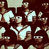
the picture where she is standing by the bricks and the sunglass picture are throwing me off because ones in black and white and another is colored.
|
|
|
|
 Aug 8 2009, 01:39 AM Aug 8 2009, 01:39 AM
Post
#7
|
|
 Mel Blanc was allergic to carrots.        Group: Official Designer Posts: 6,371 Joined: Aug 2008 Member No: 676,291 |
I like the first one, the second one is kinda messy sorta. Yeah, the middle picture bothers me a little too. :/
|
|
|
|
 Aug 9 2009, 06:38 PM Aug 9 2009, 06:38 PM
Post
#8
|
|
|
Senior Member    Group: Member Posts: 37 Joined: Aug 2009 Member No: 740,982 |
The one with the "scraps" looks really nice. It does look creative!
QUOTE the picture where she is standing by the bricks and the sunglass picture are throwing me off because ones in black and white and another is colored. Yeah I agree to that. |
|
|
|
 Aug 9 2009, 08:09 PM Aug 9 2009, 08:09 PM
Post
#9
|
|
 Death is a promise given to us at birth        Group: Official Designer Posts: 4,757 Joined: Mar 2004 Member No: 7,459 |
the border is nice.
You used to blend. |
|
|
|
 Aug 10 2009, 01:35 PM Aug 10 2009, 01:35 PM
Post
#10
|
|
 Senior Member        Group: Administrator Posts: 8,629 Joined: Jan 2007 Member No: 498,468 |
I agree with Kevin on the images you used for the left side of your canvas. Tbh, I like the second version better. It adds something extra to it. But I like the whole effect. It came out very nice.
|
|
|
|
  |
1 User(s) are reading this topic (1 Guests and 0 Anonymous Users)
0 Members:


