
First infographic |
Resource Center Links
This Month's Contests | Hosts Looking for Hostees | Hostees looking for Hosts | BigBookofResources
Submission Guidelines
  |
 May 28 2009, 11:42 PM May 28 2009, 11:42 PM
Post
#26
|
|
 Senior Member  Group: Official Designer Posts: 339 Joined: Mar 2009 Member No: 721,527 |
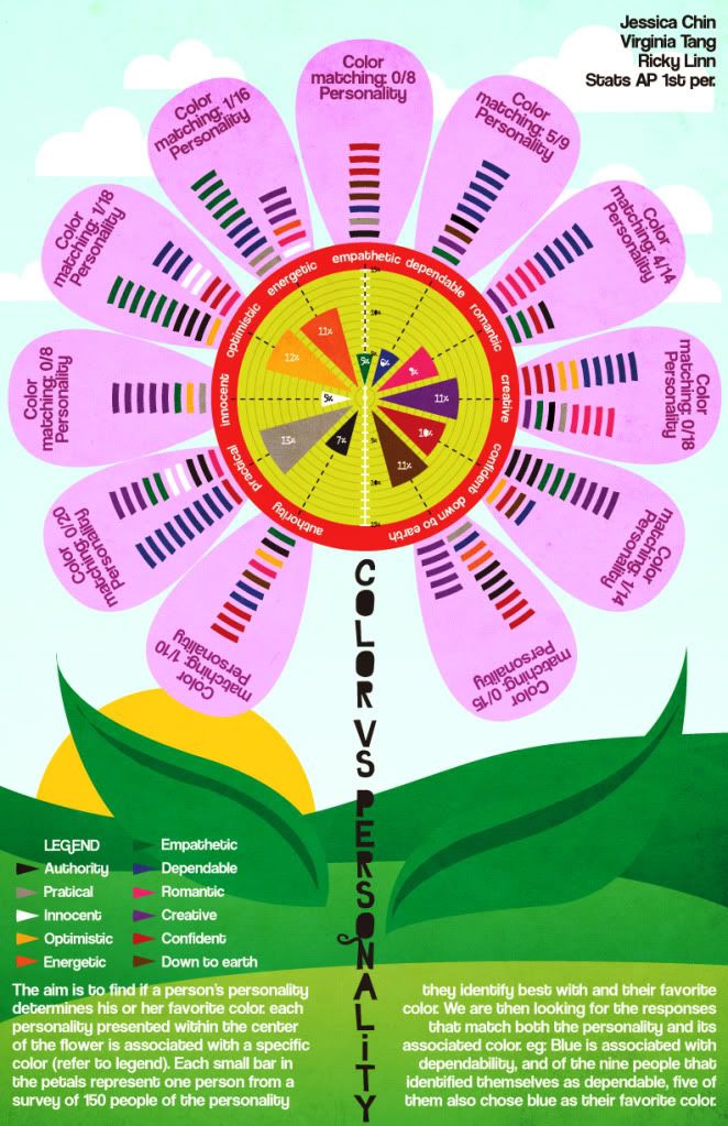
Thanks uhm Abbey right? and schizo... I haven't learned your name yet, sorry.
A lot of the critiques were centered around the legibility of the visual. Most of them didn't think it was easy to read or easy to follow. They didn't understand how to read the visual, but when they turned to the paragraph for an explanation, apparently that was too drawn out and boring, and the font choice didn't help the ease of its legibility. Yup. |
|
|
|


|
May 29 2009, 01:13 AM
Post
#27
|
|
 kthxbai Group: Official Designer Posts: 2,832 Joined: Feb 2008 Member No: 621,203 |
QUOTE(Tomates @ May 25 2009, 07:11 PM)  i like it a lot. My one thing is that its kinda hard to read the font thats on the leafs and around the pedals. Yeah. I definitely wouldn't understand it only because I couldn't read it. QUOTE(rickysaurus @ May 28 2009, 11:42 PM) and the font choice didn't help the ease of its legibility. Yup. Yup. |
|
|
|

|
May 29 2009, 03:01 AM
Post
#28
|
|
|
Senior Member Group: Official Designer Posts: 339 Joined: Mar 2009 Member No: 721,527 |
With more legibility:
|
|
|
|
|
May 29 2009, 03:27 AM
Post
#29
|
|
|
kthxbai Group: Official Designer Posts: 2,832 Joined: Feb 2008 Member No: 621,203 |
1. You spelled PRACTICAL incorrectly in the Legend.
2. It should be "Each small bar in the petals represents" 3. Also, the sentence makes no sense to me. "Each small bar in the petals represents one person from a survey of 150 people of the personality they identify best with and their favorite color." It's worded very awkwardly. 4. eg: should be e.g.: That's all I found for now. I'll look over it again to see if I missed anything. |
|
|
|
|
May 29 2009, 08:26 AM
Post
#30
|
|
|
define our lives for us. Group: Staff Alumni Posts: 11,656 Joined: Aug 2004 Member No: 43,293 |
I think the design of it is extremely creative and cute but what I had to say has already been said and plus I see you have like three new revised ones lol.
Yeah, the design of it is just.. so creative lmao. I really love it, overall hahaha~ besides the fonts and stuff but the most recent one seems pretty nice too. I prefer the old font but it is a little hard to read unless you try really hard, so yeah. ooooo, outta curiousity, what font did you use for the first one? me likey me likeyyyyy |
|
|
|


|
May 29 2009, 01:57 PM
Post
#31
|
|
 Senior Member Group: Staff Alumni Posts: 2,435 Joined: Feb 2007 Member No: 506,205 |
QUOTE(rickysaurus @ May 28 2009, 11:42 PM) Thanks uhm Abbey right? and schizo... I haven't learned your name yet, sorry. A lot of the critiques were centered around the legibility of the visual. Most of them didn't think it was easy to read or easy to follow. They didn't understand how to read the visual, but when they turned to the paragraph for an explanation, apparently that was too drawn out and boring, and the font choice didn't help the ease of its legibility. Yup. Ohh, I see. And it's Gabi.  |
|
|
|


|
May 29 2009, 02:05 PM
Post
#32
|
|
 Ley <3 Group: Member Posts: 579 Joined: Jul 2008 Member No: 664,894 |
Wow! Talk about creative
I liked it better when your groups names were on the leaves. Other than that i really like it.
|
|
|
|

|
May 31 2009, 01:24 AM
Post
#33
|
|
|
Senior Member Group: Official Designer Posts: 339 Joined: Mar 2009 Member No: 721,527 |
Alright I corrected the type errors that emberfly pointed out. Thanks.
The font used is called ghosttown. You can find it on dafont.com Hi Gabi! Last one for the project.  |
|
|
|
|
May 31 2009, 01:30 AM
Post
#34
|
|
|
kthxbai Group: Official Designer Posts: 2,832 Joined: Feb 2008 Member No: 621,203 |
the "8" over the innocent girl's head looked like a bird to me at first.. because of the orange t-shirt behind it.
not a problem.. just sayin' :o |
|
|
|
|
May 31 2009, 01:32 AM
Post
#35
|
|
 Sex, Blood, & RocknRoll Group: People Staff Posts: 5,305 Joined: Nov 2007 Member No: 596,480 |
Oh my gosh I love it!
|
|
|
|

|
May 31 2009, 01:59 AM
Post
#36
|
|
 Senior Member Group: Administrator Posts: 8,629 Joined: Jan 2007 Member No: 498,468 |
Woah this is so cool. I love it!
|
|
|
|

|
May 31 2009, 02:13 AM
Post
#37
|
|
|
Senior Member Group: Official Designer Posts: 339 Joined: Mar 2009 Member No: 721,527 |
Thanks guys :]
|
|
|
|
|
May 31 2009, 08:49 AM
Post
#38
|
|
 Mel Blanc was allergic to carrots. Group: Official Designer Posts: 6,371 Joined: Aug 2008 Member No: 676,291 |
Oooo, niicce!! It looks awesome! :DD
|
|
|
|

|
1 User(s) are reading this topic (1 Guests and 0 Anonymous Users)
0 Members: