I'm stuck |
Resource Center Links
This Month's Contests | Hosts Looking for Hostees | Hostees looking for Hosts | BigBookofResources
Submission Guidelines
  |

 May 2 2009, 10:03 PM May 2 2009, 10:03 PM
Post
#1
|
|
|
Member  Group: Member Posts: 11 Joined: Feb 2009 Member No: 712,860 |
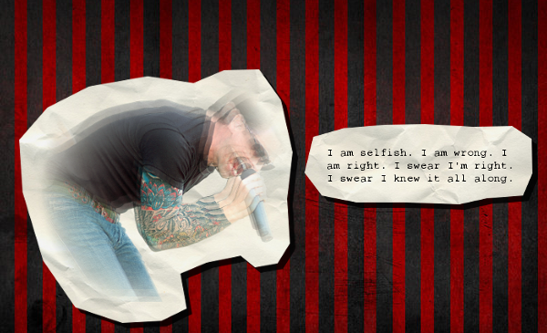 so I'd like some help. I was thinking about adding some brushes or something, but I have no idea what kind or if I should do something else. what would you do? |
|
|
|


|
May 2 2009, 10:18 PM
Post
#2
|
|
 DDR \\ I'm Dee :) Group: Mentor Posts: 8,662 Joined: Mar 2006 Member No: 384,020 |
I'm going to move this to the Showcase Booth because you'll probably get more replies there (even though this work isn't completed.)
I think the blur is a little too much blur, though. |
|
|
|

|
May 2 2009, 10:32 PM
Post
#3
|
|
|
I'm Luke Group: Member Posts: 96 Joined: Mar 2009 Member No: 718,950 |
Your blur is a little too choppy, and it would be nice to have just a little motion blur, also, I'd look at maybe some splatter brushes
|
|
|
|


|
May 3 2009, 02:30 AM
Post
#4
|
|
 Senior Member Group: Administrator Posts: 8,629 Joined: Jan 2007 Member No: 498,468 |
I like the concept but like Dee said, the blur is too much. Also it looks weird since he's just floating there. I suggest you move him down so his knees touch the bottom of the canvas.
|
|
|
|

|
May 3 2009, 08:09 AM
Post
#5
|
|
 Mel Blanc was allergic to carrots. Group: Official Designer Posts: 6,371 Joined: Aug 2008 Member No: 676,291 |
Yeah, you should reduce the blur and move him down some. Maybe you could try like some..."retro" brushes? You know, like curvy brushes and such. I like the concept though. Also, I think you should give him more of a "papery" effect since that looks what you're going for. Idk, that's just me. Good job otherwise.

|
|
|
|

|
May 3 2009, 11:01 AM
Post
#6
|
|
|
Member Group: Member Posts: 11 Joined: Feb 2009 Member No: 712,860 |
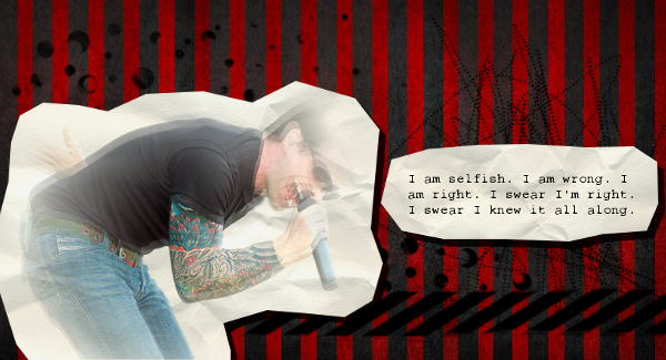 so this is what I have so far. what do you think? |
|
|
|
|
May 3 2009, 11:08 AM
Post
#7
|
|
 kthxbai Group: Official Designer Posts: 2,832 Joined: Feb 2008 Member No: 621,203 |
that looks way better.
that tattoo is so awesome :D |
|
|
|

|
May 3 2009, 11:16 AM
Post
#8
|
|
 Senior Member Group: Official Designer Posts: 5,880 Joined: Nov 2007 Member No: 593,382 |
Looks cool. I think right now it's a little to organized. I would suggest taking that box and the quote to the right of him and move it so it's like over the guy. Just the edges.
|
|
|
|

|
May 3 2009, 11:40 AM
Post
#9
|
|
|
Mel Blanc was allergic to carrots. Group: Official Designer Posts: 6,371 Joined: Aug 2008 Member No: 676,291 |
It looks better than the previous one, I'll give you that and yeah, I agree that you should kind of move the quote part near the top right hand corner.
|
|
|
|
|
May 3 2009, 11:49 AM
Post
#10
|
|
|
Member Group: Member Posts: 11 Joined: Feb 2009 Member No: 712,860 |
okay, so I did that.
I won't post it because I'm lazy and I'm sure you can imagine it. do you think it's done now? |
|
|
|
|
May 3 2009, 01:13 PM
Post
#11
|
|
 Senior Member Group: Staff Alumni Posts: 2,435 Joined: Feb 2007 Member No: 506,205 |
I LOVE the background and the quote. I'm not too sure about the photo, but to be honest I don't have any ideas on what would look better. I really like it, though.
|
|
|
|

|
May 3 2009, 01:54 PM
Post
#12
|
|
 Senior Member Group: Official Designer Posts: 339 Joined: Mar 2009 Member No: 721,527 |
I think you need to break the lyrics out of the boundaries. Why contain them when the rest of your image suggests a lot of mess and emotion?
|
|
|
|

|
May 3 2009, 04:15 PM
Post
#13
|
|
|
DDR \\ I'm Dee :) Group: Mentor Posts: 8,662 Joined: Mar 2006 Member No: 384,020 |
^ That's deep.
I like the image now, it looks much more complete. |
|
|
|
|
May 3 2009, 04:26 PM
Post
#14
|
|
 Senior Member Group: Official Member Posts: 1,801 Joined: Aug 2007 Member No: 568,102 |
QUOTE(karmakiller @ May 3 2009, 04:15 PM)  ^ That's deep. I like the image now, it looks much more complete. I agree. Much more put together, though I'd like to see the image with a bit more depth. It looks flat. |
|
|
|

|
May 3 2009, 06:33 PM
Post
#15
|
|
|
Senior Member Group: Administrator Posts: 8,629 Joined: Jan 2007 Member No: 498,468 |
I think it looks A LOT better now. I like the brushes you used.
|
|
|
|
|
May 3 2009, 07:26 PM
Post
#16
|
|
|
Member Group: Member Posts: 11 Joined: Feb 2009 Member No: 712,860 |
thanks so much for all your help guys!
I really appreciate it! |
|
|
|
|
May 4 2009, 11:56 PM
Post
#17
|
|
 Onen i-Estel Edain, ú-chebin estel anim. Group: Official Designer Posts: 425 Joined: May 2008 Member No: 653,128 |
AHHHH
I love that song Just... I forgot what it's called D: What's it called again? ._." /fail |
|
|
|


|
May 5 2009, 01:46 AM
Post
#18
|
|
 Senior Member Group: Staff Alumni Posts: 1,815 Joined: Jun 2006 Member No: 423,396 |
It might look cool with a couple white splatter brushes behind the papers, although splatters are way too overused now. It may also look like cum.
|
|
|
|

|
May 5 2009, 03:59 PM
Post
#19
|
|
|
Mel Blanc was allergic to carrots. Group: Official Designer Posts: 6,371 Joined: Aug 2008 Member No: 676,291 |
QUOTE(Markster @ May 5 2009, 02:46 AM) It might look cool with a couple white splatter brushes behind the papers, although splatters are way too overused now. It may also look like cum.  I think instead of white splatter brushes, maybe some kind of faint, feathery brushes or something. 
|
|
|
|
|
2 User(s) are reading this topic (2 Guests and 0 Anonymous Users)
0 Members: