Logo Designs |
Resource Center Links
This Month's Contests | Hosts Looking for Hostees | Hostees looking for Hosts | BigBookofResources
Submission Guidelines
  |

 Apr 26 2009, 10:05 PM Apr 26 2009, 10:05 PM
Post
#1
|
|
 Melieized  Group: Official Designer Posts: 1,372 Joined: Nov 2006 Member No: 478,715 |
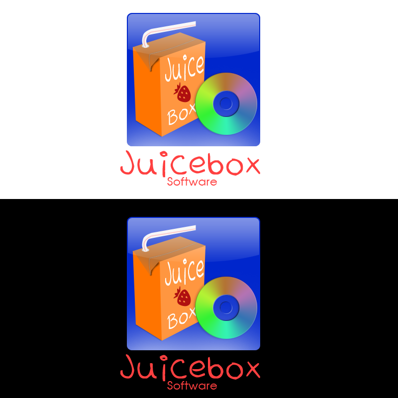
Here are some logos that i have been designing for the past couple of days. C&C please!!
1. 2. 3. 4. |
|
|
|


|
Apr 26 2009, 10:11 PM
Post
#2
|
|
 Senior Member Group: Administrator Posts: 8,629 Joined: Jan 2007 Member No: 498,468 |
Are they for that one site? I can't remember the name of it, atm.
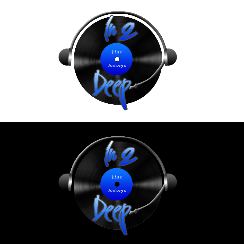
I think I like number two the best. Four looks good but you should add something to it so the disk doesn't blend with the background so much. One and three look a bit plain to me. But they're all nice. :) |
|
|
|


|
Apr 26 2009, 10:35 PM
Post
#3
|
|
 Mel Blanc was allergic to carrots. Group: Official Designer Posts: 6,371 Joined: Aug 2008 Member No: 676,291 |
^I think it's called crowdSPRING?
Anyways, yeah, I like #2 the best. The text is a little hard to read in the fourth one, but idk, I guess that's just me. Otherwise, great job Melie! 
|
|
|
|


|
Apr 27 2009, 11:01 AM
Post
#4
|
|
|
Melieized Group: Official Designer Posts: 1,372 Joined: Nov 2006 Member No: 478,715 |
QUOTE(Mikeplyts @ Apr 26 2009, 10:35 PM)  ^I think it's called crowdSPRING? yeah i submitted it through that site. i'm hoping that i might win ONE. |
|
|
|
|
Apr 27 2009, 03:45 PM
Post
#5
|
|
 Senior Member Group: Staff Alumni Posts: 2,435 Joined: Feb 2007 Member No: 506,205 |
I LOVE two, but I'm not too sure about the rest. I don't like the colors in one or three, and something about the fonts in four are bothering me.
|
|
|
|

|
Apr 27 2009, 05:23 PM
Post
#6
|
|
|
Melieized Group: Official Designer Posts: 1,372 Joined: Nov 2006 Member No: 478,715 |
QUOTE(schizo @ Apr 27 2009, 03:45 PM) I LOVE two, but I'm not too sure about the rest. I don't like the colors in one or three, and something about the fonts in four are bothering me. ^thanks...yeah i wasn't so thrilled about #4 too much. #1 though, i kinda like because it gives that web 2.0 feel i think. that's what they wanted. #3 was tricky because the competition was pretty tough so i doubt i'll get that one. |
|
|
|
|
Apr 28 2009, 07:45 AM
Post
#7
|
|
 Senior Member Group: Member Posts: 786 Joined: Dec 2006 Member No: 488,341 |
I like #2. The font on #4 doesn't look that great.
|
|
|
|

|
Apr 28 2009, 09:15 AM
Post
#8
|
|
 yes......and? Group: Staff Alumni Posts: 209 Joined: Feb 2005 Member No: 94,410 |
Have you tried any of these in just black and white? A logo isn't successful unless it translate well in black and white, no matter how great it may look in color. The reason being is that when your logo is printed on material it will eventually be copied or faxed and a logo that doesn't work in white and black in those conditions reflects badly on you as a designer.
Also, a good idea is resize your logo to the size that would it be on a business card, which in a lot of cases makes for a very small logo. This is done so that you know what details you will lose as your logo goes smaller. For example, your first logo, when you resize this to business card size, your text that says "Follow yours" will mostly likely being illegible. I can see the same thing happening in your last logo with the text in the middle, it's barely readable at the size it is now, you won't be able to make it out at all once you have to resize it smaller. Your second logo looks good. I'm not entirely sure how I feel about the typeface for "Optimal". But as whole, you have a good logo here, it looks professional. |
|
|
|
|
Apr 28 2009, 09:18 AM
Post
#9
|
|
|
Melieized Group: Official Designer Posts: 1,372 Joined: Nov 2006 Member No: 478,715 |
QUOTE(hi-res @ Apr 28 2009, 09:15 AM) Have you tried any of these in just black and white? A logo isn't successful unless it translate well in black and white, no matter how great it may look in color. The reason being is that when your logo is printed on material it will eventually be copied or faxed and a logo that doesn't work in white and black in those conditions reflects badly on you as a designer. Also, a good idea is size your logo to the size that would be on a business card, which in a lot of cases makes for a very small logo. This is done that you know what details you will lose as your logo goes smaller. For example, if your first logo, when you resize this to business card size, your text that says "Follow yours" will mostly likely being illegible. I can see the same thing happening in your last logo with the text in the middle, it's barely readable at the size it now, you be able to make it out at all once you have to resize it smaller. Your second logo looks good. I'm not entirely sure how I feel about the typeface for "Optimal". But as whole, you have a good logo here. thanks so much for your advice. i'm very new to logo designing and these are my first attempts. is there any tutorial on how to make a successful logo design? i've looked but i wasn't really too successful. thanks again! |
|
|
|
|
Apr 28 2009, 10:02 AM
Post
#10
|
|
|
yes......and? Group: Staff Alumni Posts: 209 Joined: Feb 2005 Member No: 94,410 |
Most of the good articles you will come across online will only explain the process of the designing a good logo, as opposed to the technique of making one. In otherwise, designing a logo isn't like designing a blend in photoshop, there is no step by step guide of exactly what is you need to do make a logo - you really have to use you creativity, BUT there a process you follow to guide you with making a good logo.
To be honest, it takes a while to thoroughly explain what it takes to make a successful logo, but a part of the learning is doing what you are now, creating logos and asking advice. Also, if you're serious about logo designing, invest in a book about the process of logo design making, particularly if you aren't going to school for design. To give you an overview of basic of logo designing, check this out: http://vector.tutsplus.com/articles/web-ro...-a-killer-logo/ Also, a great way to learn about logo design, is seeking inspiration and noting what is successful about certain logos. For inspiration, check out: http://www.smashingmagazine.com/2009/04/01...creative-logos/ http://www.smashingmagazine.com/2009/04/09...ur-inspiration/ My biggest advice is not to rush to the computer first when making a logo. Take some time to actually think about what you want the logo to communicate and sketch out your ideas. IN fact, clients I've worked with love ( and most will require) seeing sketches of many different ideas for their logo. The other more in-depth things that involve making a logo are researching your client and his competition, understanding the target audience, etc. All that would be way too much to explain now, but I do suggest (again) that if you interested in doing logo design seriously then investment in books is the best way. I did even while I was in school and they were a BIG help in improving myself skills in logo making. Hope this was all somewhat help, best of luck! |
|
|
|
|
Apr 28 2009, 10:50 AM
Post
#11
|
|
|
Melieized Group: Official Designer Posts: 1,372 Joined: Nov 2006 Member No: 478,715 |
^thanks so much for those links. i'm checking the out now as we speak.
my only problem is that i don't have a scanner so that's why go straight to the computer 1st. but thanks for these great links and advice! |
|
|
|
|
2 User(s) are reading this topic (2 Guests and 0 Anonymous Users)
0 Members: