Playing Cards |
Rating


|
Resource Center Links
This Month's Contests | Hosts Looking for Hostees | Hostees looking for Hosts | BigBookofResources
Submission Guidelines
 Mar 31 2009, 03:23 AM Mar 31 2009, 03:23 AM
Post
#1
|
|
 Senior Member  Group: Official Designer Posts: 339 Joined: Mar 2009 Member No: 721,527 |
The brief: Illustrative designs of the Jack, Queen, King of each of the four suits. And each suit will be represented by a season as well. So each suit of Jack, Queen, King will be drawn to reflect the season that it represents.
Diamonds: Winter / Hearts: Summer / Clubs: Spring / Spade: Fall Updated previews of Jacks and Queens. Kings are in production and can be seen at the end of the thread.  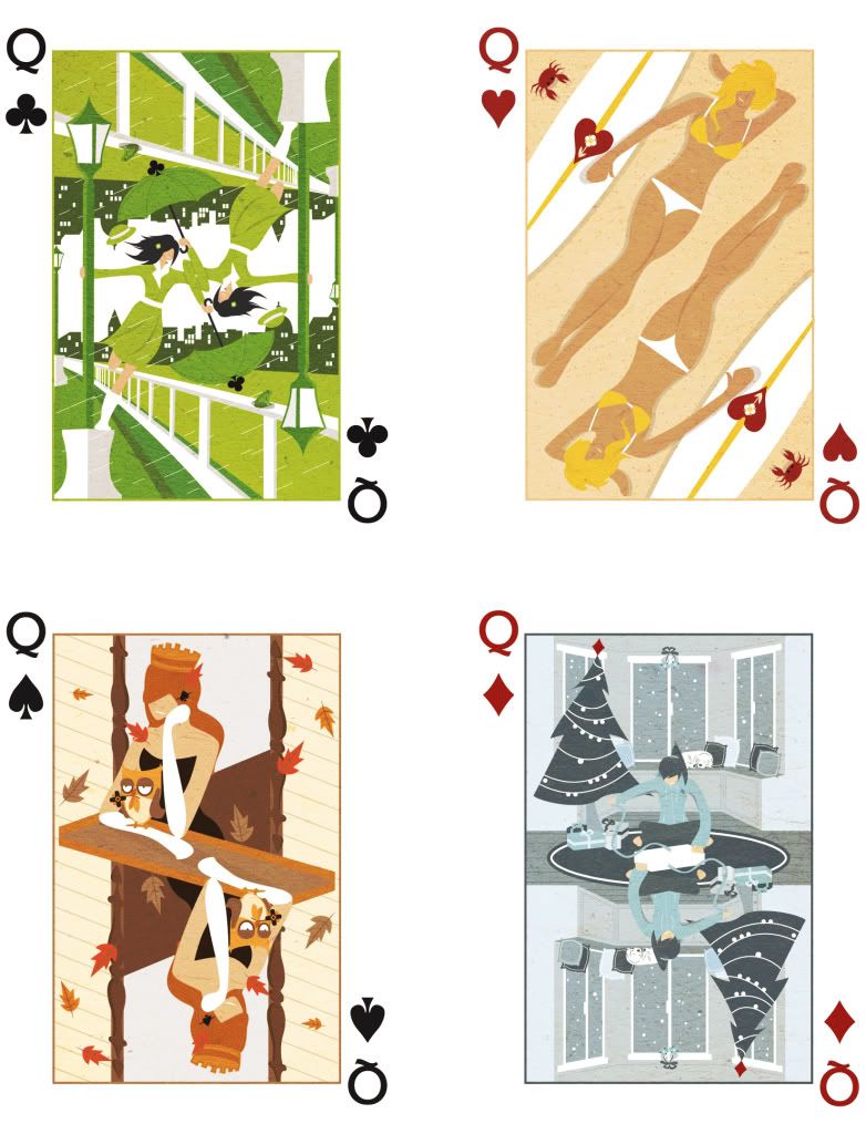 |
|
|
|


Posts in this topic
 rickysaurus Playing Cards Mar 31 2009, 03:23 AM
 Janette There really isn't anything I can find to crit... Mar 31 2009, 03:38 PM interpretation Ooh, this is creative. I like what you've done... Mar 31 2009, 03:51 PM schizo Awesome! There's really nothing bad to say... Mar 31 2009, 04:22 PM ForgiveTheSinner I love them!!! So cool lol. Can't ... Mar 31 2009, 07:22 PM manny-the-dino Woah this is reeeeeeeeeeeeeally cool. I get an egy... Mar 31 2009, 11:54 PM rickysaurus Wow thanks for all the positive feedback! I wa... Apr 1 2009, 12:18 AM manny-the-dino For it being incomplete, it's really good. Apr 1 2009, 12:23 AM rickysaurus Update:
Reduced arm sizes for both arms, reduced t... Apr 1 2009, 04:12 PM
Janette There really isn't anything I can find to crit... Mar 31 2009, 03:38 PM interpretation Ooh, this is creative. I like what you've done... Mar 31 2009, 03:51 PM schizo Awesome! There's really nothing bad to say... Mar 31 2009, 04:22 PM ForgiveTheSinner I love them!!! So cool lol. Can't ... Mar 31 2009, 07:22 PM manny-the-dino Woah this is reeeeeeeeeeeeeally cool. I get an egy... Mar 31 2009, 11:54 PM rickysaurus Wow thanks for all the positive feedback! I wa... Apr 1 2009, 12:18 AM manny-the-dino For it being incomplete, it's really good. Apr 1 2009, 12:23 AM rickysaurus Update:
Reduced arm sizes for both arms, reduced t... Apr 1 2009, 04:12 PM
 interpretation QUOTE(rickysaurus @ Apr 1 2009, 05:12 PM)... Apr 1 2009, 04:28 PM rickysaurus Here's hopefully the final draft of the fall o... Apr 2 2009, 01:14 AM elletricity wow these are really good (: i can't wait to s... Apr 2 2009, 03:09 AM rickysaurus Thanks everyone!
SPRING'S HERE Apr 4 2009, 05:02 AM ForgiveTheSinner Ahhh I love all of them XD
Can you like...make a... Apr 5 2009, 12:21 AM rickysaurus Ah I see the reflection. It wasn't really on p... Apr 5 2009, 04:08 AM Markster Duuuuuuuuude, I freaking love this. I want these t... Apr 5 2009, 01:53 PM Beenly I just love the art flow of your pictures.
I'd... Apr 5 2009, 03:11 PM rickysaurus Thanks for all the kind comments! You guys tru... Apr 5 2009, 03:40 PM Beenly So, have you thought about designing the Queen or ... Apr 5 2009, 03:43 PM rickysaurus Yup they're next on the list. I think I'll... Apr 5 2009, 03:46 PM interpretation QUOTE(rickysaurus @ Apr 5 2009, 04:40 PM)... Apr 5 2009, 03:54 PM rickysaurus Two weeks worth of work has produced this:
Queens ... Apr 5 2009, 09:33 PM xzkdxrawrx These are amazing :D
Maybe you should look into de... Apr 5 2009, 09:38 PM Mikeplyts Ohh, nice updates. Yeah, I agree that you should t... Apr 5 2009, 09:39 PM rickysaurus I would imagine the production costs would be huge... Apr 5 2009, 09:51 PM xzkdxrawrx But people would buy :D Apr 5 2009, 10:05 PM rickysaurus Thanks divergent for the link. Printing and sellin... Apr 7 2009, 01:50 AM rickysaurus First version of the Queen of Hearts: Apr 8 2009, 06:47 PM Mikeplyts Ooo, that's very nice. Awesome job! Apr 8 2009, 07:20 PM Medi For the red hearts cards, I'd suggest lighting... Apr 8 2009, 07:45 PM Mikeplyts QUOTE(Medi @ Apr 8 2009, 08:45 PM) For th... Apr 8 2009, 08:27 PM Medi QUOTE(Mikeplyts @ Apr 8 2009, 08:27 PM) T... Apr 8 2009, 10:30 PM rickysaurus They're at 35%... Apr 9 2009, 02:58 AM Mikeplyts I can see the sand and stuff but it doesn't re... Apr 9 2009, 11:27 AM interpretation QUOTE(rickysaurus @ Apr 7 2009, 02:50 AM)... Apr 9 2009, 07:59 PM IWontRapeYou The spring jack is amazing, so is the queen. Aweso... Apr 9 2009, 08:06 PM rickysaurus Update. She was a little too skinny. Apr 10 2009, 04:47 AM Melie very outstanding work you're producing! i ... Apr 10 2009, 09:02 AM ForgiveTheSinner I like the white hair on the jack though O_o it ma... Apr 10 2009, 11:29 PM Mikeplyts QUOTE(ForgiveTheSinner @ Apr 11 2009, 12... Apr 10 2009, 11:41 PM rickysaurus Sorry but the Jacks are finalized :/ I'm not g... Apr 11 2009, 02:38 AM IWontRapeYou I always think of Halloween with fall, so I think ... Apr 11 2009, 11:30 AM ForgiveTheSinner Yea, making the railing shorter will make her look... Apr 11 2009, 03:11 PM rickysaurus How does this look? Apr 11 2009, 08:41 PM Mikeplyts Ehh...I'm not sure on the updated one. I think... Apr 11 2009, 10:27 PM ForgiveTheSinner The updated one looks good but I'm not feeling... Apr 11 2009, 10:52 PM Insurmountable Personally I like the Queen handing out the candy,... Apr 14 2009, 01:53 AM livwho I love all of these! You're an incredibly ... Apr 14 2009, 02:28 AM rickysaurus Thank you for the support. Like I said before, sel... Apr 14 2009, 02:54 AM interpretation I like that you changed the color of the queen... Apr 14 2009, 03:55 PM elletricity ^ I actually like that one too. But of the two you... Apr 14 2009, 09:21 PM livwho The latest Queen is probably my favorite... becaus... Apr 14 2009, 09:45 PM ForgiveTheSinner I like the queen with the black dress. The owl sur... Apr 14 2009, 10:59 PM rickysaurus Thanks for the feedback. It really is pretty split... Apr 14 2009, 11:25 PM rickysaurus First iteration. I'm a bit lost on what to put... Apr 15 2009, 05:30 PM livwho A dog or something? Apr 15 2009, 07:23 PM ForgiveTheSinner Nonono!! I think that one is good the way ... Apr 15 2009, 08:25 PM rickysaurus Update! That's a squirrel by the way. Not ... Apr 15 2009, 08:43 PM Mikeplyts Nah, the original one is better than the squirrel ... Apr 15 2009, 08:51 PM livwho A frog would be cute, but if she were just walking... Apr 15 2009, 09:06 PM IWontRapeYou I love both of them. That green is so lovely. Apr 15 2009, 09:18 PM rickysaurus Two options, which is better?: Apr 16 2009, 02:07 AM xzkdxrawrx I like the 2nd one better :D Apr 16 2009, 07:51 AM ForgiveTheSinner Second one! But the girls leg looks chopped of... Apr 16 2009, 09:54 PM mike0C Very impressive, good work. Apr 16 2009, 11:24 PM calilani Awesome work! I'd like a deck too! Apr 20 2009, 09:06 AM rickysaurus My deadlines May 8th. I kinda wanna finish a day o... Apr 22 2009, 12:52 AM Markster ^Beautiful. Apr 22 2009, 04:06 AM rickysaurus Thanks!
Minor updates, threw in a few more de... Apr 22 2009, 04:26 PM ForgiveTheSinner Keep the dog!! It looks good as it is. Apr 22 2009, 06:41 PM Mikeplyts Yeah, I like the one with the dog too. Apr 22 2009, 07:43 PM rickysaurus QUEENS ARE DONE! *exhausted
Actually they... Apr 23 2009, 01:00 AM interpretation QUOTE(rickysaurus @ Apr 23 2009, 02:00 AM... Apr 23 2009, 08:54 PM Mikeplyts They look awesome! Although, it seems every on... Apr 23 2009, 07:09 AM rickysaurus She has a frog on the railing ;] Apr 23 2009, 08:45 AM Mikeplyts QUOTE(rickysaurus @ Apr 23 2009, 09:45 AM... Apr 23 2009, 10:14 AM IWontRapeYou I think summer is my favorite. Super awesome job. Apr 23 2009, 08:03 PM ForgiveTheSinner I think on the queen of clubs, the one of the hat ... Apr 23 2009, 09:58 PM rickysaurus QUOTE(ForgiveTheSinner @ Apr 23 2009, 07... Apr 24 2009, 10:04 PM interpretation QUOTE(rickysaurus @ Apr 24 2009, 11:04 PM... Apr 24 2009, 10:15 PM livwho LOVE the fall. :D Apr 23 2009, 10:17 PM Mikeplyts QUOTE(rickysaurus @ Apr 24 2009, 11:04 PM... Apr 25 2009, 08:42 AM rickysaurus If you guys don't mind, I'd appreciate it ... Apr 25 2009, 08:10 PM dosomethin888 These are beyond awesome Apr 26 2009, 01:54 AM rickysaurus Thanks everyone!
I took your suggestions in m... Apr 26 2009, 04:52 AM Mikeplyts Now that's nice. Great job!
Oh, and I... Apr 26 2009, 07:39 AM Insurmountable yay golf, love the king. Apr 26 2009, 12:51 PM interpretation QUOTE(rickysaurus @ Apr 26 2009, 05:52 AM... Apr 26 2009, 01:22 PM ForgiveTheSinner ^ Agree with Christy. But good job, as usual :) Apr 26 2009, 08:10 PM rickysaurus Alright final draft unless someone can point out s... Apr 27 2009, 12:07 AM schizo King of clubs...Ha. I think it looks really good, ... Apr 27 2009, 03:51 PM rickysaurus QUOTE(schizo @ Apr 27 2009, 01:51 PM) May... Apr 27 2009, 10:07 PM livwho The legs look fine. Everything is great, actually.... Apr 27 2009, 07:46 PM Mikeplyts Flawless. Great job! Apr 28 2009, 03:26 PM Pooonani Wow I'm really really late on this.
Holy craa... Apr 28 2009, 07:39 PM rickysaurus Thanks! With this much positive feedback I mig... Apr 28 2009, 11:28 PM
interpretation QUOTE(rickysaurus @ Apr 1 2009, 05:12 PM)... Apr 1 2009, 04:28 PM rickysaurus Here's hopefully the final draft of the fall o... Apr 2 2009, 01:14 AM elletricity wow these are really good (: i can't wait to s... Apr 2 2009, 03:09 AM rickysaurus Thanks everyone!
SPRING'S HERE Apr 4 2009, 05:02 AM ForgiveTheSinner Ahhh I love all of them XD
Can you like...make a... Apr 5 2009, 12:21 AM rickysaurus Ah I see the reflection. It wasn't really on p... Apr 5 2009, 04:08 AM Markster Duuuuuuuuude, I freaking love this. I want these t... Apr 5 2009, 01:53 PM Beenly I just love the art flow of your pictures.
I'd... Apr 5 2009, 03:11 PM rickysaurus Thanks for all the kind comments! You guys tru... Apr 5 2009, 03:40 PM Beenly So, have you thought about designing the Queen or ... Apr 5 2009, 03:43 PM rickysaurus Yup they're next on the list. I think I'll... Apr 5 2009, 03:46 PM interpretation QUOTE(rickysaurus @ Apr 5 2009, 04:40 PM)... Apr 5 2009, 03:54 PM rickysaurus Two weeks worth of work has produced this:
Queens ... Apr 5 2009, 09:33 PM xzkdxrawrx These are amazing :D
Maybe you should look into de... Apr 5 2009, 09:38 PM Mikeplyts Ohh, nice updates. Yeah, I agree that you should t... Apr 5 2009, 09:39 PM rickysaurus I would imagine the production costs would be huge... Apr 5 2009, 09:51 PM xzkdxrawrx But people would buy :D Apr 5 2009, 10:05 PM rickysaurus Thanks divergent for the link. Printing and sellin... Apr 7 2009, 01:50 AM rickysaurus First version of the Queen of Hearts: Apr 8 2009, 06:47 PM Mikeplyts Ooo, that's very nice. Awesome job! Apr 8 2009, 07:20 PM Medi For the red hearts cards, I'd suggest lighting... Apr 8 2009, 07:45 PM Mikeplyts QUOTE(Medi @ Apr 8 2009, 08:45 PM) For th... Apr 8 2009, 08:27 PM Medi QUOTE(Mikeplyts @ Apr 8 2009, 08:27 PM) T... Apr 8 2009, 10:30 PM rickysaurus They're at 35%... Apr 9 2009, 02:58 AM Mikeplyts I can see the sand and stuff but it doesn't re... Apr 9 2009, 11:27 AM interpretation QUOTE(rickysaurus @ Apr 7 2009, 02:50 AM)... Apr 9 2009, 07:59 PM IWontRapeYou The spring jack is amazing, so is the queen. Aweso... Apr 9 2009, 08:06 PM rickysaurus Update. She was a little too skinny. Apr 10 2009, 04:47 AM Melie very outstanding work you're producing! i ... Apr 10 2009, 09:02 AM ForgiveTheSinner I like the white hair on the jack though O_o it ma... Apr 10 2009, 11:29 PM Mikeplyts QUOTE(ForgiveTheSinner @ Apr 11 2009, 12... Apr 10 2009, 11:41 PM rickysaurus Sorry but the Jacks are finalized :/ I'm not g... Apr 11 2009, 02:38 AM IWontRapeYou I always think of Halloween with fall, so I think ... Apr 11 2009, 11:30 AM ForgiveTheSinner Yea, making the railing shorter will make her look... Apr 11 2009, 03:11 PM rickysaurus How does this look? Apr 11 2009, 08:41 PM Mikeplyts Ehh...I'm not sure on the updated one. I think... Apr 11 2009, 10:27 PM ForgiveTheSinner The updated one looks good but I'm not feeling... Apr 11 2009, 10:52 PM Insurmountable Personally I like the Queen handing out the candy,... Apr 14 2009, 01:53 AM livwho I love all of these! You're an incredibly ... Apr 14 2009, 02:28 AM rickysaurus Thank you for the support. Like I said before, sel... Apr 14 2009, 02:54 AM interpretation I like that you changed the color of the queen... Apr 14 2009, 03:55 PM elletricity ^ I actually like that one too. But of the two you... Apr 14 2009, 09:21 PM livwho The latest Queen is probably my favorite... becaus... Apr 14 2009, 09:45 PM ForgiveTheSinner I like the queen with the black dress. The owl sur... Apr 14 2009, 10:59 PM rickysaurus Thanks for the feedback. It really is pretty split... Apr 14 2009, 11:25 PM rickysaurus First iteration. I'm a bit lost on what to put... Apr 15 2009, 05:30 PM livwho A dog or something? Apr 15 2009, 07:23 PM ForgiveTheSinner Nonono!! I think that one is good the way ... Apr 15 2009, 08:25 PM rickysaurus Update! That's a squirrel by the way. Not ... Apr 15 2009, 08:43 PM Mikeplyts Nah, the original one is better than the squirrel ... Apr 15 2009, 08:51 PM livwho A frog would be cute, but if she were just walking... Apr 15 2009, 09:06 PM IWontRapeYou I love both of them. That green is so lovely. Apr 15 2009, 09:18 PM rickysaurus Two options, which is better?: Apr 16 2009, 02:07 AM xzkdxrawrx I like the 2nd one better :D Apr 16 2009, 07:51 AM ForgiveTheSinner Second one! But the girls leg looks chopped of... Apr 16 2009, 09:54 PM mike0C Very impressive, good work. Apr 16 2009, 11:24 PM calilani Awesome work! I'd like a deck too! Apr 20 2009, 09:06 AM rickysaurus My deadlines May 8th. I kinda wanna finish a day o... Apr 22 2009, 12:52 AM Markster ^Beautiful. Apr 22 2009, 04:06 AM rickysaurus Thanks!
Minor updates, threw in a few more de... Apr 22 2009, 04:26 PM ForgiveTheSinner Keep the dog!! It looks good as it is. Apr 22 2009, 06:41 PM Mikeplyts Yeah, I like the one with the dog too. Apr 22 2009, 07:43 PM rickysaurus QUEENS ARE DONE! *exhausted
Actually they... Apr 23 2009, 01:00 AM interpretation QUOTE(rickysaurus @ Apr 23 2009, 02:00 AM... Apr 23 2009, 08:54 PM Mikeplyts They look awesome! Although, it seems every on... Apr 23 2009, 07:09 AM rickysaurus She has a frog on the railing ;] Apr 23 2009, 08:45 AM Mikeplyts QUOTE(rickysaurus @ Apr 23 2009, 09:45 AM... Apr 23 2009, 10:14 AM IWontRapeYou I think summer is my favorite. Super awesome job. Apr 23 2009, 08:03 PM ForgiveTheSinner I think on the queen of clubs, the one of the hat ... Apr 23 2009, 09:58 PM rickysaurus QUOTE(ForgiveTheSinner @ Apr 23 2009, 07... Apr 24 2009, 10:04 PM interpretation QUOTE(rickysaurus @ Apr 24 2009, 11:04 PM... Apr 24 2009, 10:15 PM livwho LOVE the fall. :D Apr 23 2009, 10:17 PM Mikeplyts QUOTE(rickysaurus @ Apr 24 2009, 11:04 PM... Apr 25 2009, 08:42 AM rickysaurus If you guys don't mind, I'd appreciate it ... Apr 25 2009, 08:10 PM dosomethin888 These are beyond awesome Apr 26 2009, 01:54 AM rickysaurus Thanks everyone!
I took your suggestions in m... Apr 26 2009, 04:52 AM Mikeplyts Now that's nice. Great job!
Oh, and I... Apr 26 2009, 07:39 AM Insurmountable yay golf, love the king. Apr 26 2009, 12:51 PM interpretation QUOTE(rickysaurus @ Apr 26 2009, 05:52 AM... Apr 26 2009, 01:22 PM ForgiveTheSinner ^ Agree with Christy. But good job, as usual :) Apr 26 2009, 08:10 PM rickysaurus Alright final draft unless someone can point out s... Apr 27 2009, 12:07 AM schizo King of clubs...Ha. I think it looks really good, ... Apr 27 2009, 03:51 PM rickysaurus QUOTE(schizo @ Apr 27 2009, 01:51 PM) May... Apr 27 2009, 10:07 PM livwho The legs look fine. Everything is great, actually.... Apr 27 2009, 07:46 PM Mikeplyts Flawless. Great job! Apr 28 2009, 03:26 PM Pooonani Wow I'm really really late on this.
Holy craa... Apr 28 2009, 07:39 PM rickysaurus Thanks! With this much positive feedback I mig... Apr 28 2009, 11:28 PM  |
1 User(s) are reading this topic (1 Guests and 0 Anonymous Users)
0 Members: