myspace 3.0, a personal myspace layout |
Rating


|
Resource Center Links
This Month's Contests | Hosts Looking for Hostees | Hostees looking for Hosts | BigBookofResources
Submission Guidelines
  |
 Mar 22 2009, 05:56 PM Mar 22 2009, 05:56 PM
Post
#1
|
|
 Sex, Blood, & RocknRoll  Group: People Staff Posts: 5,305 Joined: Nov 2007 Member No: 596,480 |
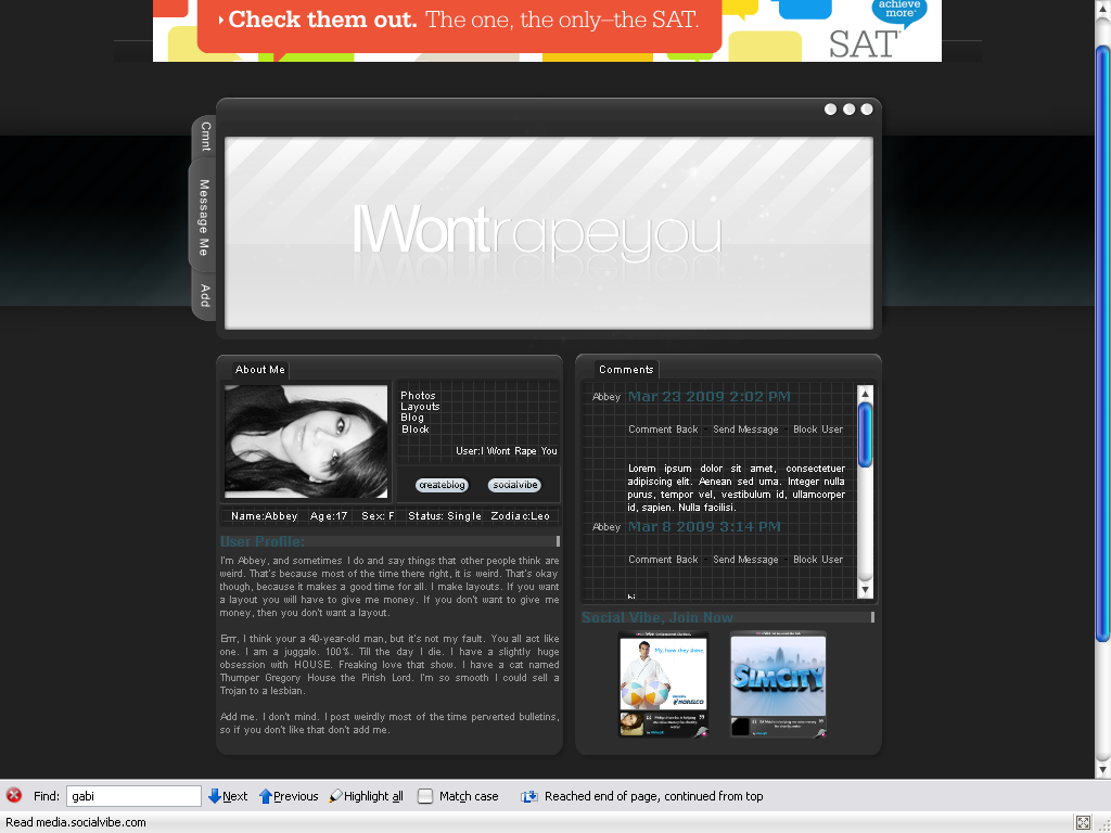
I didn't want to post this until I was finished, but damn I am just so bored.
At the time I started this I was set out to make a back and white layout. Every thing is going to have a roll over. My pc will rollover to color, the three dots in the right hand corner will link home and glow red so one so fourth. C&C please? Edit A few changes, plus I thought I'd see what it looks like with color. I think I like it better white. Blue version: here EDIT: live preview SV and CB links have rollovers, so do the links above them. Comments done too. Haven't seen it in IE yet. |
|
|
|


|
Mar 22 2009, 06:40 PM
Post
#2
|
|
 Coming from Illinois Group: Member Posts: 319 Joined: Mar 2009 Member No: 718,627 |
I like it, kinda has a mac UI feel to it. Cause the three dots in the top right hand corner. the only thing that I don't feel is the banner above the space. Everything else is cool. I like the tabs.
|
|
|
|


|
Mar 22 2009, 08:34 PM
Post
#3
|
|
 Irrisistable Cabbages. Group: Member Posts: 549 Joined: Nov 2007 Member No: 589,355 |
When did myspace 3.0 come around?
I like the layout. I can read the text iwontrapeyou that well though. |
|
|
|

|
Mar 22 2009, 08:37 PM
Post
#4
|
|
|
Sex, Blood, & RocknRoll Group: People Staff Posts: 5,305 Joined: Nov 2007 Member No: 596,480 |
It's just what I call the layout.
|
|
|
|
|
Mar 22 2009, 09:02 PM
Post
#5
|
|
 DDR \\ I'm Dee :) Group: Mentor Posts: 8,662 Joined: Mar 2006 Member No: 384,020 |
Oooh I like it. I'm partial to gray designs, so I can't wait to see the finished product.
|
|
|
|

|
Mar 22 2009, 09:57 PM
Post
#6
|
|
 show me a garden thats bursting to life Group: Staff Alumni Posts: 12,303 Joined: Mar 2005 Member No: 115,987 |
There isn't a shadow on the bottom left box. Or if there is..it isn't all that noticeable. Sorry, it's one thing I look for. I'm a dork.
 But, other than that, I think that this is pretty dang awesome. But, other than that, I think that this is pretty dang awesome.
|
|
|
|

|
Mar 22 2009, 10:02 PM
Post
#7
|
|
|
Sex, Blood, & RocknRoll Group: People Staff Posts: 5,305 Joined: Nov 2007 Member No: 596,480 |
^There is, it's just at a different angle. I'll have to fix it.
Thanks guys! |
|
|
|
|
Mar 22 2009, 10:16 PM
Post
#8
|
|
 Senior Member Group: Staff Alumni Posts: 2,435 Joined: Feb 2007 Member No: 506,205 |
Oooh, me like. It's really professional. :)
|
|
|
|

|
Mar 22 2009, 10:40 PM
Post
#9
|
|
 Senior Member Group: Administrator Posts: 8,629 Joined: Jan 2007 Member No: 498,468 |
Ohh I really like it. I think with the rollovers it will look even better. Nice job. :)
|
|
|
|

|
Mar 23 2009, 01:39 PM
Post
#10
|
|
|
Sex, Blood, & RocknRoll Group: People Staff Posts: 5,305 Joined: Nov 2007 Member No: 596,480 |
^Thank guys, The only rollovers I haven't worked out yet are the ones on the tab. I can't make them pull out so I don't what to do with them.
|
|
|
|
| *Janette* |
Mar 24 2009, 12:34 AM
Post
#11
|
|
Guest |
That's hot. I prefer the edited version, though. It looks better to me with a hint of color. (:
|
|
|
|
|
Mar 24 2009, 12:44 AM
Post
#12
|
|
|
Sex, Blood, & RocknRoll Group: People Staff Posts: 5,305 Joined: Nov 2007 Member No: 596,480 |
|
|
|
|
|
Mar 24 2009, 05:42 AM
Post
#13
|
|
|
Treasure Pleasure Group: Head Staff Posts: 11,193 Joined: Oct 2005 Member No: 281,127 |
I actually like that. Nice work.

|
|
|
|
|
Mar 24 2009, 10:01 PM
Post
#14
|
|
|
Senior Member Group: Administrator Posts: 8,629 Joined: Jan 2007 Member No: 498,468 |
Wait which rollovers are supposed to be working? /slow
I say go with the gray or blue one.
|
|
|
|
|
Mar 24 2009, 11:25 PM
Post
#15
|
|
|
Sex, Blood, & RocknRoll Group: People Staff Posts: 5,305 Joined: Nov 2007 Member No: 596,480 |
lol none of them now, I just coded them comments, background ect. I am moving sloooooow.
|
|
|
|
|
Mar 25 2009, 02:55 AM
Post
#16
|
|
 사랑해 ~ 我愛你 ♥ Group: Design Staff Posts: 825 Joined: Jan 2007 Member No: 492,587 |
i love the clean, dark look (: gj ;D
|
|
|
|

|
Mar 25 2009, 05:14 PM
Post
#17
|
|
|
Sex, Blood, & RocknRoll Group: People Staff Posts: 5,305 Joined: Nov 2007 Member No: 596,480 |
^Thank you.
|
|
|
|
|
Mar 28 2009, 01:31 PM
Post
#18
|
|
 Mel Blanc was allergic to carrots. Group: Official Designer Posts: 6,371 Joined: Aug 2008 Member No: 676,291 |
Ooohh, I like this a lot. I like the blue one the best. Nice job.
|
|
|
|

|
2 User(s) are reading this topic (2 Guests and 0 Anonymous Users)
0 Members: