tropicana |

 Feb 24 2009, 06:48 PM Feb 24 2009, 06:48 PM
Post
#1
|
|
 I'm Jc  Group: Mentor Posts: 13,619 Joined: Jul 2006 Member No: 437,556 |
so i was watching cnn in this morning and they were reading feedback on tropicana's new orange juice carton. people were bashing it like crazy. then i read more about it online. wtf so much uproar over orange juice.
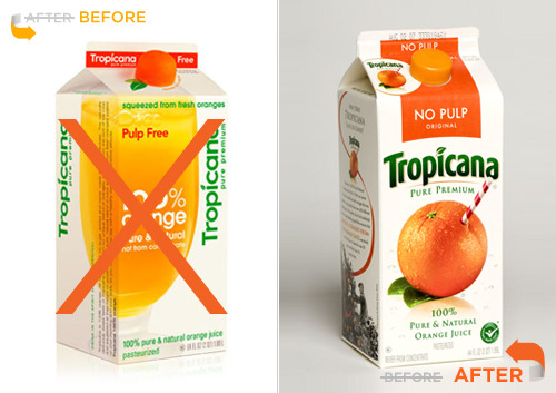 apparently after seeing how upset everyone is, tropicana has announced they are going back to the other packaging and ditching the new look. i think this had an opposite effect on me, becuase i actually bought a carton of it sunday... |
|
|
|


Posts in this topic
 brooklyneast05 tropicana Feb 24 2009, 06:48 PM
 smash it's a silly marketing thing. the new one seem... Feb 24 2009, 07:11 PM
 brooklyneast05 i know...i liked the new design
QUOTE(smash ... Feb 24 2009, 07:43 PM hi-C QUOTE(brooklyneast05 @ Feb 24 2009, 07:43... Feb 24 2009, 07:47 PM hi-C I love the redesign. People are just resistant to... Feb 24 2009, 07:42 PM iDecay I actually like the design, it's a bit more mo... Feb 24 2009, 07:44 PM Beenly I think the new version looks much more cleaner.
O... Feb 24 2009, 07:47 PM MissUchiha QUOTE(Beenly @ Feb 24 2009, 07:47 PM) [si... Feb 24 2009, 08:11 PM Beenly oh well the money is the matter Feb 24 2009, 08:21 PM karmakiller I like the lid of the new design! it doesn... Feb 24 2009, 08:27 PM smash the cap is a nice touch. i do like the straw too. ... Feb 24 2009, 08:32 PM fainaru Maybe it's the fact that the text is rotated t... Feb 24 2009, 08:40 PM IWontRapeYou I think they should just move the orange with the ... Feb 24 2009, 08:49 PM manny-the-dino I dk what the big deal is. I mean it's just a ... Feb 24 2009, 10:55 PM ArjunaCapulong doesn't matter, it's too expensive so I ai... Feb 24 2009, 10:56 PM manny-the-dino QUOTE(ArjunaCapulong @ Feb 24 2009, 07:56... Feb 24 2009, 11:36 PM jcp But tropicana's thing was an orange with a str... Feb 24 2009, 10:57 PM
brooklyneast05 i know...i liked the new design
QUOTE(smash ... Feb 24 2009, 07:43 PM hi-C QUOTE(brooklyneast05 @ Feb 24 2009, 07:43... Feb 24 2009, 07:47 PM hi-C I love the redesign. People are just resistant to... Feb 24 2009, 07:42 PM iDecay I actually like the design, it's a bit more mo... Feb 24 2009, 07:44 PM Beenly I think the new version looks much more cleaner.
O... Feb 24 2009, 07:47 PM MissUchiha QUOTE(Beenly @ Feb 24 2009, 07:47 PM) [si... Feb 24 2009, 08:11 PM Beenly oh well the money is the matter Feb 24 2009, 08:21 PM karmakiller I like the lid of the new design! it doesn... Feb 24 2009, 08:27 PM smash the cap is a nice touch. i do like the straw too. ... Feb 24 2009, 08:32 PM fainaru Maybe it's the fact that the text is rotated t... Feb 24 2009, 08:40 PM IWontRapeYou I think they should just move the orange with the ... Feb 24 2009, 08:49 PM manny-the-dino I dk what the big deal is. I mean it's just a ... Feb 24 2009, 10:55 PM ArjunaCapulong doesn't matter, it's too expensive so I ai... Feb 24 2009, 10:56 PM manny-the-dino QUOTE(ArjunaCapulong @ Feb 24 2009, 07:56... Feb 24 2009, 11:36 PM jcp But tropicana's thing was an orange with a str... Feb 24 2009, 10:57 PM  |
1 User(s) are reading this topic (1 Guests and 0 Anonymous Users)
0 Members: