Africa 2025 (WIP) |
Resource Center Links
This Month's Contests | Hosts Looking for Hostees | Hostees looking for Hosts | BigBookofResources
Submission Guidelines
  |

 Feb 23 2009, 12:22 PM Feb 23 2009, 12:22 PM
Post
#1
|
|
 talent on another level  Group: Member Posts: 746 Joined: Oct 2006 Member No: 475,735 |
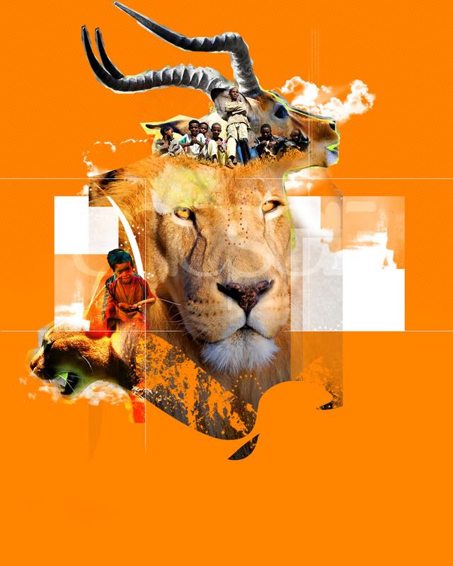
Composition I'm playing with. The theme is Africa, and the effort to stop poverty by 2025. Any helpful feedback would be nice.
|
|
|
|


|
Feb 23 2009, 01:01 PM
Post
#2
|
|
|
talent on another level Group: Member Posts: 746 Joined: Oct 2006 Member No: 475,735 |
thanks for the feedback.
|
|
|
|
|
Feb 23 2009, 03:48 PM
Post
#3
|
|
 Senior Member Group: Member Posts: 292 Joined: Jul 2007 Member No: 545,047 |
My only complaint is that it's a bit small. I'm straining my eyes trying to see the cute kids

|
|
|
|

|
Feb 23 2009, 03:49 PM
Post
#4
|
|
 /人◕‿‿◕人\ Group: Official Member Posts: 8,283 Joined: Dec 2007 Member No: 602,927 |
Cool design, but the cutouts are shitty.
|
|
|
|


|
Feb 23 2009, 05:47 PM
Post
#5
|
|
|
talent on another level Group: Member Posts: 746 Joined: Oct 2006 Member No: 475,735 |
QUOTE(9001 @ Feb 23 2009, 04:49 PM)  Cool design, but the cutouts are shitty. i purposely cut them out to fit a certain style, there is nothing shitty about it.  QUOTE(GunsNRachel @ Feb 23 2009, 04:48 PM) My only complaint is that it's a bit small. I'm straining my eyes trying to see the cute kids i minimized the size of the picture for this preview, its much bigger. |
|
|
|
|
Feb 23 2009, 06:02 PM
Post
#6
|
|
 Senior Member Group: Member Posts: 786 Joined: Dec 2006 Member No: 488,341 |
I like it, I like all of your works actually. But I also agree with the cutout even though I know it's intentional, it doesn't look good though...everything else is clean except the cougar and ram (or whatever they are...I'm bad with animals).
|
|
|
|

|
Feb 23 2009, 07:58 PM
Post
#7
|
|
|
talent on another level Group: Member Posts: 746 Joined: Oct 2006 Member No: 475,735 |
QUOTE(ForgiveTheSinner @ Feb 23 2009, 07:02 PM) I like it, I like all of your works actually. But I also agree with the cutout even though I know it's intentional, it doesn't look good though...everything else is clean except the cougar and ram (or whatever they are...I'm bad with animals). thanks for the feedback. i'll see how i feel about the overall piece before i make any changes. |
|
|
|
|
Feb 23 2009, 08:02 PM
Post
#8
|
|
 Sex, Blood, & RocknRoll Group: People Staff Posts: 5,305 Joined: Nov 2007 Member No: 596,480 |
I don't think the cougar looks to bad, the springbok ( I think?) does look a little off. It's to jagged. Other that that this is really awesome! Great job, as always.
|
|
|
|


|
Feb 23 2009, 09:04 PM
Post
#9
|
|
|
talent on another level Group: Member Posts: 746 Joined: Oct 2006 Member No: 475,735 |
QUOTE(IWontRapeYou @ Feb 23 2009, 09:02 PM) I don't think the cougar looks to bad, the springbok ( I think?) does look a little off. It's to jagged. Other that that this is really awesome! Great job, as always. thanks |
|
|
|
|
Feb 23 2009, 09:17 PM
Post
#10
|
|
 Senior Member Group: Staff Alumni Posts: 1,815 Joined: Jun 2006 Member No: 423,396 |
I agree; I love that lion being the focus of the piece.
|
|
|
|

|
Feb 23 2009, 09:32 PM
Post
#11
|
|
 Photoartist Group: Staff Alumni Posts: 12,363 Joined: Apr 2006 Member No: 399,390 |
admittedly this isn't the best I've seen from you, but I've always had respect for a ninja that uses their skills for causes like this
|
|
|
|

|
Feb 23 2009, 10:25 PM
Post
#12
|
|
 Senior Member Group: Staff Alumni Posts: 2,435 Joined: Feb 2007 Member No: 506,205 |
It's not my favorite thing of yours that I've seen, but it still looks good. I like the style of cutting you used looks fine with everything but the antelope thing at the top. I think that's what's throwing it off for me.
|
|
|
|

|
Feb 23 2009, 10:47 PM
Post
#13
|
|
|
talent on another level Group: Member Posts: 746 Joined: Oct 2006 Member No: 475,735 |
QUOTE(Markster @ Feb 23 2009, 10:17 PM) I agree; I love that lion being the focus of the piece. me 2  QUOTE(schizo @ Feb 23 2009, 11:25 PM) It's not my favorite thing of yours that I've seen, but it still looks good. I like the style of cutting you used looks fine with everything but the antelope thing at the top. I think that's what's throwing it off for me. thanks for the feedback. QUOTE(ArjunaCapulong @ Feb 23 2009, 10:32 PM) admittedly this isn't the best I've seen from you, but I've always had respect for a ninja that uses their skills for causes like this thanks for the positive message. |
|
|
|
|
Feb 23 2009, 11:35 PM
Post
#14
|
|
 Senior Member Group: Administrator Posts: 8,629 Joined: Jan 2007 Member No: 498,468 |
I didn't really notice the way you cobbed everything but now that I look at them, horns look weird since they zig-zag. The group of kids up top are low in quality & hard to see. I agree with Mike on the white. And I think the orange brush at the bottom is a bit random. Like everyone else said, this isn't your best, tbh. But it's good either way. :)
|
|
|
|

|
Feb 23 2009, 11:41 PM
Post
#15
|
|
|
talent on another level Group: Member Posts: 746 Joined: Oct 2006 Member No: 475,735 |
QUOTE(manny-the-dino @ Feb 24 2009, 12:35 AM) I didn't really notice the way you cobbed everything but now that I look at them, horns look weird since they zig-zag. The group of kids up top are low in quality & hard to see. I agree with Mike on the white. And I think the orange brush at the bottom is a bit random. Like everyone else said, this isn't your best, tbh. But it's good either way. :) thanks for the feedback. this is minimized version of the original so the kids look low quality and small. its till a wip, so these tips given so far are great. |
|
|
|
|
Feb 24 2009, 05:35 AM
Post
#16
|
|
|
Senior Member Group: Member Posts: 292 Joined: Jul 2007 Member No: 545,047 |
QUOTE(bigtrey90 @ Feb 23 2009, 05:47 PM) i minimized the size of the picture for this preview, its much bigger.  |
|
|
|
|
Feb 24 2009, 02:22 PM
Post
#17
|
|
 Hello, I'm Heli Group: Member Posts: 198 Joined: Aug 2007 Member No: 568,604 |
I really like it.
I also like the Orange BG. Even Tho its mad bright. Only Question i got is .. Will you put more stuff underneath the Lion or why isnt it centered?! |
|
|
|

|
Feb 24 2009, 03:14 PM
Post
#18
|
|
|
talent on another level Group: Member Posts: 746 Joined: Oct 2006 Member No: 475,735 |
QUOTE(BandidaFamosa @ Feb 24 2009, 03:22 PM) I really like it. I also like the Orange BG. Even Tho its mad bright. Only Question i got is .. Will you put more stuff underneath the Lion or why isnt it centered?! thanks i will be adding more under the lion |
|
|
|
|
Feb 26 2009, 10:10 PM
Post
#19
|
|
 사랑해 ~ 我愛你 ♥ Group: Design Staff Posts: 825 Joined: Jan 2007 Member No: 492,587 |
i'd cut out the images a little more cleanly, esp. around the top animal - it looks sortof weirdd. i'd also blend the white squares and the animals a bit more - the white parts stand out too much and distract from the lion and other images. just my opinion. i like what you did so far though (: i LOVE the orange!
|
|
|
|

|
Feb 27 2009, 10:33 PM
Post
#20
|
|
 Mel Blanc was allergic to carrots. Group: Official Designer Posts: 6,371 Joined: Aug 2008 Member No: 676,291 |
I think this looks really good but again, not your best. I'm sort of digging the cutout thing though. The only thing that bugs me is that random brush near the bottom and the antelope's horns. The horns kind of distract me a bit but the lion makes up for that, lol. Overall, this is pretty good but not your best. I'm hoping the finished piece will look much better.
|
|
|
|

|
Feb 28 2009, 08:26 PM
Post
#21
|
|
 Senior Member Group: Member Posts: 75 Joined: Feb 2009 Member No: 717,000 |
I really love that shade of orange. I think all the colors fit really well with the theme. The only thing that I see is the top left of the lion has a weird straight cut on it. Although I'm thinking you're probably going to add something on there?
|
|
|
|
|
Mar 1 2009, 09:02 AM
Post
#22
|
|
|
talent on another level Group: Member Posts: 746 Joined: Oct 2006 Member No: 475,735 |
thanks for all the feedback
|
|
|
|
|
1 User(s) are reading this topic (1 Guests and 0 Anonymous Users)
0 Members: