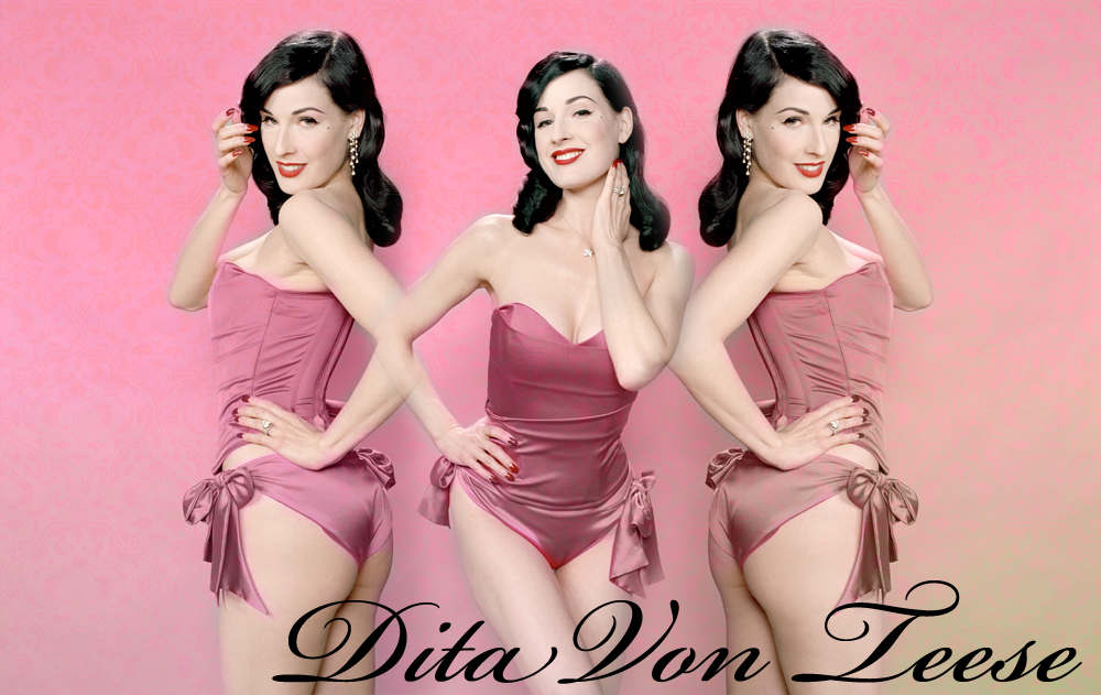
Dita VonTeese, what could i do to make it better? |
Resource Center Links
This Month's Contests | Hosts Looking for Hostees | Hostees looking for Hosts | BigBookofResources
Submission Guidelines
  |
 Jan 28 2009, 08:03 PM Jan 28 2009, 08:03 PM
Post
#1
|
|
 Senior Member      Group: Member Posts: 351 Joined: Jul 2007 Member No: 543,127 |
ive been trying to improve on my graphic making skills(not like i really have any) and this is the final(?) product.
tips? comments? criticism? |
|
|
|
 Jan 28 2009, 08:04 PM Jan 28 2009, 08:04 PM
Post
#2
|
|
 Senior Member         Group: Head Staff Posts: 18,173 Joined: Mar 2005 Member No: 108,478 |
Maybe put the left image a bit farther away from the middle one since it looks like the two Dita images are joined at the elbow.
|
|
|
|
 Jan 28 2009, 08:17 PM Jan 28 2009, 08:17 PM
Post
#3
|
|
 Senior Member     Group: Member Posts: 254 Joined: Aug 2008 Member No: 682,007 |
Maybe put the left image a bit farther away from the middle one since it looks like the two Dita images are joined at the elbow. yeah agreed, i really like the background how it has the vintage print on it. Dita i think is beautiful &&& really like this, good start so far. |
|
|
|
 Jan 28 2009, 08:23 PM Jan 28 2009, 08:23 PM
Post
#4
|
|
 What2Say?   Group: Member Posts: 23 Joined: Aug 2007 Member No: 555,338 |
|
|
|
|
 Jan 28 2009, 08:33 PM Jan 28 2009, 08:33 PM
Post
#5
|
|
 poison        Group: Official Member Posts: 4,806 Joined: Mar 2008 Member No: 629,020 |
^agree
also i'm not crazy about the font |
|
|
|
 Jan 28 2009, 08:48 PM Jan 28 2009, 08:48 PM
Post
#6
|
|
 Senior Member        Group: Administrator Posts: 8,629 Joined: Jan 2007 Member No: 498,468 |
Maybe put the left image a bit farther away from the middle one since it looks like the two Dita images are joined at the elbow. Or you could also flip both of the outer pictures horizontally so that none of her elbows join. I like the background & love the fact that you used Dita. She's amazing. |
|
|
|
 Jan 28 2009, 08:53 PM Jan 28 2009, 08:53 PM
Post
#7
|
|
 What2Say?   Group: Member Posts: 23 Joined: Aug 2007 Member No: 555,338 |
And I'd also like to add that the font is a bit too large
and the background should be more visible. |
|
|
|
 Jan 28 2009, 09:06 PM Jan 28 2009, 09:06 PM
Post
#8
|
|
 AIDS at RAVES.       Group: Official Designer Posts: 2,386 Joined: Dec 2007 Member No: 598,878 |
definately change the font :]
|
|
|
|
 Jan 28 2009, 10:38 PM Jan 28 2009, 10:38 PM
Post
#9
|
|
|
rawr?       Group: Official Member Posts: 2,705 Joined: Nov 2005 Member No: 285,858 |
i really don't like how the background is pink, because it blends in with her outfit sorta. i recommend you use the lighter pink (: it'll help!
|
|
|
|
 Jan 28 2009, 11:31 PM Jan 28 2009, 11:31 PM
Post
#10
|
|
 DDR \\ I'm Dee :)        Group: Mentor Posts: 8,662 Joined: Mar 2006 Member No: 384,020 |
I agree with the elbows comment. You could always switch the two outer pics. I think the "feel" of the image is softness, but her photos look a bit rough (if that makes sense), they could use some smoothing out. I never would have thought to use a pink background, I probably would've used something like baby blue, lol. I think it's off to a great start, though.
|
|
|
|
 Jan 28 2009, 11:39 PM Jan 28 2009, 11:39 PM
Post
#11
|
|
 Senior Member      Group: Member Posts: 351 Joined: Jul 2007 Member No: 543,127 |
i moved her over so theyre not touching and had to redo the textures cause i had erased her skin so thats why that looks a little different... I'm not very good at picking out fonts. so any suggestions on that? and what is coloring? i messed with curves a little, but idk if thats what you mean... |
|
|
|
 Jan 29 2009, 06:09 PM Jan 29 2009, 06:09 PM
Post
#12
|
|
|
rawr?       Group: Official Member Posts: 2,705 Joined: Nov 2005 Member No: 285,858 |
lol no like the background. the background pink kind of blends in with her clothes. i like it though, good job. just the background blends with don's clothes (X!
|
|
|
|
 Jan 29 2009, 06:18 PM Jan 29 2009, 06:18 PM
Post
#13
|
|
 Amberific.         Group: Staff Alumni Posts: 12,913 Joined: Jul 2004 Member No: 29,772 |
i moved her over so theyre not touching and had to redo the textures cause i had erased her skin so thats why that looks a little different... *tsk tsk* That's why you always reserve an original copy.I'm not very good at picking out fonts. so any suggestions on that? and what is coloring? i messed with curves a little, but idk if thats what you mean... The font is kind of boring, but I don't necessarily think there's anything wrong with it. I dunno. If you're not familiar with dafont.com, you should be because it's a great resource for free fonts. |
|
|
|
  |
1 User(s) are reading this topic (1 Guests and 0 Anonymous Users)
0 Members:


