Opinion of layout |
Resource Center Links
This Month's Contests | Hosts Looking for Hostees | Hostees looking for Hosts | BigBookofResources
Submission Guidelines
  |

 Dec 16 2008, 11:47 AM Dec 16 2008, 11:47 AM
Post
#1
|
|
|
Newbie  Group: Member Posts: 2 Joined: Dec 2008 Member No: 703,756 |
I would really like some feedback on this layout please.
Not just the header image of but the text and colums. 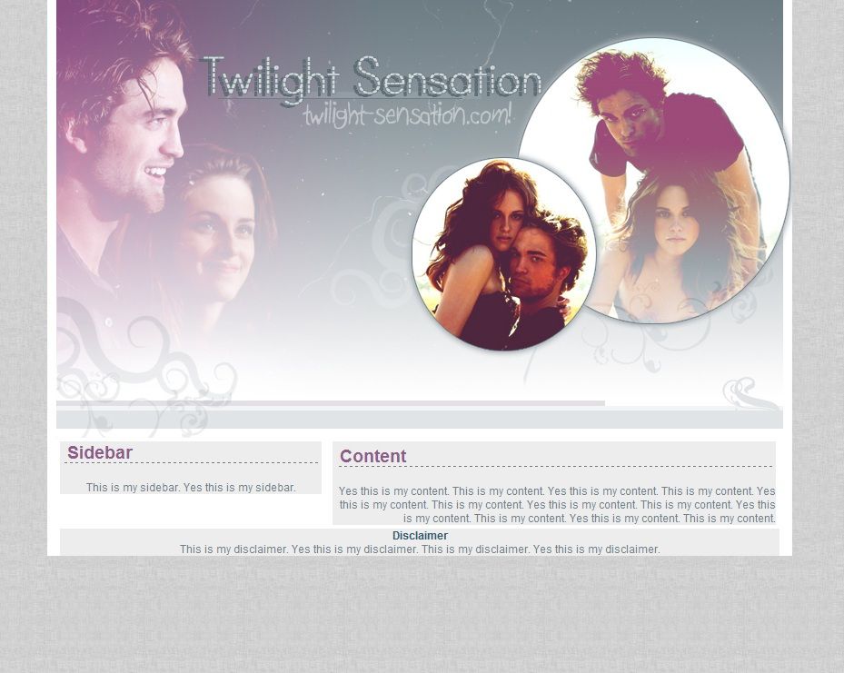
|
|
|
|


|
Dec 16 2008, 08:16 PM
Post
#2
|
|
 Senior Member Group: Member Posts: 786 Joined: Dec 2006 Member No: 488,341 |
It looks nice, I like it but I would have moved the circles closer to the other picture and inside the white line, not on it.
Font choice isn't horrible but I feel you can use a much better font. Font and text color is good. |
|
|
|

|
Dec 16 2008, 08:20 PM
Post
#3
|
|
 Mel Blanc was allergic to carrots. Group: Official Designer Posts: 6,371 Joined: Aug 2008 Member No: 676,291 |
^Yeah. I agree. Overall, the layout looks nice but maybe the disclaimer could be moved to the left but whatever floats your boat.

|
|
|
|


|
Dec 16 2008, 08:20 PM
Post
#4
|
|
 Senior Member Group: Administrator Posts: 8,629 Joined: Jan 2007 Member No: 498,468 |
QUOTE(ForgiveTheSinner @ Dec 16 2008, 05:16 PM)  It looks nice, I like it but I would have moved the circles closer to the other picture and inside the white line, not on it. Font choice isn't horrible but I feel you can use a much better font. Font and text color is good. Agreed. I love the colors you used to edit the pictures. And the brushes as well. But yes your watermark could be a bit more discrete. Oh & I fixed the topic's title for you. 
|
|
|
|


|
Dec 16 2008, 09:57 PM
Post
#5
|
|
 poison Group: Official Member Posts: 4,806 Joined: Mar 2008 Member No: 629,020 |
QUOTE(ForgiveTheSinner @ Dec 16 2008, 08:16 PM) It looks nice, I like it but I would have moved the circles closer to the other picture and inside the white line, not on it. I like it a lot, though i agree with the whole moving the circles more into the box instead of having it on the line. |
|
|
|

|
Dec 17 2008, 01:14 PM
Post
#6
|
|
 Senior Member Group: Member Posts: 254 Joined: Aug 2008 Member No: 682,007 |
...more twilight.
its nice, but i dont like the one circle going over the white line on right side. the font isn't for me either, &&& would look into that. -] |
|
|
|

|
1 User(s) are reading this topic (1 Guests and 0 Anonymous Users)
0 Members: