wh-wh-whats your fantasy? |
Resource Center Links
This Month's Contests | Hosts Looking for Hostees | Hostees looking for Hosts | BigBookofResources
Submission Guidelines
  |

 Jul 20 2008, 11:39 PM Jul 20 2008, 11:39 PM
Post
#1
|
|
|
define our lives for us.  Group: Staff Alumni Posts: 11,656 Joined: Aug 2004 Member No: 43,293 |
eh.
rusty. 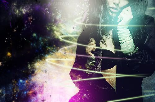 before edited c&c please? IM WEAK ON TEXT >:[ i can NEVERRR get it riiiightt. typography =/= loveeeeee |
|
|
|


|
Jul 20 2008, 11:55 PM
Post
#2
|
|
 yo yo yiggidy yo. Group: Official Member Posts: 1,606 Joined: Mar 2005 Member No: 108,591 |
this looks really amazing. i'm not too sure about the background though.
|
|
|
|


|
Jul 21 2008, 12:16 AM
Post
#3
|
|
 sang loves hayden. Group: Staff Alumni Posts: 3,373 Joined: Feb 2004 Member No: 5,687 |
That's hot.
Although the background, it looks a little awkward. Because it looks like you have a crisp picture with eye catching colors and then to the left, it looks like smudged colors. Not clear like the right side. Unbalance of quality it seems. |
|
|
|

|
Jul 21 2008, 12:46 AM
Post
#4
|
|
|
define our lives for us. Group: Staff Alumni Posts: 11,656 Joined: Aug 2004 Member No: 43,293 |
I was working on depth (perspective-wise, as in the girl is the focus and the rest is just a background - example here), but obviously failed xD
anyway, there's an edited version I tried. :D because you said it seemed really crispy.. so yeah. not much of a difference :X |
|
|
|
|
Jul 21 2008, 11:06 AM
Post
#5
|
|
 Senior Member Group: Member Posts: 944 Joined: Jul 2008 Member No: 663,413 |
I like it :)
|
|
|
|

|
Jul 21 2008, 11:48 AM
Post
#6
|
|
 :) Group: Staff Alumni Posts: 1,636 Joined: Jul 2004 Member No: 34,459 |
Thats pretty hot, I love the colors and the overall design. The "before edited" link looks about the same...
 is that just me? or did you link the wrong one? is that just me? or did you link the wrong one?
|
|
|
|

|
Jul 21 2008, 05:28 PM
Post
#7
|
|
 DDR \\ I'm Dee :) Group: Mentor Posts: 8,662 Joined: Mar 2006 Member No: 384,020 |
I really like the colors. The little dark flecks on the left of the swirls kinda threw me off. But the text doesn't stick out much. That's the only thing I would change.
|
|
|
|

|
2 User(s) are reading this topic (2 Guests and 0 Anonymous Users)
0 Members: