icons! |
Resource Center Links
This Month's Contests | Hosts Looking for Hostees | Hostees looking for Hosts | BigBookofResources
Submission Guidelines
  |

 Jul 16 2008, 06:07 PM Jul 16 2008, 06:07 PM
Post
#1
|
|
|
AKA RockIt Studios  Group: Official Member Posts: 2,286 Joined: Jun 2006 Member No: 421,809 |
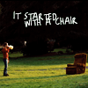
i don't even remember what brought this on, but i haven't done any iconing in a long time. i wasn't aiming for any style in particular, but i tried to stray away from familiar territory.
there's a few i really like, and one or two that i couldn't figure out how to improve. opinions? first one is my favorite.  p.s.-i'm in love with the damn sparkles. =/ |
|
|
|


|
Jul 16 2008, 06:10 PM
Post
#2
|
|
 torn Group: Official Designer Posts: 953 Joined: Oct 2004 Member No: 55,718 |
TWILIGHT FTW!
I like the last one, the last one in the second row, and why yes, you do have an addiction to sparkles. :D Don't worry, we all have our little issues. The soft light blending mode and I are joined by the hip. |
|
|
|


| *absinthe* |
Jul 16 2008, 06:17 PM
Post
#3
|
|
Guest |
 They're all pretty cute. The two on the far right in the first row are a bit bland in my opinion. Maybe add some text for the one on the far right? And for the one next to it...it doesn't seem to stand out as much as all the others. They're all pretty cute. The two on the far right in the first row are a bit bland in my opinion. Maybe add some text for the one on the far right? And for the one next to it...it doesn't seem to stand out as much as all the others. Anyway, my favorite is the one with Pattinson and his water bottle.  edit: I would personally change the font for the text in this one QUOTE I had to lean in and squint to read it. That's just me, though. |
|
|
|
|
Jul 16 2008, 07:15 PM
Post
#4
|
|
|
AKA RockIt Studios Group: Official Member Posts: 2,286 Joined: Jun 2006 Member No: 421,809 |
|
|
|
|
|
Jul 16 2008, 09:55 PM
Post
#5
|
|
 Death is a promise given to us at birth Group: Official Designer Posts: 4,757 Joined: Mar 2004 Member No: 7,459 |
very awesome. i love it.
|
|
|
|


|
Jul 16 2008, 10:01 PM
Post
#6
|
|
 Senior Member Group: Member Posts: 786 Joined: Dec 2006 Member No: 488,341 |
I like the first and last one and I don't know why (maybe it's my eyes) but some of them look a little blurry.
|
|
|
|

|
Jul 16 2008, 10:42 PM
Post
#7
|
|
 :) Group: Staff Alumni Posts: 1,636 Joined: Jul 2004 Member No: 34,459 |
I like the 7th one, but thats about it, to be honest. The others are cliché and... I want to say bland? but that isn't exactly the word I'm looking for.
I'm just.... not impressed. Sorry. |
|
|
|

|
Jul 17 2008, 12:37 PM
Post
#8
|
|
 You have no idea. Group: Member Posts: 219 Joined: Nov 2007 Member No: 586,524 |
I really favor the ones with just text. They just catch my eye.
|
|
|
|

|
Jul 17 2008, 12:39 PM
Post
#9
|
|
 <(^_^<) DANCE!(>^_^)> Group: Official Member Posts: 1,304 Joined: Nov 2007 Member No: 586,621 |
they're all awesome, but the last one is my favorite!
|
|
|
|

|
Jul 17 2008, 01:04 PM
Post
#10
|
|
 Senior Member Group: Staff Alumni Posts: 2,435 Joined: Feb 2007 Member No: 506,205 |
The last one is definately my favorite. The rest are okay. I think the sparkles are a bit tacky, to be honest. A little more coloring and editting to the actual photos may have made them a bit better, too.
|
|
|
|

|
Jul 18 2008, 05:26 PM
Post
#11
|
|
 yo yo yiggidy yo. Group: Official Member Posts: 1,606 Joined: Mar 2005 Member No: 108,591 |
i love the last one the best. but the first one is pretty awesome too, as well as the last one in the second row. great job.
|
|
|
|

|
Jul 18 2008, 05:31 PM
Post
#12
|
|
 go green! :D Group: Member Posts: 59 Joined: May 2008 Member No: 647,023 |
I like the first one & the first one in the third row.
Good job on all of them 
|
|
|
|

|
2 User(s) are reading this topic (2 Guests and 0 Anonymous Users)
0 Members: