Women's Anatomy, the ideas just keep comin! |
Resource Center Links
This Month's Contests | Hosts Looking for Hostees | Hostees looking for Hosts | BigBookofResources
Submission Guidelines

 Jun 22 2008, 07:39 PM Jun 22 2008, 07:39 PM
Post
#1
|
|
 talent on another level  Group: Member Posts: 746 Joined: Oct 2006 Member No: 475,735 |
A very personal piece I created in about 2 hours on and off. I was aiming to improve my style of simple with a WOW factor. I was inspired by elements from artist work and add my twist too it. Tell me what you think. I believe I can add so much more too it, but just need verification I'm on the right track with composition and nothing seems out of place. By the way, if you have any advice to make the feet seem less flat, please tell me, lol.
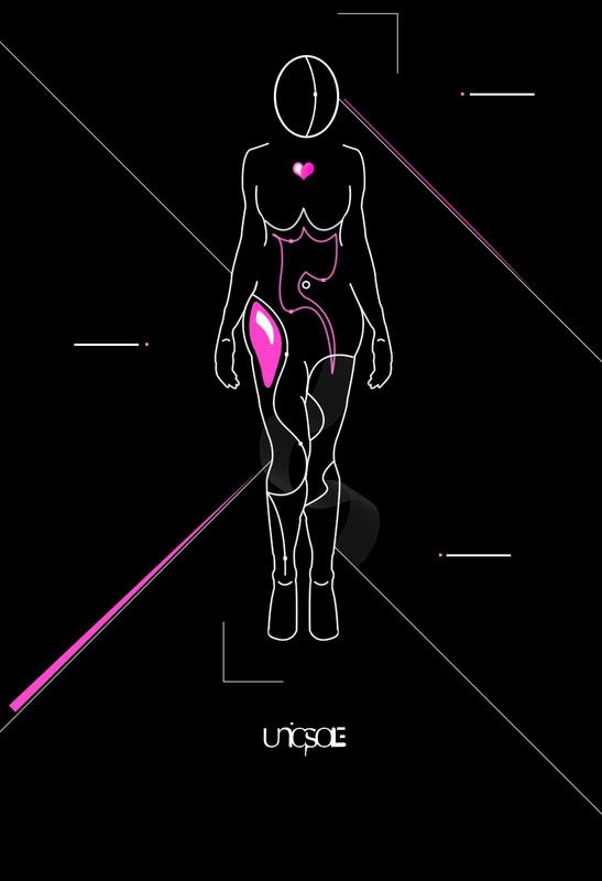 UPDATED VERSION! 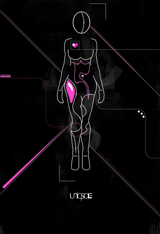 FINAL VERSION! (That I know of  ) )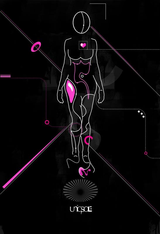
|
|
|
|


Posts in this topic
 bigtrey90 Women's Anatomy Jun 22 2008, 07:39 PM
 Vaguememory Wow, this is really neat, its like really cool. I... Jun 22 2008, 07:53 PM bigtrey90 thanks! Jun 22 2008, 08:00 PM Vaguememory your welcome =D Jun 22 2008, 08:13 PM speakerboxx123 you are very creative.
love your work
keep it up.... Jun 22 2008, 09:10 PM bigtrey90 ^ thanks for the compliment. really appreciate th... Jun 22 2008, 09:23 PM manny-the-dino this is pretty cool, i have to say. it's not y... Jun 23 2008, 10:17 PM bigtrey90 thanks for the feedback.
your right, this isn... Jun 24 2008, 06:45 AM RockItStudios i like the track you're on. but make her hips ... Jun 24 2008, 07:53 AM bigtrey90 they aren't chunky, their wide, lol.
but i se... Jun 24 2008, 09:38 AM GunsNRachel I like it. The only thing I would change though is... Jun 24 2008, 05:48 PM bijou The hips and breasts could be improved. Her should... Jun 26 2008, 03:27 PM vintage-toile this is a very interesting idea. you have pulled i... Jun 27 2008, 02:08 AM GunsNRachel Lol the hearts in the wrong spot? Jun 27 2008, 10:19 AM bigtrey90 ^ lol i know the heart is in the wrong spot. i ju... Jun 27 2008, 10:59 AM bigtrey90 i updated my topic with an edited version. i moved... Jul 4 2008, 01:02 PM
Vaguememory Wow, this is really neat, its like really cool. I... Jun 22 2008, 07:53 PM bigtrey90 thanks! Jun 22 2008, 08:00 PM Vaguememory your welcome =D Jun 22 2008, 08:13 PM speakerboxx123 you are very creative.
love your work
keep it up.... Jun 22 2008, 09:10 PM bigtrey90 ^ thanks for the compliment. really appreciate th... Jun 22 2008, 09:23 PM manny-the-dino this is pretty cool, i have to say. it's not y... Jun 23 2008, 10:17 PM bigtrey90 thanks for the feedback.
your right, this isn... Jun 24 2008, 06:45 AM RockItStudios i like the track you're on. but make her hips ... Jun 24 2008, 07:53 AM bigtrey90 they aren't chunky, their wide, lol.
but i se... Jun 24 2008, 09:38 AM GunsNRachel I like it. The only thing I would change though is... Jun 24 2008, 05:48 PM bijou The hips and breasts could be improved. Her should... Jun 26 2008, 03:27 PM vintage-toile this is a very interesting idea. you have pulled i... Jun 27 2008, 02:08 AM GunsNRachel Lol the hearts in the wrong spot? Jun 27 2008, 10:19 AM bigtrey90 ^ lol i know the heart is in the wrong spot. i ju... Jun 27 2008, 10:59 AM bigtrey90 i updated my topic with an edited version. i moved... Jul 4 2008, 01:02 PM
 ----- QUOTE(bigtrey90 @ Jul 4 2008, 01:02 PM) i... Jul 4 2008, 01:21 PM fixtatik the only thing that bugs me is the ying & yang... Jul 4 2008, 10:25 PM karmakiller I like the belly button in the first one better th... Jul 4 2008, 10:31 PM doughnut honestly, it looks very awkward Jul 4 2008, 11:11 PM bigtrey90 thanks for all the feedback and compliments. i ke... Jul 5 2008, 05:34 AM fixtatik it doesn't really come across as being a peace... Jul 5 2008, 05:49 AM bigtrey90 this is a very personal piece, so you probably won... Jul 5 2008, 06:06 AM Melie you know i really really like this a lot! to m... Jul 5 2008, 11:46 PM Markster I have to say I like this, and I like the colors y... Jul 7 2008, 11:58 AM GunsNRachel I like the updated version a lot more. Her heart i... Jul 7 2008, 02:15 PM jaeminnie I think it looks pretty cool. I like the colors. Jul 9 2008, 08:19 PM crueldade Wow, I LOVE this!! However, one thing both... Jul 9 2008, 09:29 PM bigtrey90 WOW! Thanks for all the positive feedback. i... Jul 10 2008, 05:37 PM bigtrey90 RE: Women's Anatomy Jul 11 2008, 06:02 PM GunsNRachel Hooray for the heart! Jul 11 2008, 06:48 PM bigtrey90 woooh! Jul 12 2008, 07:26 AM Designerd that is f*ckin awesome. great work. Jul 13 2008, 01:36 PM bigtrey90 RE: Women's Anatomy Jul 13 2008, 04:22 PM xXJenWearsPradaXx final is by far the best... owns all the others :)... Jul 16 2008, 12:00 AM bigtrey90 thank you! Jul 16 2008, 10:35 AM nikx618 that's pretty cool[: Jul 16 2008, 06:19 PM bigtrey90 thanks! Jul 17 2008, 09:19 AM Jachque Wow Nice Job. I wish i could do things that well D... Jul 21 2008, 10:12 PM bigtrey90 thanks for the comment.
if you keep practicing yo... Jul 22 2008, 06:10 AM arcanum Thats really neat. I like it a lot. Everything is ... Jul 22 2008, 05:00 PM bigtrey90 ^ thank you! Jul 23 2008, 05:39 AM
----- QUOTE(bigtrey90 @ Jul 4 2008, 01:02 PM) i... Jul 4 2008, 01:21 PM fixtatik the only thing that bugs me is the ying & yang... Jul 4 2008, 10:25 PM karmakiller I like the belly button in the first one better th... Jul 4 2008, 10:31 PM doughnut honestly, it looks very awkward Jul 4 2008, 11:11 PM bigtrey90 thanks for all the feedback and compliments. i ke... Jul 5 2008, 05:34 AM fixtatik it doesn't really come across as being a peace... Jul 5 2008, 05:49 AM bigtrey90 this is a very personal piece, so you probably won... Jul 5 2008, 06:06 AM Melie you know i really really like this a lot! to m... Jul 5 2008, 11:46 PM Markster I have to say I like this, and I like the colors y... Jul 7 2008, 11:58 AM GunsNRachel I like the updated version a lot more. Her heart i... Jul 7 2008, 02:15 PM jaeminnie I think it looks pretty cool. I like the colors. Jul 9 2008, 08:19 PM crueldade Wow, I LOVE this!! However, one thing both... Jul 9 2008, 09:29 PM bigtrey90 WOW! Thanks for all the positive feedback. i... Jul 10 2008, 05:37 PM bigtrey90 RE: Women's Anatomy Jul 11 2008, 06:02 PM GunsNRachel Hooray for the heart! Jul 11 2008, 06:48 PM bigtrey90 woooh! Jul 12 2008, 07:26 AM Designerd that is f*ckin awesome. great work. Jul 13 2008, 01:36 PM bigtrey90 RE: Women's Anatomy Jul 13 2008, 04:22 PM xXJenWearsPradaXx final is by far the best... owns all the others :)... Jul 16 2008, 12:00 AM bigtrey90 thank you! Jul 16 2008, 10:35 AM nikx618 that's pretty cool[: Jul 16 2008, 06:19 PM bigtrey90 thanks! Jul 17 2008, 09:19 AM Jachque Wow Nice Job. I wish i could do things that well D... Jul 21 2008, 10:12 PM bigtrey90 thanks for the comment.
if you keep practicing yo... Jul 22 2008, 06:10 AM arcanum Thats really neat. I like it a lot. Everything is ... Jul 22 2008, 05:00 PM bigtrey90 ^ thank you! Jul 23 2008, 05:39 AM  |
2 User(s) are reading this topic (2 Guests and 0 Anonymous Users)
0 Members: