
Women's Anatomy, the ideas just keep comin! |
Resource Center Links
This Month's Contests | Hosts Looking for Hostees | Hostees looking for Hosts | BigBookofResources
Submission Guidelines
  |
 Jun 22 2008, 07:39 PM Jun 22 2008, 07:39 PM
Post
#1
|
|
 talent on another level  Group: Member Posts: 746 Joined: Oct 2006 Member No: 475,735 |
A very personal piece I created in about 2 hours on and off. I was aiming to improve my style of simple with a WOW factor. I was inspired by elements from artist work and add my twist too it. Tell me what you think. I believe I can add so much more too it, but just need verification I'm on the right track with composition and nothing seems out of place. By the way, if you have any advice to make the feet seem less flat, please tell me, lol.
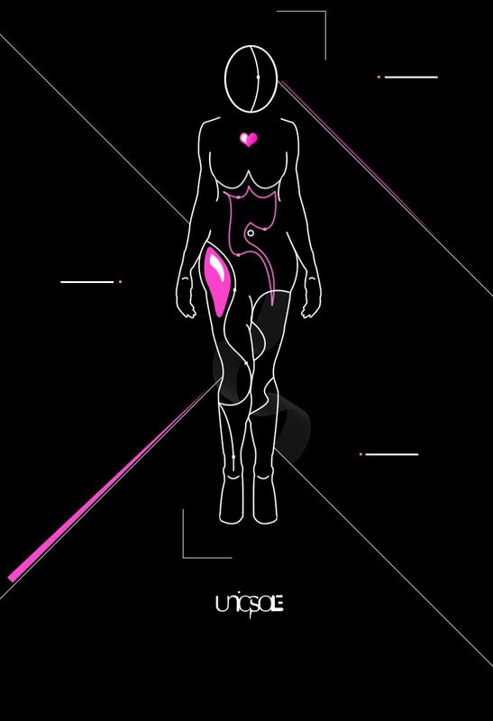 UPDATED VERSION! 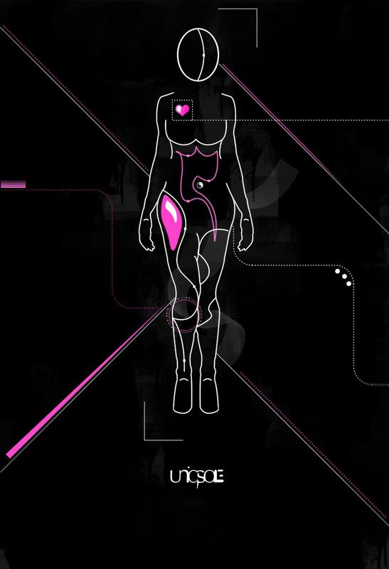 FINAL VERSION! (That I know of  ) )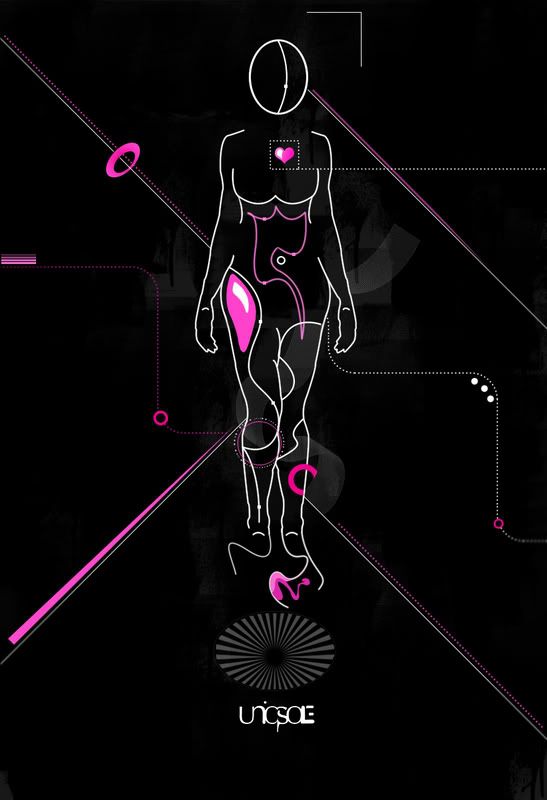
|
|
|
|


|
Jun 22 2008, 07:53 PM
Post
#2
|
|
 GREAKAZOID RCDcrewmember MODLION 1st class MODPIGGY 2nd class... Group: Member Posts: 211 Joined: Feb 2008 Member No: 624,214 |
Wow, this is really neat, its like really cool. I'm not good with it, I think its awsome though =]
|
|
|
|


|
Jun 22 2008, 08:00 PM
Post
#3
|
|
|
talent on another level Group: Member Posts: 746 Joined: Oct 2006 Member No: 475,735 |
thanks!
|
|
|
|
|
Jun 22 2008, 08:13 PM
Post
#4
|
|
|
GREAKAZOID RCDcrewmember MODLION 1st class MODPIGGY 2nd class... Group: Member Posts: 211 Joined: Feb 2008 Member No: 624,214 |
your welcome =D
|
|
|
|
|
Jun 22 2008, 09:10 PM
Post
#5
|
|
|
im with the marching band Group: Member Posts: 740 Joined: Dec 2006 Member No: 491,167 |
you are very creative.
love your work keep it up. p.s.you should write tutorials. |
|
|
|

|
Jun 22 2008, 09:23 PM
Post
#6
|
|
|
talent on another level Group: Member Posts: 746 Joined: Oct 2006 Member No: 475,735 |
^ thanks for the compliment. really appreciate that!
i used to make tutorials for my website, but i'll keep that idea in mind. |
|
|
|
|
Jun 23 2008, 10:17 PM
Post
#7
|
|
 Senior Member Group: Administrator Posts: 8,629 Joined: Jan 2007 Member No: 498,468 |
this is pretty cool, i have to say. it's not your typical text book diagram of a woman's anatomy. the only thing that i think you can fix are the shape of her breasts; they sort of look likes pecs, tbh.
 & she doesn't have a neck, now that i think of it. haaha maybe you should add a neck so she looks human. lol & she doesn't have a neck, now that i think of it. haaha maybe you should add a neck so she looks human. lolbut this is good overall. great job! 
|
|
|
|


|
Jun 24 2008, 06:45 AM
Post
#8
|
|
|
talent on another level Group: Member Posts: 746 Joined: Oct 2006 Member No: 475,735 |
thanks for the feedback.
your right, this isn't the typical anatomy because it won't be. certain features are changed to my style. |
|
|
|
|
Jun 24 2008, 07:53 AM
Post
#9
|
|
|
AKA RockIt Studios Group: Official Member Posts: 2,286 Joined: Jun 2006 Member No: 421,809 |
i like the track you're on. but make her hips less obvious. like, instead of "chunky", make them "curvy". :]
|
|
|
|

|
Jun 24 2008, 09:38 AM
Post
#10
|
|
|
talent on another level Group: Member Posts: 746 Joined: Oct 2006 Member No: 475,735 |
they aren't chunky, their wide, lol.
but i see what you mean. |
|
|
|
|
Jun 24 2008, 05:48 PM
Post
#11
|
|
 Senior Member Group: Member Posts: 292 Joined: Jul 2007 Member No: 545,047 |
I like it. The only thing I would change though is where her butt/hips go into her leg. You should smooth it out there instead of having the dent. It does make her look a little chunky.
|
|
|
|

|
Jun 26 2008, 03:27 PM
Post
#12
|
|
 Senior Member Group: Member Posts: 113 Joined: Sep 2005 Member No: 221,897 |
The hips and breasts could be improved. Her shoulders have a strange posture as do her legs as though she's about to cross them or has to urinate badly.
Overall, I really like it. It's very creative and I like the use of color. |
|
|
|
|
Jun 27 2008, 02:08 AM
Post
#13
|
|
 Kissing for yesterday. Group: Official Designer Posts: 465 Joined: Sep 2007 Member No: 569,813 |
this is a very interesting idea. you have pulled it off well. to make the feet less flat add some tiny curves into them to suggest toes?
overall a good job. |
|
|
|

|
Jun 27 2008, 10:19 AM
Post
#14
|
|
|
Senior Member Group: Member Posts: 292 Joined: Jul 2007 Member No: 545,047 |
Lol the hearts in the wrong spot?
|
|
|
|
|
Jun 27 2008, 10:59 AM
Post
#15
|
|
|
talent on another level Group: Member Posts: 746 Joined: Oct 2006 Member No: 475,735 |
^ lol i know the heart is in the wrong spot. i just have a habit of putting everything in the center. i guess i should make this seem more accurate and get out of this CENTERED anxiety.
thanks for all the feedback and suggestions. |
|
|
|
|
Jul 4 2008, 01:02 PM
Post
#16
|
|
|
talent on another level Group: Member Posts: 746 Joined: Oct 2006 Member No: 475,735 |
i updated my topic with an edited version. i moved the heart to the right place, lol, and changed the background.
i like how there is no neck, because......i just like it.  the feet, i don't even know where to begin to edit them, so any tips would be great. i smoothed out the hips as well. |
|
|
|
|
Jul 4 2008, 01:21 PM
Post
#17
|
|
 ;) Group: Duplicate Posts: 2,374 Joined: Feb 2004 Member No: 3,760 |
QUOTE(bigtrey90 @ Jul 4 2008, 01:02 PM)  i updated my topic with an edited version. i moved the heart to the right place, lol, and changed the background. hm. the heart should technically be on the right for us (since it's on her left). and it's actually closer to the middle than it is on the "left." but i get that this isn't supposed to be completely anatomically correct. it's a good graphic, nonetheless. |
|
|
|

|
Jul 4 2008, 10:25 PM
Post
#18
|
|
|
Senior Member Group: Member Posts: 1,237 Joined: May 2008 Member No: 648,123 |
the only thing that bugs me is the ying & yang on her stomach. why?
everything else i absolutely love. i even love that her heart is on the wrong side. seriously, if i had the money and you had a huge copy, i'd buy a print of it. you should sell it somewhere |
|
|
|

|
Jul 4 2008, 10:31 PM
Post
#19
|
|
 DDR \\ I'm Dee :) Group: Mentor Posts: 8,662 Joined: Mar 2006 Member No: 384,020 |
I like the belly button in the first one better than the belly button in the second one. I really like the idea behind it and I think it looks awesome. You get an A+ on the wow factor. I think, though, that you could do her toes kinda like how you did her fingers, only a little more rounded. They seem a little jagged.
|
|
|
|

|
Jul 4 2008, 11:11 PM
Post
#20
|
|
 (′ ・ω・`) Group: Official Designer Posts: 6,179 Joined: Dec 2004 Member No: 72,477 |
honestly, it looks very awkward
|
|
|
|

|
Jul 5 2008, 05:34 AM
Post
#21
|
|
|
talent on another level Group: Member Posts: 746 Joined: Oct 2006 Member No: 475,735 |
thanks for all the feedback and compliments. i keep all tips in mind.
i meant to say on the "right" side of the chest instead of place, lol. the ying yang as her belly button is supposed to represent peace. awkward but different. i wasn't really thinking about making a print, but i'll keep that in mind later. |
|
|
|
|
Jul 5 2008, 05:49 AM
Post
#22
|
|
|
Senior Member Group: Member Posts: 1,237 Joined: May 2008 Member No: 648,123 |
it doesn't really come across as being a peaceful theme. dripping grunge, a torn apart anatomy, and lines darting this way and that, almost saying "eat me here." thigh, roasted or baked?
//edit: though, now that i think about it, it's like a little bit of peace in a world of calamity. |
|
|
|
|
Jul 5 2008, 06:06 AM
Post
#23
|
|
|
talent on another level Group: Member Posts: 746 Joined: Oct 2006 Member No: 475,735 |
this is a very personal piece, so you probably won't understand why things are set up a certain way, etc.
|
|
|
|
|
Jul 5 2008, 11:46 PM
Post
#24
|
|
 Melieized Group: Official Designer Posts: 1,372 Joined: Nov 2006 Member No: 478,715 |
you know i really really like this a lot! to me, it feels like it needs some type of text on some of those lines. but i really really like this!!
|
|
|
|

|
Jul 7 2008, 11:58 AM
Post
#25
|
|
 Senior Member Group: Staff Alumni Posts: 1,815 Joined: Jun 2006 Member No: 423,396 |
I have to say I like this, and I like the colors you used. But I can't decide whether I like the first one or the updated one better.
|
|
|
|

|
1 User(s) are reading this topic (1 Guests and 0 Anonymous Users)
0 Members: