What should I do with this? |
  |

 May 20 2008, 02:58 PM May 20 2008, 02:58 PM
Post
#1
|
|
 Senior Member  Group: Member Posts: 292 Joined: Jul 2007 Member No: 545,047 |
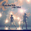
I like this, and I want to use it for my website layout, but I don't know what to do with it? And something about it just.. irks me. Any suggestions?
Reason for edit: thumb your pictures, please. thanks! :D
|
|
|
|


|
May 20 2008, 03:46 PM
Post
#2
|
|
|
Senior Member Group: Official Member Posts: 1,028 Joined: Sep 2007 Member No: 579,129 |
Well, firstly, did you make it?
The picture quality ain't so great for one thing. I really don't know. It's just a bunch of pictures blended together. Perhaps use some brushes? Add text? I'm not too fond of it, but you can definitely work on it. G'luck  Hope I helped a little. Hope I helped a little.
|
|
|
|


|
May 20 2008, 06:01 PM
Post
#3
|
|
 sang loves hayden. Group: Staff Alumni Posts: 3,373 Joined: Feb 2004 Member No: 5,687 |
I think it's best to move this thread to Graphics Help because you are asking suggestions on this banner. Showcase Booth is mainly for a finish product.
IMO, I think there should be some kind of texture on top of it. If you don't want to add textures with layer styles on top of it, try colorizing it. You might end up with an awesome product, when you are messing around with textures/brushes/colorization/etc. The blending in the middle (the girl and the clown), is not that good. Try to blend but get rid of that white areas. It throws away the image. |
|
|
|

|
May 20 2008, 06:20 PM
Post
#4
|
|
 yo yo yiggidy yo. Group: Official Member Posts: 1,606 Joined: Mar 2005 Member No: 108,591 |
its actually kind of creepy. i think i would like it better if that clown wasn't there. lol. and in that section since the girl looks brighter, maybe you should enlarge her photo and put it to the far left because she looks real odd there. lol.
|
|
|
|

|
May 20 2008, 07:04 PM
Post
#5
|
|
 Senior Member Group: Administrator Posts: 8,629 Joined: Jan 2007 Member No: 498,468 |
i really like the idea you have here but yeah there is something that "irks" me. i think it's probably the 2nd image you blended into this; it just looks really random & faded unlike the other pictures you used.
but other than that, i gotta say, this is BOMB! lol
|
|
|
|

|
May 20 2008, 08:01 PM
Post
#6
|
|
|
Senior Member Group: Member Posts: 292 Joined: Jul 2007 Member No: 545,047 |
I keep losing this from it being moved all over the place!
 Anyway, I changed it a bit.. I like the idea of putting a texture on it, but what? I think I want to have it look sparklie or something, but I'm not sure. Suggestions would be greatly appreciated =D |
|
|
|

|
May 20 2008, 08:06 PM
Post
#7
|
|
|
Senior Member Group: Administrator Posts: 8,629 Joined: Jan 2007 Member No: 498,468 |
i think it's your blending that's weird, tbh.

|
|
|
|
|
May 20 2008, 08:40 PM
Post
#8
|
|
|
Senior Member Group: Member Posts: 292 Joined: Jul 2007 Member No: 545,047 |
Argh, yea I use the gradient method. I'm not sure why this is giving me such a hard time, I usually don't make them look that weird. Is there another way that you guys recommend I use to blend?
|
|
|
|
|
May 20 2008, 08:52 PM
Post
#9
|
|
|
Senior Member Group: Member Posts: 1,237 Joined: May 2008 Member No: 648,123 |
i hate to be the one who's gonna bash it. it's just the whole concept of header images with redundant people in the same position. kinda cliché, but that might just be me.
working with images like these is dangerous. you can make it look good if you really put some effort into it, but if you just take a celebrity and copy his / her face and paste it on itself 14 times, then it starts looking like a 10 year old's piczo page. even more-so than most people realize, unless you took the photograph yourself, got it from a free stock photo site and received permission from the photographer, or paid for the image, it's copyright infringement. i'd say use only one image, but add in some original designs with non-standardized text (meaning don't grab a love quote or a song lyric just to slap on there). try experimenting with different layers of the same image. for example, you can add effects behind the person, but in front of the background. try to give the header a common theme with the rest of your site. too many people copy and paste a picture with a quote like "pain is good" and call it artwork...and then their sites are happy and chipper with bright colors. doesn't make much sense to me. it's like anyone with photoshop is a self-proclaimed graphic designer. i know i suck at photoshop, which is why i try my best to keep my layout graphics to a minimum, and focus on interesting coding. |
|
|
|


|
May 20 2008, 11:39 PM
Post
#10
|
|
|
Senior Member Group: Member Posts: 88 Joined: May 2008 Member No: 648,583 |
i think you should use only like 2 images and put a harder edge to your blending. it's a bit too faded
|
|
|
|
|
May 29 2008, 11:10 AM
Post
#11
|
|
 "Did I scare you?" Group: Member Posts: 179 Joined: Sep 2006 Member No: 468,620 |
I actually prefer the first one to the second try because the blending is better, although I agree, it needs to be a little sharper, with the clowns face gone. :)
|
|
|
|

|
May 30 2008, 04:50 AM
Post
#12
|
|
 Kissing for yesterday. Group: Official Designer Posts: 465 Joined: Sep 2007 Member No: 569,813 |
i prefer the blending on the first one, as on the second it literally does look like you have simply taken four images from a set and erased the area inbetween.
the first one would have worked very well if you had removed the clown and the ghosty picture of the woman below it and kwept it to a set of three, then add some texture and brushes etc. really, the second one is too basic so i would say scrap that one for another day and work on the original. |
|
|
|

|
May 31 2008, 03:29 PM
Post
#13
|
|
 awestinnn Group: Member Posts: 624 Joined: Aug 2006 Member No: 460,069 |
Another good thing to do would be to add a dominant element to it - add something so it catches your eye first, and then leads to other parts of the image. Try a more close up picture of her, for starters.
|
|
|
|

|
2 User(s) are reading this topic (2 Guests and 0 Anonymous Users)
0 Members: