Wallpapers, ++various++ |
Resource Center Links
This Month's Contests | Hosts Looking for Hostees | Hostees looking for Hosts | BigBookofResources
Submission Guidelines
  |

 May 11 2008, 03:13 AM May 11 2008, 03:13 AM
Post
#1
|
|
|
Senior Member  Group: Member Posts: 33 Joined: May 2008 Member No: 648,286 |
Here are a few simple wallpapers I made the other day. Please click on the thumbnails for full size. Thank you. Feedback and suggestions are appreciated.
David Duchovny & Gillian Anderson: 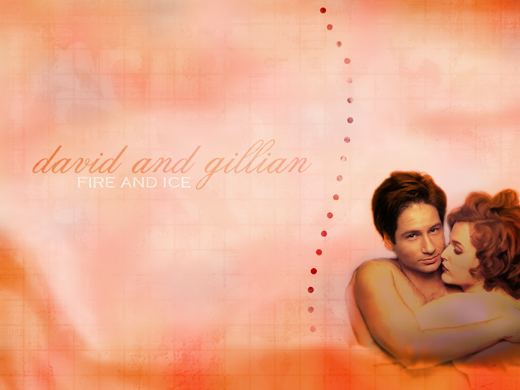   Angelina Jolie: 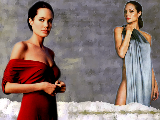 Aly (of Aly & AJ): 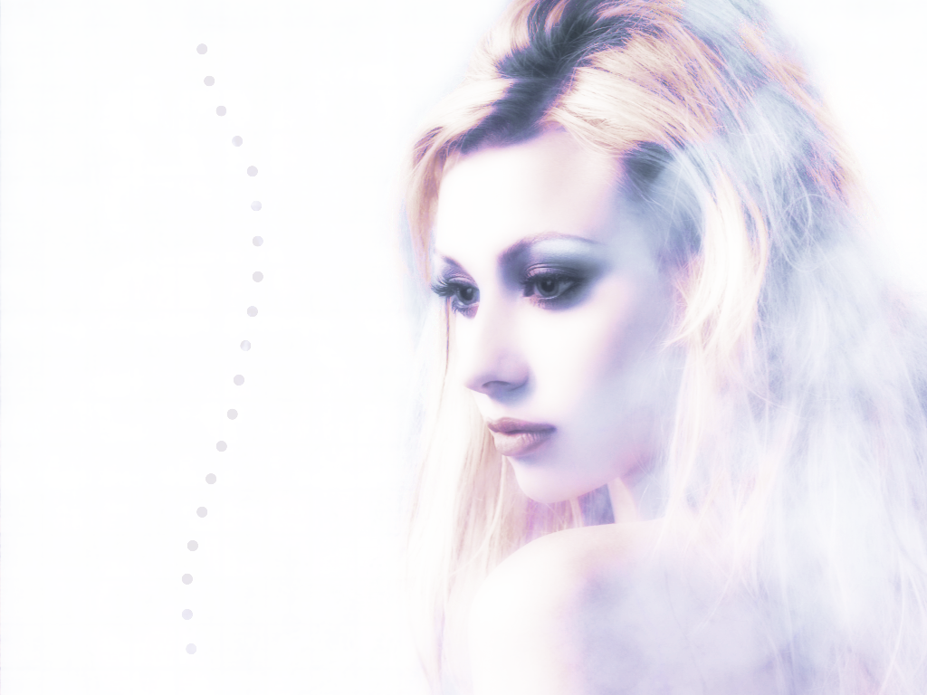 |
|
|
|


|
May 11 2008, 03:22 AM
Post
#2
|
|
|
We're Over 9,000!!!1! Group: Human Posts: 307 Joined: Jan 2006 Member No: 352,435 |
hmm they're generally pretty neat wallpapers. but i personally am not digging the background on the angelina jolie wallpaper. i like grey and all but the texture for the background seems a bit..eh not appealing to me. that's just my opinion, i'm sure others probably like it.
but good job! |
|
|
|


| *absinthe* |
May 11 2008, 03:32 AM
Post
#3
|
|
Guest |
I agree with TiffanyFactorial on them being generally neat wallpapers. I'm also not feeling the Jolie background for some reason.
They're pretty nicely done, imo. I think some could use a bit more to them, though. |
|
|
|
|
May 11 2008, 03:32 AM
Post
#4
|
|
|
Senior Member Group: Member Posts: 33 Joined: May 2008 Member No: 648,286 |
QUOTE(TiffanyFactorial @ May 11 2008, 01:22 AM)  hmm they're generally pretty neat wallpapers. but i personally am not digging the background on the angelina jolie wallpaper. i like grey and all but the texture for the background seems a bit..eh not appealing to me. that's just my opinion, i'm sure others probably like it. but good job! I agree with you on the Angie one. It isn't the best thing I've ever done. I appreciate the feedback. Thank you! |
|
|
|
|
May 11 2008, 11:22 AM
Post
#5
|
|
 Senior Member Group: Head Staff Posts: 18,173 Joined: Mar 2005 Member No: 108,478 |
They're pretty. :)
|
|
|
|
|
May 11 2008, 05:10 PM
Post
#6
|
|
|
Senior Member Group: Member Posts: 33 Joined: May 2008 Member No: 648,286 |
QUOTE(Synesthesia @ May 11 2008, 09:22 AM) They're pretty. :) thank you 
|
|
|
|
|
May 12 2008, 06:12 PM
Post
#7
|
|
 crushed. Group: Staff Alumni Posts: 9,432 Joined: Jun 2004 Member No: 20,026 |
aw, i love watching x-files re-runs
 they look pretty good-the second one seems to have a poorer quality than the rest of them. my favorite one is the third one. and like others have said, the texture and background of the angelina jolie doesn't seem all that appealing-maybe it's because of the color. you should also add borders to all of them. |
|
|
|

|
May 14 2008, 08:24 PM
Post
#8
|
|
 stop staring >_> Group: Member Posts: 497 Joined: Aug 2006 Member No: 455,389 |
David Duchovny & Gillian Anderson: Do you notice how the bottom of their arms look like they ate too much carrots and turned orange? Your background seem to be very unorganized and not flowing. There's simplicity, but there's also unorganized simplicity. This fall in the unorganized. Again it doesnt flow whatsoever. Maybe try adding something more artistic rather than just brushes and images. this is better =) Angelina Jolie: glowie figure? no no. LOL Aly (of Aly & AJ): my favorite but the wavey line killed it LOL. |
|
|
|
|
May 14 2008, 08:52 PM
Post
#9
|
|
 Senior Member Group: Administrator Posts: 8,629 Joined: Jan 2007 Member No: 498,468 |
i also agree with everyone else that they are generally good wallpaper.
although the angeline jolie one is weird. perhaps because of the different styles of pictures you used. the one where she is in a dress seems elegant but the other one screams "sexual." LOL also, i'm not so fond of the aly one; she looks like a ghost, imo. other than that, good job! 
|
|
|
|

|
May 15 2008, 10:56 AM
Post
#10
|
|
|
Senior Member Group: Member Posts: 33 Joined: May 2008 Member No: 648,286 |
thank you for the feedback and suggestions. where can I find some good brushes and brush techniques for Paint Shop Pro 8?
I have brushes, but I don't really know how to use them properly. I tend to just randomly put a bunch onto a page and then stick some photos on top and there you have it. Not the best approach to making artwork, I'm sure. I made these awhile back:    and I don't know... They're a bit off. my friend said the polaroids in the Mel C one seemed out of place. I agree, but it was empty space and I wanted to fill it with something. I am open to suggestions and any help you want to offer. I'd really like to improve on my work and be able to make things like layouts and such. and not just the simple wallpaper here and there. also, I have been trying to do something with this photo for the past 5 days because I love the coloring on it, but nothing is working out. Any suggestions? thanks again! |
|
|
|
|
2 User(s) are reading this topic (2 Guests and 0 Anonymous Users)
0 Members: