Portfolio - v5, ... |
Resource Center Links
This Month's Contests | Hosts Looking for Hostees | Hostees looking for Hosts | BigBookofResources
Submission Guidelines
  |

 May 11 2008, 11:35 AM May 11 2008, 11:35 AM
Post
#1
|
|
 ;)  Group: Duplicate Posts: 2,374 Joined: Feb 2004 Member No: 3,760 |
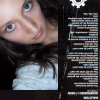
so... i changed my layout AGAIN. i have no clue why, just felt the impulse to do it, i guess.
i know it works on firefox and IE, so if you're on safari or opera, please tell me if it's ok! http://heartquasm.org |
|
|
|


|
May 11 2008, 12:01 PM
Post
#2
|
|
 AIDS at RAVES. Group: Official Designer Posts: 2,386 Joined: Dec 2007 Member No: 598,878 |
woah that was a short period, but I love V5 but I didnt know where the nav was until I hovered over quasm lol I love your rollovers and concept:]
|
|
|
|

|
May 11 2008, 12:01 PM
Post
#3
|
|
 Senior Member Group: Head Staff Posts: 18,173 Joined: Mar 2005 Member No: 108,478 |
I really like the rollovers. You always have great ones. :D The old love one was cool too, though.
|
|
|
|
|
May 11 2008, 12:14 PM
Post
#4
|
|
 Senior Member Group: Staff Alumni Posts: 1,815 Joined: Jun 2006 Member No: 423,396 |
Since simplicity appeals to me, I think I like this one better. :] Nav is very creative. And I like how all the letters correspond to something except for the "u". XD
|
|
|
|


|
May 11 2008, 12:19 PM
Post
#5
|
|
 <joke> inside </joke> Group: Official Member Posts: 2,283 Joined: Oct 2006 Member No: 470,590 |
its not loading on mine
but its probably because im downloading this ginormous thing thatll take a day and 4 hrs to complete  //edit ooo, i do like =] and your rollovers are certainly attractive ;] and i like how everything happens in that one page oh, and i got this when i pressed the 'x' in the portfolio section: http://heartquasm.org/test.php |
|
|
|


|
May 11 2008, 12:31 PM
Post
#6
|
|
|
;) Group: Duplicate Posts: 2,374 Joined: Feb 2004 Member No: 3,760 |
ah shit!
ok fixing. thanks! /edit/ fixed! yeah, it's supposed to redirect to index, but since i had my other layout up, i had to put it to test and forgot to change it back. >< @ skylite: hm, i thought the nav was sort of obvious since "quasm" is pretty big, but i'll see if i can put in a sort of hint, lol. thanks. |
|
|
|
|
May 11 2008, 12:54 PM
Post
#7
|
|
 Senior Member Group: Member Posts: 292 Joined: Jul 2007 Member No: 545,047 |
I like it, it's very cute.
In your "recent additons" though, you have a little picture of a guy (Sweeney Todd?) and when you click on it something totally different comes up. |
|
|
|

|
May 11 2008, 03:02 PM
Post
#8
|
|
|
;) Group: Duplicate Posts: 2,374 Joined: Feb 2004 Member No: 3,760 |
^ thanks. i fixed it lol. obviously i should've done some more proof-reading.
|
|
|
|
|
May 11 2008, 09:13 PM
Post
#9
|
|
 torn Group: Official Designer Posts: 953 Joined: Oct 2004 Member No: 55,718 |
Oohhh, I like, I like! :] Love the rollovers and the individual boxes - really neat concept. And the little people. XD
|
|
|
|

|
May 12 2008, 12:24 PM
Post
#10
|
|
|
the WILD one Group: Official Designer Posts: 90 Joined: May 2008 Member No: 647,118 |
it's amazing<3
but you knew that already. |
|
|
|

|
May 12 2008, 03:15 PM
Post
#11
|
|
 yo yo yiggidy yo. Group: Official Member Posts: 1,606 Joined: Mar 2005 Member No: 108,591 |
wow, that looks great.
|
|
|
|

|
May 12 2008, 03:17 PM
Post
#12
|
|
|
Senior Member Group: Official Member Posts: 1,028 Joined: Sep 2007 Member No: 579,129 |
Wow, it looks really nice.
The roller over is really pretty, but then it got me confused a little. However, it's probably because I'm so simple-minded o_o. |
|
|
|

|
May 12 2008, 03:23 PM
Post
#13
|
|
|
;) Group: Duplicate Posts: 2,374 Joined: Feb 2004 Member No: 3,760 |
^ haha, I think you were watching it while I was in the middle of editing the rollovers. Idk, if you look again maybe it'll make more sense?
But yeah, I changed the letters on the bottom so it's more obvious that it's a nav. |
|
|
|
|
May 12 2008, 05:12 PM
Post
#14
|
|
|
Senior Member Group: Staff Alumni Posts: 1,815 Joined: Jun 2006 Member No: 423,396 |
Awesome, I love the new navigation now, how the word highlights on hover. xD But now I think it's unnecessary to keep the text "nav*" with the red downward arrow.
|
|
|
|
|
May 12 2008, 06:02 PM
Post
#15
|
|
|
(. .) Group: Official Member Posts: 2,367 Joined: Jun 2004 Member No: 20,089 |
it's way more organized and cleaner looking, while still maintaining your style. i also like the huge "quasm"; it's something that's not seen everywhere right now. good update

|
|
|
|

|
May 14 2008, 01:01 AM
Post
#16
|
|
|
;) Group: Duplicate Posts: 2,374 Joined: Feb 2004 Member No: 3,760 |
:) thanks!
I'm really excited because my friend down the hall just told me she could let me borrow her adobe cs3 suite and I'm super excited. I haven't used photoshop or illustrator in a really long time and I'm REALLY excited about finally learning flash this summer. |
|
|
|
|
May 14 2008, 02:51 AM
Post
#17
|
|
 Liz Group: Member Posts: 77 Joined: May 2008 Member No: 646,940 |
that's amazing! I love the rollovers! you're so creative <3
|
|
|
|

|
May 25 2008, 12:27 AM
Post
#18
|
|
 Senior Member Group: Member Posts: 113 Joined: Sep 2005 Member No: 221,897 |
It's a great layout, the navigation is creative and functionally good.
|
|
|
|
|
2 User(s) are reading this topic (2 Guests and 0 Anonymous Users)
0 Members: