Graphic help, need some feedback |
Resource Center Links
This Month's Contests | Hosts Looking for Hostees | Hostees looking for Hosts | BigBookofResources
Submission Guidelines
  |

 Apr 24 2008, 07:10 AM Apr 24 2008, 07:10 AM
Post
#1
|
|
 Member  Group: Member Posts: 20 Joined: Aug 2006 Member No: 452,308 |
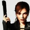
What do you think about it? its been rejected a lot, nd wanted to know how i can improve it and ideas, thankks
 
|
|
|
|


|
Apr 24 2008, 07:14 AM
Post
#2
|
|
 Addict Group: Staff Alumni Posts: 3,918 Joined: Jun 2007 Member No: 538,522 |
I like the concept and the quote - but the design needs to be stepped up a little.
Firstly, what is it that you're trying to create? A banner? An avatar? The size is making it a bit obsolete. Once you've got your proportions down, work on the text. Yellow, pixellated text squished into the bottom corner isn't doing your idea any justice. 
|
|
|
|


|
Apr 24 2008, 07:21 AM
Post
#3
|
|
|
Member Group: Member Posts: 20 Joined: Aug 2006 Member No: 452,308 |
Well, im trying to create a banner, I cant find any good places to palce the text, could place it in the same position, but upwards so its a bit above the nails if you get me XD
EDIT: the text doesn't look pixelated to me 
|
|
|
|
|
Apr 24 2008, 10:15 AM
Post
#4
|
|
|
Addict Group: Staff Alumni Posts: 3,918 Joined: Jun 2007 Member No: 538,522 |
Sorry, I didn't mean pixellated - I meant blurred. Try using the anti-aliasing tool on Photoshop to fix that.
OK, so you're creating a banner - typically banners will have a greater width than height so you'll need to get that sorted. To make your text stand out more, try using a white color and drop shadow the text. Set opacity levels to whatever you think is best. For banners to be accepted on Createblog, you'll need to demonstrate a medium to high level of creativity, effort and design. That does mean using different layering techniques, brushes and smartening up fonts.
|
|
|
|
|
Apr 24 2008, 10:19 AM
Post
#5
|
|
 <(^_^<) DANCE!(>^_^)> Group: Official Member Posts: 1,304 Joined: Nov 2007 Member No: 586,621 |
i agree about the proportions and colors. the font just doesn't fit for me, maybe if you used something that stood out more?!?!
 but i do like the idea/concept & quote. but i do like the idea/concept & quote.
|
|
|
|

|
Apr 24 2008, 11:40 AM
Post
#6
|
|
|
Member Group: Member Posts: 20 Joined: Aug 2006 Member No: 452,308 |
ooh, thing is om not great at photoshop >.<
if i make the width greater then the height, it'll kind of ruin the picture. im sure i used anti aliasing on it meh ill have another go at it thankss any more ideas or advice? |
|
|
|
|
Apr 24 2008, 11:40 AM
Post
#7
|
|
 crushed. Group: Staff Alumni Posts: 9,432 Joined: Jun 2004 Member No: 20,026 |
QUOTE(S-Majere @ Apr 24 2008, 11:15 AM)  For banners to be accepted on Createblog, you'll need to demonstrate a medium to high level of creativity, effort and design. That does mean using different layering techniques, brushes and smartening up fonts. yes, you can't just take a picture and add some text on it. i do like the concept, but i don't think the gray and yellow mesh together very well. the font also looks a little plain, so maybe choose one that stands out a little more (you can go to dafont.com), or add effects (like outlining or shadows)~like people above have mentioned already 
|
|
|
|

|
Apr 24 2008, 01:24 PM
Post
#8
|
|
|
Adobe Addict Group: Staff Alumni Posts: 1,237 Joined: Mar 2005 Member No: 113,043 |
I agree with all remarks said here...
A word of advice: Don't try to resize the picture to a larger size. What you need to do is either A, increase the CANVAS size, or B obtain a larger picture. I'd go with B. |
|
|
|

|
Apr 24 2008, 01:44 PM
Post
#9
|
|
|
Member Group: Member Posts: 20 Joined: Aug 2006 Member No: 452,308 |
QUOTE(digitalfragrance @ Apr 24 2008, 06:24 PM) I agree with all remarks said here... A word of advice: Don't try to resize the picture to a larger size. What you need to do is either A, increase the CANVAS size, or B obtain a larger picture. I'd go with B. I'm not making it bigger, im making it smaller. The original photo size is huge |
|
|
|
|
Apr 24 2008, 02:32 PM
Post
#10
|
|
 yo yo yiggidy yo. Group: Official Member Posts: 1,606 Joined: Mar 2005 Member No: 108,591 |
i don't really like it, i guess its because of the font? the yellow really doesn't fit the photo for me. try using a font and color that works better.
|
|
|
|

|
Apr 24 2008, 02:42 PM
Post
#11
|
|
|
Member Group: Member Posts: 20 Joined: Aug 2006 Member No: 452,308 |
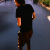
i'm back with a new banner, well the same but changed a few things
 Hope this is a bit better, i looked at a few tutorials on here, but none really suited this image, or i couldnt get it the way i wanted it. Anyways, tell me what you guys think! and how i can improve nd stuff |
|
|
|
|
Apr 24 2008, 06:30 PM
Post
#12
|
|
 The Illustrious Mari C. Group: Member Posts: 586 Joined: Jul 2004 Member No: 26,671 |
It looks a lot better but I still think you should probably do something with the text, like an outline or some effect unless you just wanted the text to look that way
|
|
|
|

|
Apr 24 2008, 07:24 PM
Post
#13
|
|
 Senior Member Group: Administrator Posts: 8,629 Joined: Jan 2007 Member No: 498,468 |
well..
first off, i LOVE the picture. very good capture. as for designing a banner using it, i can tell you really want to use text. i'm trying to think of how you can incorporate text into this. you can just trying submitting it as a stock photo. it most likely get accepted. but as for a banner... i'm fresh out of ideas. if i come up with one, i'll edit my post
|
|
|
|

|
Apr 24 2008, 07:34 PM
Post
#14
|
|
|
yo yo yiggidy yo. Group: Official Member Posts: 1,606 Joined: Mar 2005 Member No: 108,591 |
hmmm, this is better. the color of the text fits the image better, but i'm not too sure about the positioning of the text.
i agree with natalia. you should try re-submitting it as a stock photo without the text. |
|
|
|
|
Apr 25 2008, 11:48 AM
Post
#15
|
|
|
Member Group: Member Posts: 20 Joined: Aug 2006 Member No: 452,308 |
wehey, thank you!
The position of the text is a little odd, still trying to figure out where yo put it. i dont mind not having text, but i kinda wanna get a point across with the picture..Stock photo would probably be best. Thanks everyone  EDIT: Ok..turns out it was a little boring without the text, and got rejected..again. said i should use some brushes, i downloaded a whole bunch, but not sure how i can use it to this image..anyone help? thankss |
|
|
|
|
1 User(s) are reading this topic (1 Guests and 0 Anonymous Users)
0 Members: