I need advice (=, I would love some honest opinions on this (= |
Resource Center Links
This Month's Contests | Hosts Looking for Hostees | Hostees looking for Hosts | BigBookofResources
Submission Guidelines
  |

 Apr 20 2008, 06:49 PM Apr 20 2008, 06:49 PM
Post
#1
|
|
|
Member  Group: Member Posts: 24 Joined: Apr 2008 Member No: 637,980 |
 Any comments? advice? opinions? etc (= |
|
|
|


|
Apr 20 2008, 07:37 PM
Post
#2
|
|
 /人◕‿‿◕人\ Group: Official Member Posts: 8,283 Joined: Dec 2007 Member No: 602,927 |
I like it, but what are you planning on doing with it?
|
|
|
|


|
Apr 20 2008, 07:44 PM
Post
#3
|
|
 yo yo yiggidy yo. Group: Official Member Posts: 1,606 Joined: Mar 2005 Member No: 108,591 |
i really like how you blended the flower into this. it came out very nice. the text looks alright. are you going to keep this as a graphic?
|
|
|
|


|
Apr 20 2008, 08:32 PM
Post
#4
|
|
 Senior Member Group: Administrator Posts: 8,629 Joined: Jan 2007 Member No: 498,468 |
i like it.
 however, i'm a little iffy on the type of font you used. //edit umm also, the texts are slanted at different angles. you're probably like wth but i'm such a perfectionist & little stuff like that bugs me on my graphics lol. |
|
|
|

|
Apr 20 2008, 08:39 PM
Post
#5
|
|
|
Member Group: Member Posts: 24 Joined: Apr 2008 Member No: 637,980 |
I'm using this as the background for a skinny layout. I've never been good with fonts |x any font suggestions? |
|
|
|
|
Apr 20 2008, 08:41 PM
Post
#6
|
|
 Thread Killer Group: Staff Alumni Posts: 1,012 Joined: Jun 2007 Member No: 530,544 |
Brankovic?
|
|
|
|

|
Apr 20 2008, 08:43 PM
Post
#7
|
|
|
/人◕‿‿◕人\ Group: Official Member Posts: 8,283 Joined: Dec 2007 Member No: 602,927 |
I just use Arial usually. Sometimes Century Gothic. Book Antiqua is my favorite serif font.
And if I use a downloaded font I use A theme for murder. But thats pretty rare. |
|
|
|
|
Apr 20 2008, 08:54 PM
Post
#8
|
|
|
Member Group: Member Posts: 24 Joined: Apr 2008 Member No: 637,980 |
Arial didn't turn out so well.
Where can I get Brankovic? |
|
|
|
|
Apr 20 2008, 09:00 PM
Post
#9
|
|
|
Member Group: Member Posts: 24 Joined: Apr 2008 Member No: 637,980 |
I clicked random fonts (=
this one is Brush Script 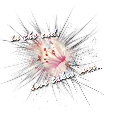
|
|
|
|
| *absinthe* |
Apr 20 2008, 09:48 PM
Post
#10
|
|
Guest |
Not a big fan of the fonts either.But I think the graphic as a whole is nice.
Maybe, take out the "in the end love takes over" ? |
|
|
|
|
Apr 20 2008, 09:58 PM
Post
#11
|
|
 drama is so intising i might just bite a mothaf**ka like tyson Group: Member Posts: 266 Joined: Mar 2008 Member No: 636,361 |
Try placing the font somewhere else. Maybe like "In the end, Love takes over" As one sentence, not seperated like that. Take off the Gradient Outline or Change the angle of it. Try switching the Font color to a Grey or Black, with a white stroke of maybe 4? and a Dropped Shadow.. then create a new layer and apply an Air Brush(i call it that but its a default brush in the beginning and it should look like an air brushed brush..lol) and just apply it behind the text maybe making a zig zag or something. good luck.
|
|
|
|

|
Apr 20 2008, 10:53 PM
Post
#12
|
|
|
Member Group: Member Posts: 24 Joined: Apr 2008 Member No: 637,980 |
QUOTE(Angeline @ Apr 20 2008, 09:33 PM)  This is really cute. I actually really like the brushes. Just, your name. The whole "Productions" thing has been done. Over and over and over x298347987298347 again. Change your name, seriously. O_O yea i was thinking about getting rid of it. Do you think people will understand or see the message? Even now with the font, do you see the message? |
|
|
|
|
Apr 20 2008, 11:05 PM
Post
#13
|
|
|
Member Group: Member Posts: 24 Joined: Apr 2008 Member No: 637,980 |
quoted wrong person
I meant absinthe |
|
|
|
|
Apr 21 2008, 05:42 AM
Post
#14
|
|
 Kissing for yesterday. Group: Official Designer Posts: 465 Joined: Sep 2007 Member No: 569,813 |
i agree with changing the name.
but i really do like this, it took me a while to figure it out, but thats what i like about it. but i agree the font does look a little out of place. |
|
|
|

|
Apr 21 2008, 08:47 AM
Post
#15
|
|
 Melieized Group: Official Designer Posts: 1,372 Joined: Nov 2006 Member No: 478,715 |
the blending is great. instead of a saying, why not try just one word?
great job! |
|
|
|

|
Apr 21 2008, 05:50 PM
Post
#16
|
|
|
Member Group: Member Posts: 24 Joined: Apr 2008 Member No: 637,980 |
It's sort of too late to change the name. I know "productions" has been used so many times, but I think I'm going to just stick with it. I tried the other suggestions (= Here they are! 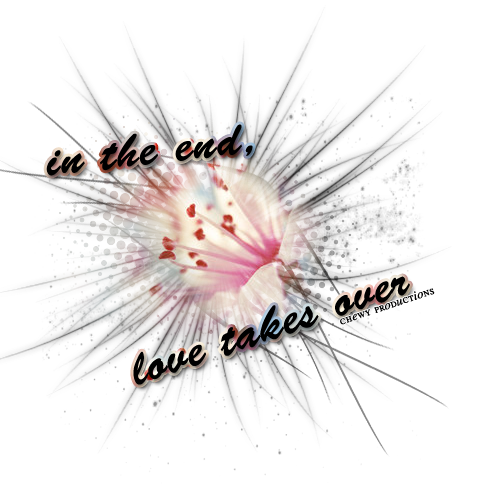 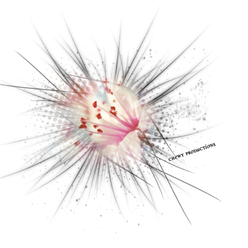 Which one do you prefer?
|
|
|
|
|
Apr 21 2008, 06:23 PM
Post
#17
|
|
 Let the romance soar Group: Member Posts: 17 Joined: Dec 2005 Member No: 315,977 |
Personally I like the first one. I like how you used a different font from what I read was your normal (I download fonts like crazy). Also, I like how you expanded the words and dropshadowed them to make them look more 3-D.
But I do have to admit, the credit is too prominent. Try smoothing it over and fade it into the background. That or remove the productions and just use chewy (ie: for my graphics, I use CookieCake instead of CookieCakeLays which is the name of my layout site on xanga). |
|
|
|

|
1 User(s) are reading this topic (1 Guests and 0 Anonymous Users)
0 Members: