
What do you think of these?, Tell me what you think about my new avatars... |
Resource Center Links
This Month's Contests | Hosts Looking for Hostees | Hostees looking for Hosts | BigBookofResources
Submission Guidelines
  |
 Apr 13 2008, 09:29 PM Apr 13 2008, 09:29 PM
Post
#1
|
|
|
Member  Group: Member Posts: 11 Joined: Mar 2008 Member No: 631,044 |
Which do you like & which don't you like?
Please comment or rate! :]     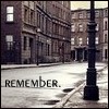  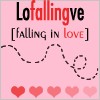 
|
|
|
|


|
Apr 13 2008, 09:31 PM
Post
#2
|
|
 drama is so intising i might just bite a mothaf**ka like tyson Group: Member Posts: 266 Joined: Mar 2008 Member No: 636,361 |
You made these? the first one looks too familiar..

|
|
|
|

|
Apr 13 2008, 09:33 PM
Post
#3
|
|
|
Member Group: Member Posts: 11 Joined: Mar 2008 Member No: 631,044 |
the first one was from a bigger picture, made smaller and edited a bit.
|
|
|
|
|
Apr 13 2008, 09:35 PM
Post
#4
|
|
|
drama is so intising i might just bite a mothaf**ka like tyson Group: Member Posts: 266 Joined: Mar 2008 Member No: 636,361 |
Maybe add some words because it doesnt look different(i think)
 i dont like the dont stop loving because it could use a bit of red on the stop sign just a little bit or a vintageish color. i dont like the dont stop loving because it could use a bit of red on the stop sign just a little bit or a vintageish color.
|
|
|
|
|
Apr 13 2008, 09:43 PM
Post
#5
|
|
 AIDS at RAVES. Group: Official Designer Posts: 2,386 Joined: Dec 2007 Member No: 598,878 |
7 out of 10? I dont know, I think you used the vintaging effect too much :[
but these are really interesting 
|
|
|
|

|
Apr 13 2008, 09:55 PM
Post
#6
|
|
|
drama is so intising i might just bite a mothaf**ka like tyson Group: Member Posts: 266 Joined: Mar 2008 Member No: 636,361 |
oh and number 2 looks to light and the remember one i dont like the text on it. but there cute.
|
|
|
|
|
Apr 13 2008, 10:11 PM
Post
#7
|
|
|
Member Group: Member Posts: 11 Joined: Mar 2008 Member No: 631,044 |
oh. ok. thanks.
|
|
|
|
|
Apr 13 2008, 10:12 PM
Post
#8
|
|
 Senior Member Group: Member Posts: 734 Joined: Oct 2005 Member No: 278,251 |
Very nice
|
|
|
|


|
Apr 13 2008, 10:13 PM
Post
#9
|
|
|
Member Group: Member Posts: 11 Joined: Mar 2008 Member No: 631,044 |
ty, bunkywhitegirl. :)
|
|
|
|
|
Apr 13 2008, 10:18 PM
Post
#10
|
|
|
Senior Member Group: Member Posts: 734 Joined: Oct 2005 Member No: 278,251 |
You're welcome.

|
|
|
|
|
Apr 13 2008, 10:49 PM
Post
#11
|
|
 torn Group: Official Designer Posts: 953 Joined: Oct 2004 Member No: 55,718 |
Shouldn't this go in the showcase forum....?
The falling in love one seems kind of boring after all of the others (which, by the way, are very cool :]). I like the colors of the first one, and the cropping, although I think it can do without the lens flare in the upper left. I'm not really fond of the tannish color of the second one. I also think the don't stop loving one could use some more color, like maybe just leave the stop sign colored and everything else desaturated. The bunny one is my favorite (so cute!), and I like the remember one too, although I think maybe you could've picked a different font. The second to last one I also think would look better with color (is it a night scene? if so, it would look cool with the city all lit up), and maybe without the dotted line. But that's just my personal preference. I really like your cropping, though. ^_^ The icons all look so interesting. Great job! |
|
|
|

|
Apr 13 2008, 10:53 PM
Post
#12
|
|
|
Member Group: Member Posts: 11 Joined: Mar 2008 Member No: 631,044 |
thanks dreamstar. :D
|
|
|
|
|
Apr 14 2008, 10:07 AM
Post
#13
|
|
 <(^_^<) DANCE!(>^_^)> Group: Official Member Posts: 1,304 Joined: Nov 2007 Member No: 586,621 |
aw. i like all of them. especially the 2nd, 3rd & 4th. very nicely done.
|
|
|
|

|
Apr 14 2008, 02:35 PM
Post
#14
|
|
|
GD. <3 Group: Staff Alumni Posts: 1,222 Joined: Aug 2005 Member No: 198,566 |
MOVED TO SHOWCASE BOOTH.
|
|
|
|

|
Apr 14 2008, 03:26 PM
Post
#15
|
|
 LOVE is our resistance Group: Member Posts: 157 Joined: Aug 2007 Member No: 556,214 |
QUOTE(marielamuneka @ Apr 13 2008, 10:35 PM)  Maybe add some words because it doesnt look different(i think) adding words usually tears apart a perfectly good avatar. i dont like people who think a plain avatar is bad. i like them though, not sure about the stop sign one. |
|
|
|


|
Apr 14 2008, 04:22 PM
Post
#16
|
|
 kthxbai Group: Official Designer Posts: 2,832 Joined: Feb 2008 Member No: 621,203 |
I think they're all bad. Very low quality. Did you make in MS Paint?
|
|
|
|

|
Apr 14 2008, 06:16 PM
Post
#17
|
|
 Senior Member Group: Administrator Posts: 8,629 Joined: Jan 2007 Member No: 498,468 |
i like all you them.
well i guess you already know that since i basically commented all of these! great job!
|
|
|
|

|
Apr 14 2008, 07:59 PM
Post
#18
|
|
 The Illustrious Mari C. Group: Member Posts: 586 Joined: Jul 2004 Member No: 26,671 |
I like all of them except the 3rd & 4th avatar
|
|
|
|

|
Apr 14 2008, 08:13 PM
Post
#19
|
|
 vengeance. Group: Official Member Posts: 3,058 Joined: Jul 2006 Member No: 437,024 |
I really like the first one, its so colorful.
 I don't really like the alst one though, its kinda of... plain. I don't really like the alst one though, its kinda of... plain.
|
|
|
|

|
Apr 14 2008, 08:23 PM
Post
#20
|
|
 yo yo yiggidy yo. Group: Official Member Posts: 1,606 Joined: Mar 2005 Member No: 108,591 |
awww, they're all so cute. all of them make me smile.
i like the 'don't stop loving' one, the teddy bear, the landscape, and the bubbles. they all make up life... sort of. everything's kaaayyoooooot [cute]. lol. |
|
|
|

| *absinthe* |
Apr 15 2008, 08:22 PM
Post
#21
|
|
Guest |
I think the last one is too crowded with text (but you already knew that). I like the rest of them.
|
|
|
|
|
Apr 16 2008, 12:23 AM
Post
#22
|
|
 Senior Member Group: Official Member Posts: 1,288 Joined: Oct 2007 Member No: 585,380 |
There not my style, but there good, i just don't like 1 & 2, to...idk i just don't like it.
|
|
|
|

|
Apr 16 2008, 06:41 PM
Post
#23
|
|
 Cornflakes :D Group: Staff Alumni Posts: 4,541 Joined: Dec 2005 Member No: 322,923 |
I have to admit the only one that looks the best is number 1. The others just don't look that good to me. They seem pixely and really low quality and there isn't anything original about them at all. I've seen plenty of icons similar to these around xanga years ago. I think you need to find different images and think of other ideas that are more original.
|
|
|
|

|
Apr 21 2008, 05:56 AM
Post
#24
|
|
 (′ ・ω・`) Group: Official Designer Posts: 6,179 Joined: Dec 2004 Member No: 72,477 |
^i agree. the ideas are pretty boring. it's good to look at. bad quality
|
|
|
|

|
Apr 21 2008, 06:06 AM
Post
#25
|
|
 Kissing for yesterday. Group: Official Designer Posts: 465 Joined: Sep 2007 Member No: 569,813 |
im really sure ive seen the dont stop loving one before?
theyre OK, perhaps the sort of thing you'd see everyone posting on photobucket..but i'm not too sure. the colours aren't too exciting, the photography in some is minimal. a little more work with them might make them a little more interesting. perhaps they would appeal to a younger audience? (12-14 years?) |
|
|
|

|
2 User(s) are reading this topic (2 Guests and 0 Anonymous Users)
0 Members: