
Experimental Piece |
Resource Center Links
This Month's Contests | Hosts Looking for Hostees | Hostees looking for Hosts | BigBookofResources
Submission Guidelines
  |
 Apr 7 2008, 05:52 PM Apr 7 2008, 05:52 PM
Post
#1
|
|
 talent on another level  Group: Member Posts: 746 Joined: Oct 2006 Member No: 475,735 |
This is a experimental piece I'm working on; its an on and off piece. POSITIVE feedback would be nice. If you think I can fix something, please make sure you describe the problem.
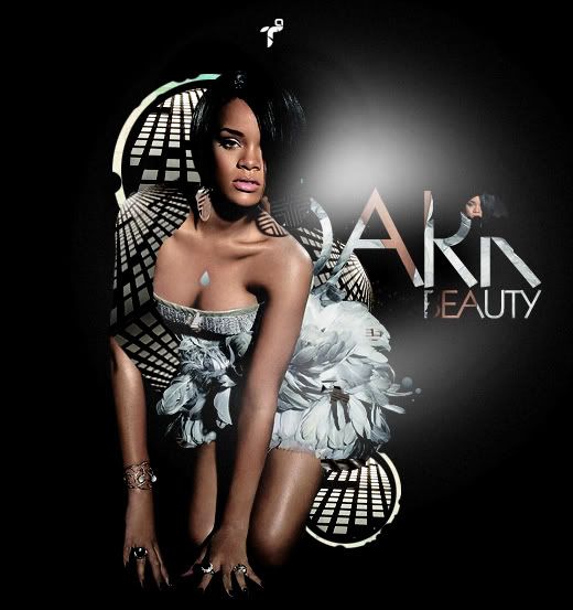 P.S: That's my logo on top of her head.  EDITED VERSION 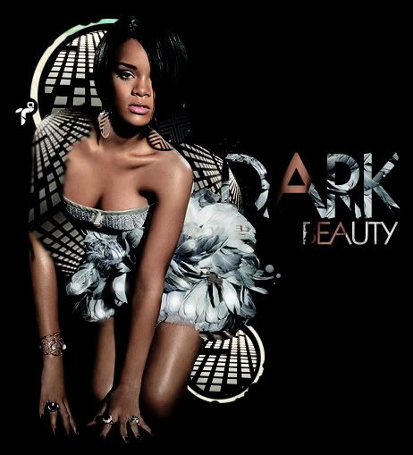
|
|
|
|


|
Apr 7 2008, 05:55 PM
Post
#2
|
|
 Kissing for yesterday. Group: Official Designer Posts: 465 Joined: Sep 2007 Member No: 569,813 |
i really do quite like this actually.
you've picked out little details, like the reflection on her arm. |
|
|
|


|
Apr 7 2008, 06:08 PM
Post
#3
|
|
|
talent on another level Group: Member Posts: 746 Joined: Oct 2006 Member No: 475,735 |

|
|
|
|
|
Apr 7 2008, 06:12 PM
Post
#4
|
|
|
Kissing for yesterday. Group: Official Designer Posts: 465 Joined: Sep 2007 Member No: 569,813 |
im a little confused as to why there is a straight line by her arm though...
*this thought just came to me..sorry* |
|
|
|
|
Apr 7 2008, 06:14 PM
Post
#5
|
|
|
talent on another level Group: Member Posts: 746 Joined: Oct 2006 Member No: 475,735 |
what straight line?
|
|
|
|
|
Apr 7 2008, 06:17 PM
Post
#6
|
|
|
Kissing for yesterday. Group: Official Designer Posts: 465 Joined: Sep 2007 Member No: 569,813 |
on her arm left arm. i looked closer and there's an outline to the arm shape, but it cnfused me a little bit about what is actually wrapped around it! and i thought it looked a little bit straight (un-natural)
but tats a bit confusing i guess. |
|
|
|
|
Apr 7 2008, 06:18 PM
Post
#7
|
|
|
talent on another level Group: Member Posts: 746 Joined: Oct 2006 Member No: 475,735 |
oh, well i'll look into fixing that.
thanks. |
|
|
|
|
Apr 7 2008, 10:26 PM
Post
#8
|
|
 kthxbai Group: Official Designer Posts: 2,832 Joined: Feb 2008 Member No: 621,203 |
i don't really like that that black+white pattern cuts off her arm.
|
|
|
|


|
Apr 7 2008, 11:30 PM
Post
#9
|
|
 sleep now, moon Group: Staff Alumni Posts: 2,540 Joined: May 2007 Member No: 526,212 |
QUOTE(emberfly @ Apr 7 2008, 10:26 PM)  i don't really like that that black+white pattern cuts off her arm. and off her neck/shoulder area, even though it's transparent. The raindrop on her chest looks out of place, and the B/W pattern below her dress made me think she's pooping patterns. ;d What's with the random glowing to the side...? Other than that, it looks fine to me. |
|
|
|

|
Apr 7 2008, 11:31 PM
Post
#10
|
|
|
kthxbai Group: Official Designer Posts: 2,832 Joined: Feb 2008 Member No: 621,203 |
^ woah i didn't even see the raindrop. it doesn't fit at all; take it off
|
|
|
|
|
Apr 7 2008, 11:49 PM
Post
#11
|
|
|
Senior Member Group: Member Posts: 66 Joined: Jan 2008 Member No: 614,870 |
This is nice
but the raindrop needs to go. && around were the designs cut into her arm make the line around there smoother use the blurring tool if you use photoshop |
|
|
|

|
Apr 8 2008, 12:01 AM
Post
#12
|
|
 yo yo yiggidy yo. Group: Official Member Posts: 1,606 Joined: Mar 2005 Member No: 108,591 |
QUOTE(emberfly @ Apr 7 2008, 11:26 PM) i don't really like that that black+white pattern cuts off her arm. and that thing on the top of her head looks too out of place. but other then that. this looks great. nice work.
|
|
|
|

|
Apr 8 2008, 12:20 AM
Post
#13
|
|
 sang loves hayden. Group: Staff Alumni Posts: 3,373 Joined: Feb 2004 Member No: 5,687 |
When I looked at this, I was confused. I was like what the frick, why is her arm displaced, why is that white sqaur-y mirror thing all around there. I was puzzled.
Although, it does look nice and I'm not sure about the brush you used (the white foggy looking one). I agree about the rain drop, it's different but it looks oddly placed and possibly not needed. Also, another thing that probably distracts the viewer is the text. I have no idea what it says. Something "ARR"? It's great your trying to put in creativity, Kudos, but it's not good if it isn't readable. The first word is not visible.. what does it really say? |
|
|
|

|
Apr 8 2008, 07:49 AM
Post
#14
|
|
|
talent on another level Group: Member Posts: 746 Joined: Oct 2006 Member No: 475,735 |
it actually says "DARK BEAUTY", but i'm going to make sure its readable.
i'm going to mess around with the raindrop to make it work. thanks for the feedback. |
|
|
|
|
Apr 8 2008, 08:04 AM
Post
#15
|
|
|
Kissing for yesterday. Group: Official Designer Posts: 465 Joined: Sep 2007 Member No: 569,813 |
i really would scrap the water droplet.
|
|
|
|
|
Apr 8 2008, 08:19 AM
Post
#16
|
|
|
talent on another level Group: Member Posts: 746 Joined: Oct 2006 Member No: 475,735 |
lol, i did.
i didn't put the updated version up yet. |
|
|
|
|
Apr 8 2008, 10:43 AM
Post
#17
|
|
 Melieized Group: Official Designer Posts: 1,372 Joined: Nov 2006 Member No: 478,715 |
yeah the rain drop should go and you might want to do something else with the text. can't make it out. maybe make it metallic?
|
|
|
|

|
Apr 8 2008, 11:17 AM
Post
#18
|
|
|
GD. <3 Group: Staff Alumni Posts: 1,222 Joined: Aug 2005 Member No: 198,566 |
I'm not feeling the white haze. It doesn't go w. the rest of the effects you've used, and I wish the main image hadn't been altered to kinda look like bad quality.
But I'm liking the concept. Food for thought, there's nothing wrong w. putting your logo on a corner or something. Lol. |
|
|
|

|
Apr 8 2008, 03:37 PM
Post
#19
|
|
|
talent on another level Group: Member Posts: 746 Joined: Oct 2006 Member No: 475,735 |
yeah i erased the white haze and raindrop.
i don't think it looks like bad quality; the original was much lighter than the current image. thanks for your positive feedback. yeah, the logo could be positioned some where else. |
|
|
|
|
Apr 8 2008, 05:21 PM
Post
#20
|
|
 drama is so intising i might just bite a mothaf**ka like tyson Group: Member Posts: 266 Joined: Mar 2008 Member No: 636,361 |
aww, papa that looks mad nice.. but i feel like its missin somethin.. maybe with your creativity you can add somethin more..
its hot papa good job. 
|
|
|
|

|
Apr 8 2008, 05:32 PM
Post
#21
|
|
|
talent on another level Group: Member Posts: 746 Joined: Oct 2006 Member No: 475,735 |
thanks
|
|
|
|
|
Apr 8 2008, 05:35 PM
Post
#22
|
|
|
drama is so intising i might just bite a mothaf**ka like tyson Group: Member Posts: 266 Joined: Mar 2008 Member No: 636,361 |
i liked the white haze. i thought it looked nice..

|
|
|
|
|
Apr 8 2008, 05:59 PM
Post
#23
|
|
|
talent on another level Group: Member Posts: 746 Joined: Oct 2006 Member No: 475,735 |
yeah well right now i'm experimenting with different styles and making sure everything flows.
|
|
|
|
|
Apr 8 2008, 06:01 PM
Post
#24
|
|
 creepy heather Group: Official Member Posts: 4,208 Joined: Aug 2004 Member No: 41,580 |
i like what u did
but she kind of looks like a poodle to me |
|
|
|

|
Apr 8 2008, 06:06 PM
Post
#25
|
|
|
talent on another level Group: Member Posts: 746 Joined: Oct 2006 Member No: 475,735 |

|
|
|
|
|
2 User(s) are reading this topic (2 Guests and 0 Anonymous Users)
0 Members: