My Rejected Avatar/Icon., Akward or not? |
Resource Center Links
This Month's Contests | Hosts Looking for Hostees | Hostees looking for Hosts | BigBookofResources
Submission Guidelines
  |

 Mar 16 2008, 07:19 PM Mar 16 2008, 07:19 PM
Post
#1
|
|
 Go fall off a cliff. ^.^  Group: Member Posts: 41 Joined: Dec 2007 Member No: 601,263 |
1.
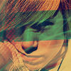
 The image is from one of Within Temptation's music videos. So she was singing. When I paused to take a screenshot, it looked like she was smiling. But I guess it looks really akward? That's what my reviewer said anyway. They said it ruined the icon. What do you think? Here are the other three that got rejected: 2.  The reviewer said: "Graphic choice is awkward, and text doesn\'t match." The reviewer said: "Graphic choice is awkward, and text doesn\'t match."3.  The reviewer said: "The four color boxes and text\'s color, style, and placement doesn\'t suit the avatar." The reviewer said: "The four color boxes and text\'s color, style, and placement doesn\'t suit the avatar."4.  The reviewer said: "The text doesn\'t match the image in terms of the background glow and positioning, and the image was overly contrasted." The reviewer said: "The text doesn\'t match the image in terms of the background glow and positioning, and the image was overly contrasted."Any thoughts? Critique? Comments? Oh, and this was the pending one (now accepted): 5.  Feel free to comment on it as well. This one's my favorite. Feel free to comment on it as well. This one's my favorite.
|
|
|
|


|
Mar 16 2008, 07:28 PM
Post
#2
|
|
 Free the Caged Bird. Let it Sing. Group: Member Posts: 168 Joined: Feb 2008 Member No: 622,056 |
Yeah...it's awkward.
You know she's not really smiling, so....I dunno. Find another pic of her? Sorry  Everything else looks nice, though. |
|
|
|


|
Mar 16 2008, 07:41 PM
Post
#3
|
|
 hello : ) Group: Official Member Posts: 4,227 Joined: Apr 2004 Member No: 13,139 |
I agree - it does look pretty awkward. Also, I don't like the font you chose or the placement that much.
|
|
|
|


|
Mar 16 2008, 07:41 PM
Post
#4
|
|
 /人◕‿‿◕人\ Group: Official Member Posts: 8,283 Joined: Dec 2007 Member No: 602,927 |
Yeah its awkward, but so is Within Temptation. I don't think it takes away too much from the icon.
|
|
|
|

|
Mar 16 2008, 07:46 PM
Post
#5
|
|
 Tick tock, Bill Group: Administrator Posts: 8,764 Joined: Dec 2005 Member No: 333,948 |
It is a quirky looking pose. She's a little blurry as well. The font is tiny and rather difficult to read. I would have skipped the text all together. I think you need a sharper image to begin with and play with the brightness/contrast some, as it's a little on the dark side. Also, I'm not sure what you're doing with the coloring. It sort of looks like a gradient (right-greenish to left-redish).
This tutorial works specifically with dark and low contrast screen caps. I would practice with some different images and see what you come up with. Post them here if you'd like, to mark your progress and get advice. =) |
|
|
|

|
Mar 17 2008, 06:45 PM
Post
#6
|
|
|
Go fall off a cliff. ^.^ Group: Member Posts: 41 Joined: Dec 2007 Member No: 601,263 |
Okay, well thanks for all the feedback.
I suppose screenshots out of music videos probably aren't the best mage source... As apparently they all look akward? Three more of the graphics like this have been rejected, with one more still pending. I'll add the other three to my first post, so you guys can tell me what you think about them too. To XTINAA: Where would you propose I place the text? It just seemed like a good spot. To Superstitious: Yeah, now that you mention that, I probably should have moved the text further away from the edge, being that it's so small. The coloring is sort of a gradient I guess? It's a texture I downloaded somewhere. And thank you for yet another great tutorial link. =] To Highwayto4355: Well, that definitely wasn;t what I was going for. Guess I should find a different image. |
|
|
|
|
Mar 17 2008, 09:39 PM
Post
#7
|
|
|
hello : ) Group: Official Member Posts: 4,227 Joined: Apr 2004 Member No: 13,139 |
Hm, maybe it'd be best to not have text (on the first icon.) Also, this is just me, but I prefer at least a 1px border around the icons. I don't know why. lol but that's just me. For number 2, I don't know if the graphic choice is exactly awkward, but I don't like the text. Text choice is especially tricky when it's so tiny, you know? Sometimes it's best to not have any. For number 3, I agree with the comments. Aesthetically, the four boxes don't do anything for me. It's kind of just there. The color scheme also doesn't match the icon. I also agree with the comments on number 4. It's important to make the text stand out but still blend in with the image. Pink and green doesn't suit it at all. Also the image seems too far away, like a little more close would have been better. Number 5 seems pretty good. I like that there is no text. I wish it was a little zoomed out though.
|
|
|
|
|
Mar 17 2008, 10:23 PM
Post
#8
|
|
|
t-t-t-toyaaa Group: Official Member Posts: 19,821 Joined: Apr 2004 Member No: 11,270 |
QUOTE(SkeleBoy @ Mar 17 2008, 04:45 PM)  Okay, well thanks for all the feedback. I suppose screenshots out of music videos probably aren't the best mage source... As apparently they all look akward? Three more of the graphics like this have been rejected, with one more still pending. I'll add the other three to my first post, so you guys can tell me what you think about them too. Yes try to stay away from music video screenshots. Plus they end up low quality most times usually and that's not helping you in any way. Text is something you should work on. When you use tiny text, that usually looks better centered on either side (left or right) not at the bottom where you can barely read it. The colors of the icon may be from the music video but they look a little odd. A few of them look overdone, (texture, brush, text wise) so you should try for something more simplistic but not overly simple. |
|
|
|

|
Mar 18 2008, 07:34 PM
Post
#9
|
|
|
Go fall off a cliff. ^.^ Group: Member Posts: 41 Joined: Dec 2007 Member No: 601,263 |
Okay, thanks for all the feedback.
xTINAA: Yeah, that's kind of what I was thinking. The text just doesn't seem to be working. I'm also thinking I may just forget about trying to use music video screenshots, 'cause they're all coming out wierd. And yes, I obviously need to work on colors/text and blending it all together. freeflow: Yeah, they low quality thing was definitely annoying. I think I did a good job disguising the low quality on 1 to 3, but it shows a bit on 4. Yeah, Sticking the text at the bottom was definitely a bad idea. Especially when the icon;s placed on a light background. Oh, and the fifth one got accepted. So yay!! =] (Thak you Miyashu! ^.^) |
|
|
|
|
Mar 18 2008, 07:37 PM
Post
#10
|
|
|
Senior Member Group: Official Member Posts: 1,028 Joined: Sep 2007 Member No: 579,129 |
You should PM your reviewer and ask them.
|
|
|
|

|
Mar 18 2008, 09:13 PM
Post
#11
|
|
 Senior Member Group: Head Staff Posts: 18,173 Joined: Mar 2005 Member No: 108,478 |
Yeah, I think you should choose images with better facial expressions for your avatars. No one would want to use an avatar with a person whose face looked awkward.
|
|
|
|
|
Mar 18 2008, 10:04 PM
Post
#12
|
|
 This bag is not a toy. Group: Staff Alumni Posts: 3,090 Joined: Oct 2007 Member No: 583,108 |
I'm glad you did this, actually, because when people do this with their submissions that get rejected, it's honestly the BEST way to get good feedback. Kudos to you for having the guts to do it, I really respect that.
As far as the image quality, I don't really think it's that bad. What's really causing these to get rejected in my opinion would have to be the things you're doing to add to the icons. The text, shapes, etc. seem out of place. I would consider looking around and seeing if you can develop your "eye" more - look for things that stick out and try to avoid them. There's really no substitute for experience - you'll get there eventually. :) |
|
|
|

|
Mar 18 2008, 11:41 PM
Post
#13
|
|
 kthxbai Group: Official Designer Posts: 2,832 Joined: Feb 2008 Member No: 621,203 |
All of those icons are really.. bad, sorry. I've learned the hard way that putting text on icons is really hard. Making the text look right, making it not pixelized, etc.. etc..
I'm pretty sure all those icons will get rejected. I know that's harsh, but sadly, it's true. I like the icon that the poll is about, but you can't just take an image and resize it to 100x100. I learned that the hard way, aswell. Keep trying though. After you get a few icons accepted, they just keep getting accepted more and moer. |
|
|
|

|
Mar 18 2008, 11:41 PM
Post
#14
|
|
|
kthxbai Group: Official Designer Posts: 2,832 Joined: Feb 2008 Member No: 621,203 |
QUOTE(libertie @ Mar 18 2008, 09:04 PM) I'm glad you did this, actually, because when people do this with their submissions that get rejected, it's honestly the BEST way to get good feedback. Kudos to you for having the guts to do it, I really respect that. As far as the image quality, I don't really think it's that bad. What's really causing these to get rejected in my opinion would have to be the things you're doing to add to the icons. The text, shapes, etc. seem out of place. I would consider looking around and seeing if you can develop your "eye" more - look for things that stick out and try to avoid them. There's really no substitute for experience - you'll get there eventually. :) ^ agree completely |
|
|
|
|
Mar 19 2008, 04:33 PM
Post
#15
|
|
|
Go fall off a cliff. ^.^ Group: Member Posts: 41 Joined: Dec 2007 Member No: 601,263 |
Thanks everyone for being honest.
TheFegNut: There's only a few reviewers I'll PM. Most of them are too busy to respond, so they aren't all that helpful. That's why I post stuff here that's been rejected. Plus, here, I can get multiple opinions. Libertie: Thanks first of all. =] And yeah, the text always seems to be my problem. I'm working on it though. =] And I definitely do look around. I'm on this site at least 3 times a day, haha. So I'm always watching to see what gets accepted. nd looking here to see threads like this, and seeing why they were rejected. Emberfly: Again, yes, text is definitely not my strong suit. And you were 99% right. Only the last one got accepted. I'll definitely keep trying, just not with music video stills. Btw, I love the three icons in your signature thingy, and how they sorta form a banner. Super cool. =] Again, thank you to everyone for being so honest. Guess my major lesson here is no music video screenshots, unless they look totally normal. And I still need to work on text. =] |
|
|
|
|
Mar 19 2008, 04:38 PM
Post
#16
|
|
 Kissing for yesterday. Group: Official Designer Posts: 465 Joined: Sep 2007 Member No: 569,813 |
you could always try face manipulation if youre that advanced :)
|
|
|
|

|
Mar 19 2008, 05:37 PM
Post
#17
|
|
|
Go fall off a cliff. ^.^ Group: Member Posts: 41 Joined: Dec 2007 Member No: 601,263 |
QUOTE(vintage-toile @ Mar 19 2008, 05:38 PM) you could always try face manipulation if youre that advanced :) Hahaha, I'm definitely not. xD |
|
|
|
|
Mar 21 2008, 03:46 PM
Post
#18
|
|
|
kthxbai Group: Official Designer Posts: 2,832 Joined: Feb 2008 Member No: 621,203 |
I saw them accepted..
EDIT// it was just a different version of that icon. |
|
|
|
|
2 User(s) are reading this topic (2 Guests and 0 Anonymous Users)
0 Members: