NEW Website Layout, Talentified |
Resource Center Links
This Month's Contests | Hosts Looking for Hostees | Hostees looking for Hosts | BigBookofResources
Submission Guidelines
  |

 Mar 17 2008, 04:51 PM Mar 17 2008, 04:51 PM
Post
#1
|
|
 talent on another level  Group: Member Posts: 746 Joined: Oct 2006 Member No: 475,735 |
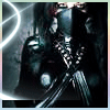
I made this layout for my portfolio website; I'm going to put it in Flash. I would like some feedback and suggestions. I don't know exactly how I'm going to transition between portfolio pieces yet, but any suggestions would be helpful. My style is simple with a WOW factor, so let me know if I reached that goal with this layout.
  EDITED VERSION. 
|
|
|
|


|
Mar 17 2008, 04:54 PM
Post
#2
|
|
|
Senior Member Group: Official Member Posts: 1,028 Joined: Sep 2007 Member No: 579,129 |
I lol'd at "Need a job done?"
I read that part before looking at what this was for and tok it the wrong way 
|
|
|
|


|
Mar 17 2008, 04:59 PM
Post
#3
|
|
|
talent on another level Group: Member Posts: 746 Joined: Oct 2006 Member No: 475,735 |
LMAO! I thought the same thing, I'm going to change that part.
I was trying to do something different from what I normally do with backgrounds. What about it bothers you? |
|
|
|
|
Mar 17 2008, 05:07 PM
Post
#4
|
|
|
talent on another level Group: Member Posts: 746 Joined: Oct 2006 Member No: 475,735 |
well the banner piece is just an example of where the pictures will pop up.
the background is wood, not white paint strokes. i know where your coming from though, thanks. i'll take this into consideration. |
|
|
|
|
Mar 17 2008, 05:12 PM
Post
#5
|
|
|
talent on another level Group: Member Posts: 746 Joined: Oct 2006 Member No: 475,735 |
wow thanks for referring me.
tell your friend she is welcome to apply, but not with a site name like that. =/ |
|
|
|
|
Mar 17 2008, 05:15 PM
Post
#6
|
|
|
talent on another level Group: Member Posts: 746 Joined: Oct 2006 Member No: 475,735 |
okay.
|
|
|
|
|
Mar 17 2008, 05:23 PM
Post
#7
|
|
 creepy heather Group: Official Member Posts: 4,208 Joined: Aug 2004 Member No: 41,580 |
i like the layout but the font is pretty horrible
and i would make it look more simplistic by taking the background out of the picture and making it white/light shade of grey |
|
|
|

|
Mar 17 2008, 05:24 PM
Post
#8
|
|
|
talent on another level Group: Member Posts: 746 Joined: Oct 2006 Member No: 475,735 |
lol, thanks for being honest.
i'll try some other fonts and background colors. |
|
|
|
|
Mar 17 2008, 05:30 PM
Post
#9
|
|
|
creepy heather Group: Official Member Posts: 4,208 Joined: Aug 2004 Member No: 41,580 |
you're welcome :]
i honestly think that would make it look better but you never know until you try it right |
|
|
|
|
Mar 17 2008, 05:38 PM
Post
#10
|
|
|
talent on another level Group: Member Posts: 746 Joined: Oct 2006 Member No: 475,735 |
yep, your right.
so i'm going to re-edit and see what happens. thanks for the feedback. |
|
|
|
|
Mar 17 2008, 06:19 PM
Post
#11
|
|
 Melieized Group: Official Designer Posts: 1,372 Joined: Nov 2006 Member No: 478,715 |
i think the layout of it is interesting although those two small images should really be something different...it just doesn't work together like that for some reason.
|
|
|
|

|
Mar 17 2008, 06:24 PM
Post
#12
|
|
 <joke> inside </joke> Group: Official Member Posts: 2,283 Joined: Oct 2006 Member No: 470,590 |
i like it
 i hate that you spelled unique wrong, though. it annoys the crap out of me.. |
|
|
|

|
Mar 17 2008, 06:33 PM
Post
#13
|
|
|
talent on another level Group: Member Posts: 746 Joined: Oct 2006 Member No: 475,735 |
i know "unique" is spelled wrong, i did that for a reason.
the small images are just to zoom in on detail. what about the images bother you? |
|
|
|
|
Mar 17 2008, 06:35 PM
Post
#14
|
|
|
Melieized Group: Official Designer Posts: 1,372 Joined: Nov 2006 Member No: 478,715 |
for some reason, if they had some color to them...so they can like stand out a little...they kind of blend in with the rest of it to me. but that's my opinion though, you don't have to take it for heart. you just do what you love

|
|
|
|
|
Mar 17 2008, 06:35 PM
Post
#15
|
|
|
GD. <3 Group: Staff Alumni Posts: 1,222 Joined: Aug 2005 Member No: 198,566 |
I'm not feeling the background, and the positioning of the images on the left make it unbalanced.
|
|
|
|

|
Mar 17 2008, 06:37 PM
Post
#16
|
|
|
talent on another level Group: Member Posts: 746 Joined: Oct 2006 Member No: 475,735 |
i'm going to change the background.
i'll play around with the images on the left. this is just a setup, not the final product. |
|
|
|
|
Mar 17 2008, 06:40 PM
Post
#17
|
|
|
<joke> inside </joke> Group: Official Member Posts: 2,283 Joined: Oct 2006 Member No: 470,590 |
QUOTE(bigtrey90 @ Mar 17 2008, 07:33 PM)  i know "unique" is spelled wrong, i did that for a reason. i know you did. i just would like it better if it was spelled correctly well, its a great layout anyway =] |
|
|
|
|
Mar 17 2008, 06:46 PM
Post
#18
|
|
|
talent on another level Group: Member Posts: 746 Joined: Oct 2006 Member No: 475,735 |
okay.
thanks for your honest feedback. |
|
|
|
|
Mar 17 2008, 07:07 PM
Post
#19
|
|
 Go fall off a cliff. ^.^ Group: Member Posts: 41 Joined: Dec 2007 Member No: 601,263 |
It looks really cool.
I love the two parts of the picture next to the full one. Honestly, I like it better with the background. The plain black is just kinda overwhelming. Only other thing I don't like are the green dots/light bursts on her picture, especially the one near her bum. Not to be crude or anything, but it kinda looks like she's farting or something. =X Other than that, grat work. =] |
|
|
|


|
Mar 17 2008, 07:10 PM
Post
#20
|
|
|
talent on another level Group: Member Posts: 746 Joined: Oct 2006 Member No: 475,735 |
thanks for your honest opinion, i like the background too, lol.
|
|
|
|
|
Mar 17 2008, 10:28 PM
Post
#21
|
|
|
t-t-t-toyaaa Group: Official Member Posts: 19,821 Joined: Apr 2004 Member No: 11,270 |
Edited version looks way better. Not to sure about the font but you should use that or find another background.
|
|
|
|

|
Mar 17 2008, 11:02 PM
Post
#22
|
|
 s e c r e c y * Group: Member Posts: 471 Joined: Jun 2006 Member No: 417,181 |
IMO, the first version looks really good. You should use a simpler font for the navigation and such like Times New Roman.
And the little turqoise blotch on her ass looks weird. edit:// I might get hosting from you. I'll let you know when I'm sure. |
|
|
|

|
Mar 18 2008, 05:12 AM
Post
#23
|
|
 i did your boyfriend Group: Official Designer Posts: 3,335 Joined: Feb 2004 Member No: 4,071 |
honestly i like the background better than just the plain black, but i get what others are saying. if you just make the background a lot darker so that there's not so much contrast, it would look great. as for the navigation, i like it the way it is but try trusty old Helvetica and see what kind of difference that makes. i definitely would not try a serif type like times new roman.
and the blotch on her ass does look awkward. |
|
|
|

|
Mar 18 2008, 08:21 AM
Post
#24
|
|
|
talent on another level Group: Member Posts: 746 Joined: Oct 2006 Member No: 475,735 |
yeah, i'm going back to edit the stuff around her butt, lol.
i really like the first version, but i'll follow your advice and edit the background and font and see what happens. =] thanks for the advice. and thanks for your interest in hosting. =] |
|
|
|
|
Mar 18 2008, 11:53 PM
Post
#25
|
|
 kthxbai Group: Official Designer Posts: 2,832 Joined: Feb 2008 Member No: 621,203 |
QUOTE(TheFegNut @ Mar 17 2008, 03:54 PM) I lol'd at "Need a job done?" I read that part before looking at what this was for and tok it the wrong way I did too.. I thaught this thread was getting a bit rated R... I like the colors alot. That bluegreen is one of my favorite colors. I think it is a bit.. boring, to say the least. Try adding some texture? I don't know what to say. Nice colors, but it's boring. |
|
|
|

|
2 User(s) are reading this topic (2 Guests and 0 Anonymous Users)
0 Members: