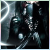
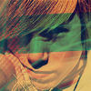
My 3 rejected banners |
Resource Center Links
This Month's Contests | Hosts Looking for Hostees | Hostees looking for Hosts | BigBookofResources
Submission Guidelines
  |

 Mar 16 2008, 12:10 PM Mar 16 2008, 12:10 PM
Post
#1
|
|
|
Member  Group: Member Posts: 12 Joined: Mar 2008 Member No: 631,141 |
   Can someone tell me whats wrong with them? I can understand the snoop one but why the other 2? |
|
|
|


|
Mar 16 2008, 12:25 PM
Post
#2
|
|
 ٩(͡๏̯͡๏)۶ Group: Staff Alumni Posts: 14,309 Joined: Nov 2004 Member No: 65,593 |
it sucks. all you did was change the monotone of each of them.
|
|
|
|


|
Mar 16 2008, 12:33 PM
Post
#3
|
|
 Kissing for yesterday. Group: Official Designer Posts: 465 Joined: Sep 2007 Member No: 569,813 |
"it sucks" isnt useful.
number one: not enough going on. far too simple. appears to be poor quality, perhaps the effects are over done. number two: the shadows on his face aren't working by the way youve presented the layers. make the images softer and add some larger text, perhaps in the bottom left corner. the green doesn't seem to work so well. number three: this one is my favourite. soften the text in the background slightly, so that the opacity is light. the glasses do not work, the brightness of the glasses in comparison to the rest of the image is too bright - a bit like a tooth whitening session gone wrong. so soften this area as well. and the use of the dark blue on the image is too dark. more work needs to be done on all three, that's all. more blending and softening is definitely needed. try to create something a bit different. they look pretty same-old at the moment. make it flow nicely and work into each other. maybe working on just one rather than making three quick banners would work nicer for you? :) x |
|
|
|

|
Mar 16 2008, 12:42 PM
Post
#4
|
|
|
Member Group: Member Posts: 12 Joined: Mar 2008 Member No: 631,141 |
Well thanks for being honest ppl..
But I have a question.. are there any good sites i can learn more about possibly making my banners better? |
|
|
|
|
Mar 16 2008, 12:47 PM
Post
#5
|
|
 We are the cure. Group: Staff Alumni Posts: 4,936 Joined: Jan 2004 Member No: 1,456 |
I don't think anyone would disagree with pointing you to http://www.good-tutorials.com/
But there is no substitute for experience. Keep doing what you're doing and getting feedback. - Nick |
|
|
|

|
Mar 16 2008, 12:48 PM
Post
#6
|
|
|
Kissing for yesterday. Group: Official Designer Posts: 465 Joined: Sep 2007 Member No: 569,813 |
uhm.. you're on one!
look on the tutorials -> photoshop/paint shop pro (depends what program you work in?) there's some awesome tutorials on there, you've just got to look through them all and find something which will help. don't just look for banner tutorials, look through anything, some give great tips for editing personal pictures which work on avatars and banners too. also type in key words on google, you'll get lots from that.  i can see you're new, if you need help just ask. i can see you're new, if you need help just ask.gosh look at me go on. too many ideas! |
|
|
|
|
Mar 16 2008, 12:53 PM
Post
#7
|
|
 Resource Center Tyrant Group: Official Member Posts: 2,263 Joined: Nov 2007 Member No: 593,306 |
Tutorials aren't going to help you if you don't know what you want. Figure out exactly what you want on your banner, look at other people's different styles creating banners (the ones that have been accepted). Experiment with brush effects, colorization, and always keep an eye and open mind out. Yeah, it's cheesy, but don't get stuck on doing the same thing over and over again on your graphics.
Like I said in my private message, work with blending modes on your second graphic. You've drowned Lupe out in the green brush/tone. . .bring his face out more. The first one just looks empty, and the lowered opacity text may or may not be productive to your graphic. I wouldn't mind it if it were brighter and not hidden in the dark. |
|
|
|

|
Mar 16 2008, 12:55 PM
Post
#8
|
|
 creepy heather Group: Official Member Posts: 4,208 Joined: Aug 2004 Member No: 41,580 |
i dont see anything wrong with them, but photomanip isnt really my expertise...
|
|
|
|

|
Mar 16 2008, 02:10 PM
Post
#9
|
|
|
Member Group: Member Posts: 12 Joined: Mar 2008 Member No: 631,141 |
Ok..back..IDK what to do with this one...i didn't save it yet so i need some options.
 So what should I drop or add to this one ;) |
|
|
|
|
Mar 16 2008, 02:33 PM
Post
#10
|
|
 This bag is not a toy. Group: Staff Alumni Posts: 3,090 Joined: Oct 2007 Member No: 583,108 |
The outline of the guy's head/shoulders is a bit too pronounced and looks accidental. Also, the colors look pretty muted, and you can barely make out features in his face because of the darkness in the picture.
I would perhaps lighten up the pattern a little, because it seems to make the banner pretty busy overall. |
|
|
|

|
Mar 16 2008, 02:37 PM
Post
#11
|
|
 Senior Member Group: Staff Alumni Posts: 1,815 Joined: Jun 2006 Member No: 423,396 |
Hm. I think your banners need more contrast. Each banner looks kinda flat, seeing how the colors used in everything are dull. Maybe by using dark and light colors, you can let certain parts of the banner stand out more.
|
|
|
|


|
Mar 16 2008, 05:20 PM
Post
#12
|
|
 Senior Member Group: Member Posts: 1,011 Joined: Jun 2007 Member No: 533,410 |
I think the banners need more than font. Do stuff to it, idk,
go to tutorials sites && such |
|
|
|

|
Mar 16 2008, 07:12 PM
Post
#13
|
|
 Melieized Group: Official Designer Posts: 1,372 Joined: Nov 2006 Member No: 478,715 |
in your first set, your lupe was almost blended in with the bg so he wasn't being accented. the kanye one looked like it was just a cut and paste (sorry if i'm being too harsh) and the snoop one doesn't even look like you did much with it.
as for the second set, your bg is very distracting to what is the focus which is that pic of a-rod. the second one, the pic doesn't go well with the bg. could try some vector bg for that pic of jose? check out deviantart.com. they have some great banners that are submitted that can help you with ideas. very helpful website. |
|
|
|

|
Mar 17 2008, 03:00 AM
Post
#14
|
|
 ^_^ Group: Staff Alumni Posts: 8,141 Joined: Jan 2005 Member No: 91,466 |
You're definitely on the right track with the KanYe banner. It just doesn't stand out though.
|
|
|
|

|
Mar 17 2008, 07:11 PM
Post
#15
|
|
 Go fall off a cliff. ^.^ Group: Member Posts: 41 Joined: Dec 2007 Member No: 601,263 |
You're definitely on the right track.
You just need to accent the guys in them, since they're the focal point. Cuz the way you have it, they get kinda lost. You just need to do something to make them stick out a bit more from the rest of the banner. Escpecially the Lupe Fiasco one. He really gets lost under the green gradient. The Snoop Dogg one just needs to be reworked a little bit, since he's the only thing on the banner. And The Kanye one is definitely on its way, you just need to make him stick out from the background a bit more, cuz the blue gradient almost blends him right in. |
|
|
|

|
Mar 17 2008, 08:56 PM
Post
#16
|
|
 kthxbai Group: Official Designer Posts: 2,832 Joined: Feb 2008 Member No: 621,203 |
QUOTE(vintage-toile @ Mar 16 2008, 12:33 PM)  number three: this one is my favourite. soften the text in the background slightly, so that the opacity is light. the glasses do not work, the brightness of the glasses in comparison to the rest of the image is too bright - a bit like a tooth whitening session gone wrong. so soften this area as well. and the use of the dark blue on the image is too dark. more work needs to be done on all three, that's all. more blending and softening is definitely needed. try to create something a bit different. they look pretty same-old at the moment. make it flow nicely and work into each other. maybe working on just one rather than making three quick banners would work nicer for you? :) x «agreed |
|
|
|

|
Mar 17 2008, 10:27 PM
Post
#17
|
|
|
t-t-t-toyaaa Group: Official Member Posts: 19,821 Joined: Apr 2004 Member No: 11,270 |
Too much texture on some of them and the fonts don't fit in that great either. You should try different effects on your banners that don't make it seem so overdone.
|
|
|
|

|
Mar 18 2008, 11:05 AM
Post
#18
|
|
|
Member Group: Member Posts: 12 Joined: Mar 2008 Member No: 631,141 |
Any Improvement?

|
|
|
|
|
Mar 18 2008, 11:57 PM
Post
#19
|
|
|
kthxbai Group: Official Designer Posts: 2,832 Joined: Feb 2008 Member No: 621,203 |
QUOTE(Cartman19x @ Mar 18 2008, 10:05 AM) Any Improvement? ^ I like "pig"? and the building, but its too plain and.. boring. |
|
|
|
|
2 User(s) are reading this topic (2 Guests and 0 Anonymous Users)
0 Members: