Graphics Of Mine, Wallpapers and other such things. |
Resource Center Links
This Month's Contests | Hosts Looking for Hostees | Hostees looking for Hosts | BigBookofResources
Submission Guidelines
  |

 Jul 28 2007, 06:18 AM Jul 28 2007, 06:18 AM
Post
#1
|
|
|
Senior Member  Group: Member Posts: 125 Joined: Jul 2007 Member No: 552,336 |
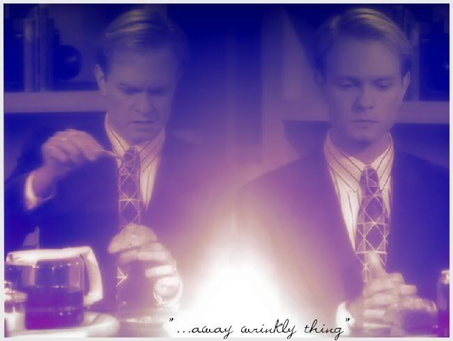
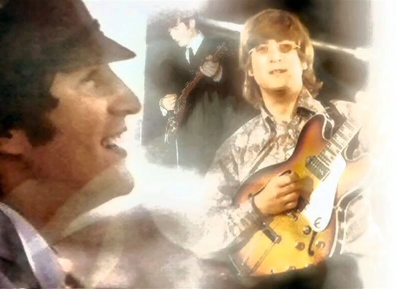
Wallpapers: Remus Wallpapers: (1024x768) 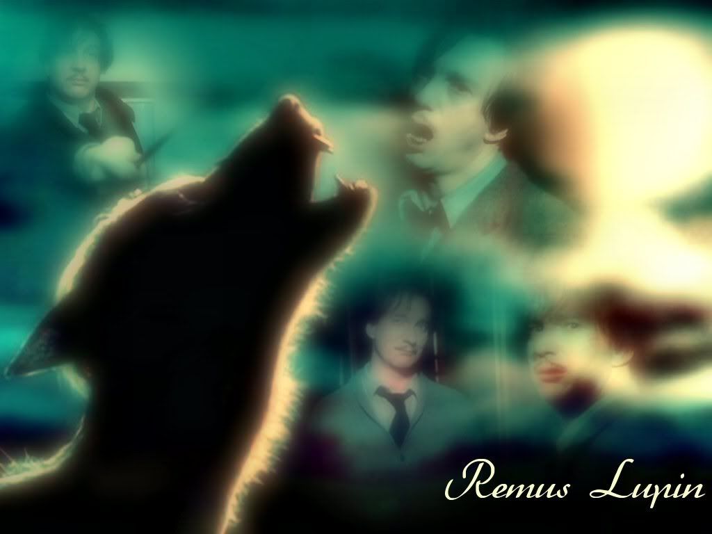 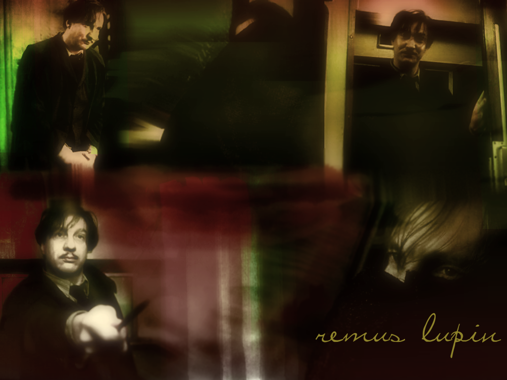 Snape Wallpaper: (800x600) 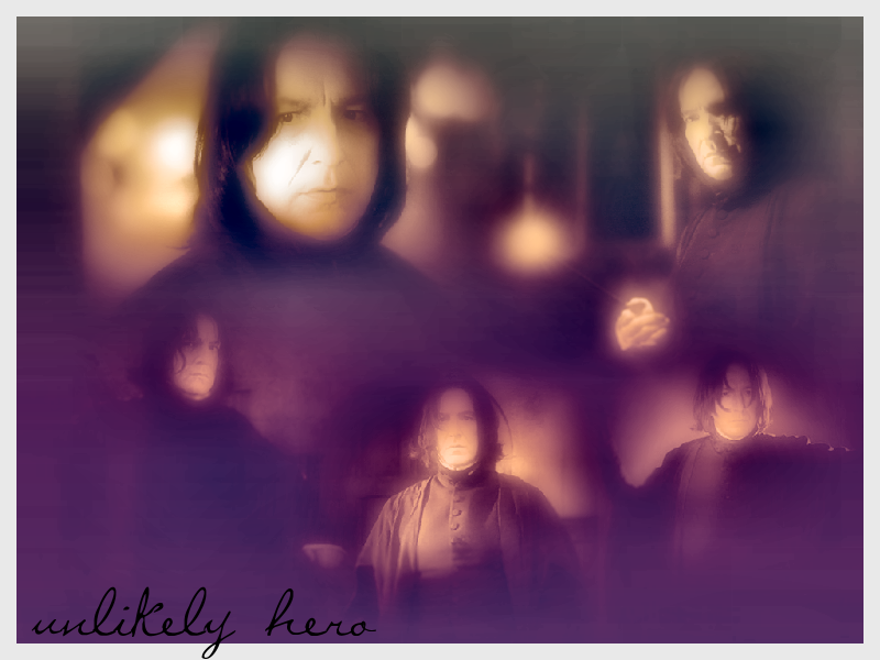 David Hyde Pierce Wallpapers: (1024x768 and 800x600) 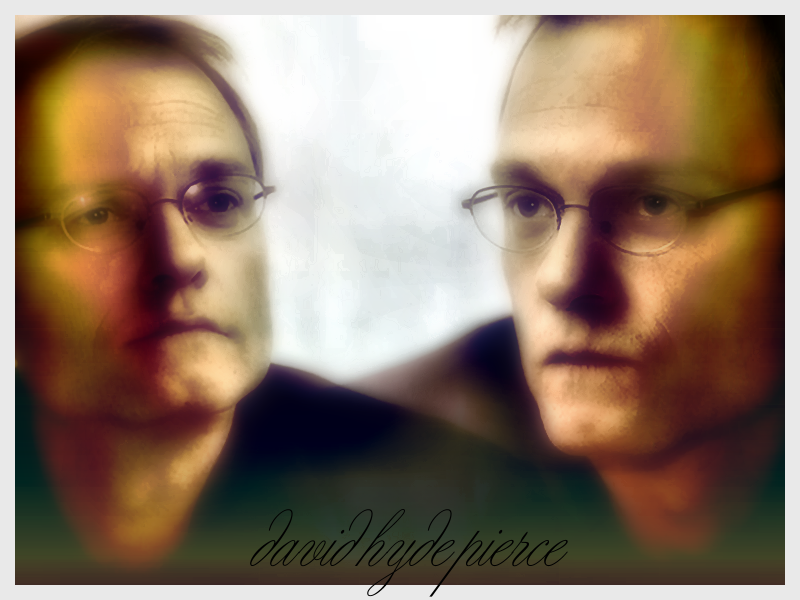 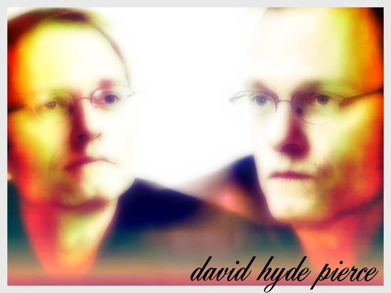 
|
|
|
|


|
Jul 28 2007, 06:28 AM
Post
#2
|
|
|
Senior Member Group: Member Posts: 125 Joined: Jul 2007 Member No: 552,336 |
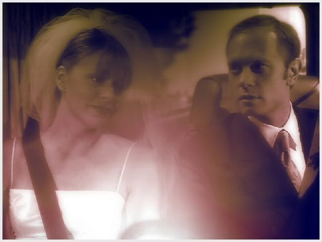
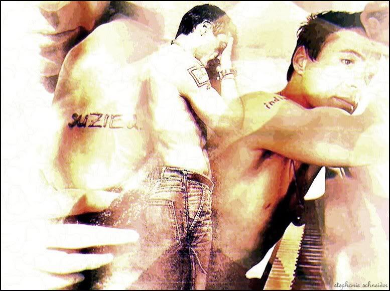
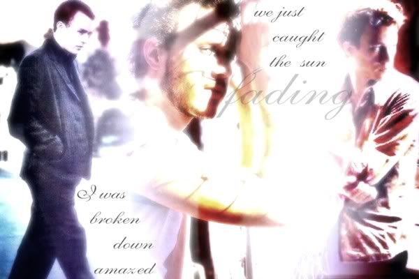
I've been on a bit of a "Frasier" artwork kick these days. weee, I love that show!
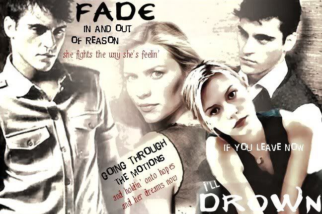
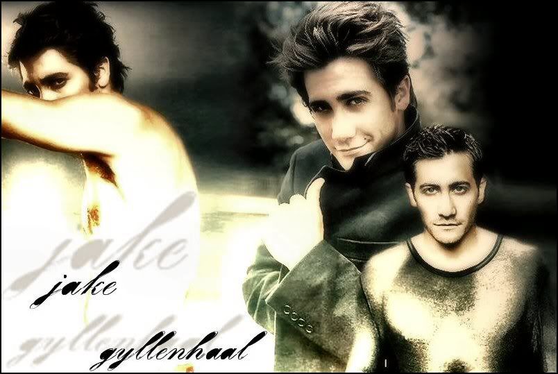
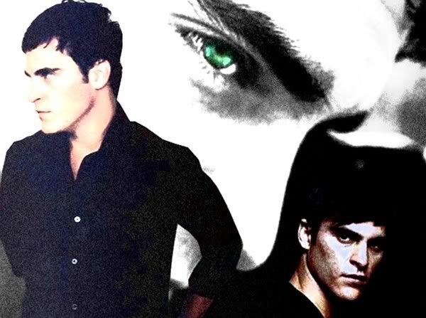
 Other graphics that can be used for headers and such 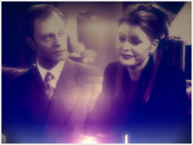  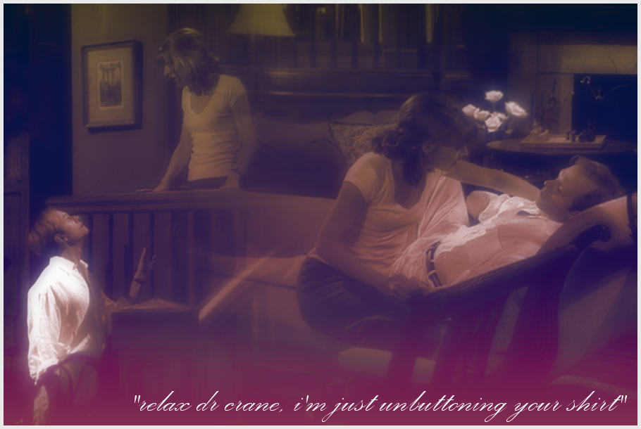   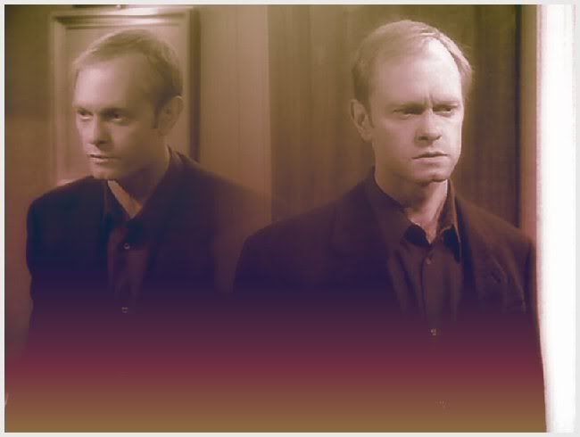 |
|
|
|
|
Jul 28 2007, 06:37 AM
Post
#3
|
|
|
Senior Member Group: Member Posts: 125 Joined: Jul 2007 Member No: 552,336 |
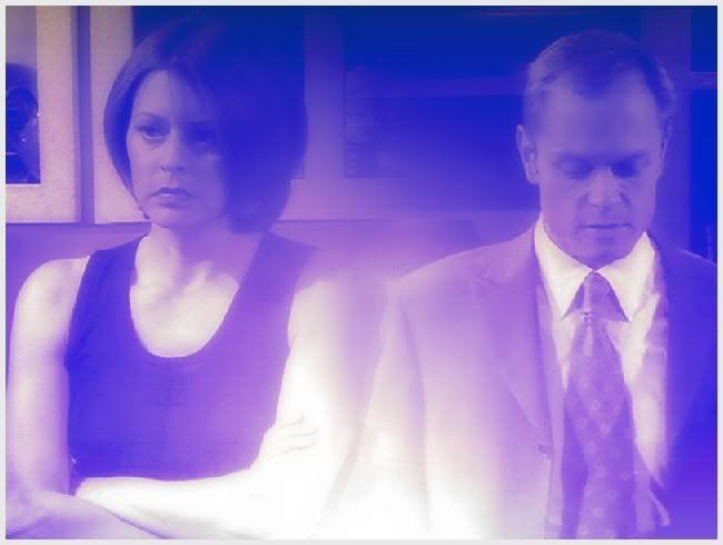
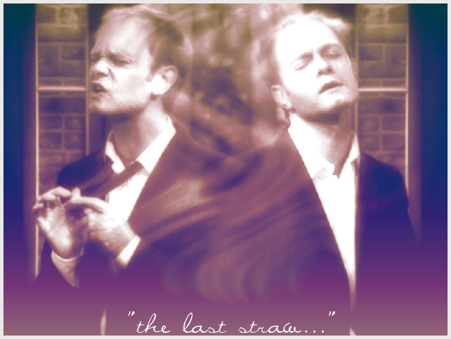
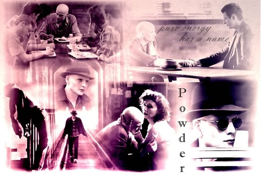
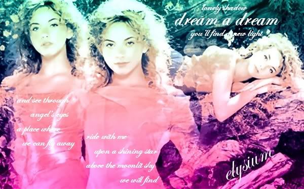
m'kay, this is the last of the Frasier stuff. I have tons more, but I won't torture you with it... I'll move onto another subject matter in a few minutes.
|
|
|
|
|
Jul 28 2007, 07:10 AM
Post
#4
|
|
|
Senior Member Group: Member Posts: 125 Joined: Jul 2007 Member No: 552,336 |
|
|
|
|
|
Jul 28 2007, 07:11 AM
Post
#5
|
|
|
Senior Member Group: Member Posts: 125 Joined: Jul 2007 Member No: 552,336 |
|
|
|
|
|
Jul 28 2007, 07:16 AM
Post
#6
|
|
|
Senior Member Group: Member Posts: 125 Joined: Jul 2007 Member No: 552,336 |
     |
|
|
|
|
Jul 28 2007, 12:35 PM
Post
#7
|
|
 sang loves hayden. Group: Staff Alumni Posts: 3,373 Joined: Feb 2004 Member No: 5,687 |
The blending on the work is good. On some there is like too much gaussion blur which is quite bleh. Try using textures/brushes/etc. to make it look more interesting than just blur/fake vector look?
|
|
|
|

|
Jul 28 2007, 02:09 PM
Post
#8
|
|
 ;) Group: Staff Alumni Posts: 9,573 Joined: Feb 2005 Member No: 99,124 |
I like how most of them look really soft. I think some of them could look better (color wise).
|
|
|
|


|
Jul 28 2007, 02:39 PM
Post
#9
|
|
|
define our lives for us. Group: Staff Alumni Posts: 11,656 Joined: Aug 2004 Member No: 43,293 |
whoa, um, that is a lot for one thread.
i think you need to work on the colouring of it. I agree with Relentless with adding more textures and too much blur. some of them also look real grainy |
|
|
|

| *IVIike* |
Jul 28 2007, 03:26 PM
Post
#10
|
|
Guest |
i love the blending you did. They are a bit too blurry, but thats really the only thing i don't like

|
|
|
|
|
Jul 28 2007, 07:24 PM
Post
#11
|
|
 1 2 3 4 5 6 Group: Member Posts: 788 Joined: May 2007 Member No: 522,043 |
woah, resize + dont double post
blending looks pretty good. |
|
|
|

| *The Markster* |
Jul 28 2007, 07:36 PM
Post
#12
|
|
Guest |
The blending for all of them looks okay. But I think you need to work on controlling gaussian blur, and maybe you could use different coloring methods and blending modes.
|
|
|
|
|
Jul 29 2007, 01:36 AM
Post
#13
|
|
 Senior Member Group: Member Posts: 1,011 Joined: Jun 2007 Member No: 533,410 |
blending is good, but the images all get repetitive and boring
after awhile. sorry for the negativeness. and the images used..could be more exiting. overall, atleast your sharpening your skills. |
|
|
|

| *SinfullySweet* |
Jul 29 2007, 01:40 AM
Post
#14
|
|
Guest |
I think you're over doing the filters and blurs.
Try spicing up your style and change some things. Add some textures and brushes
|
|
|
|
|
Jul 29 2007, 03:51 AM
Post
#15
|
|
 Want fries with that? Group: Member Posts: 692 Joined: Sep 2004 Member No: 50,652 |
You're overdoing the filters A LOT!
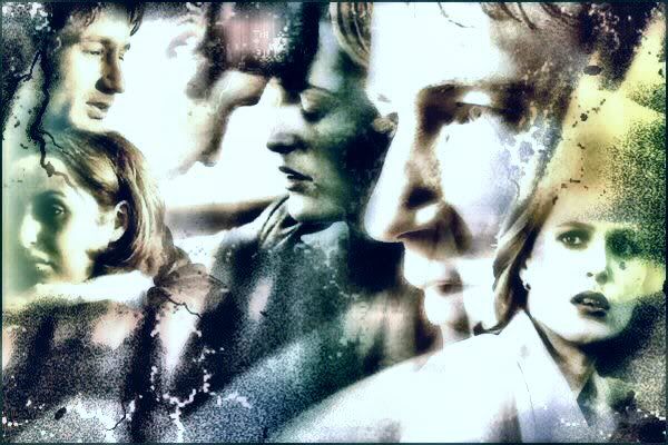
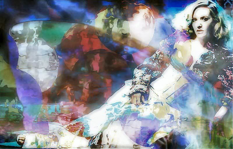
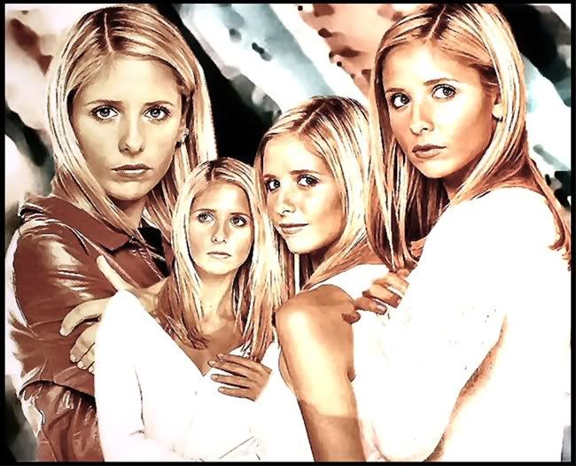
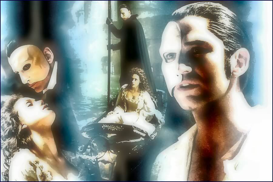
Try using different techniques to add some more variety to your graphics. Good job blending though! I loved the Buffy and the Phantom of the Opera one. :) |
|
|
|


|
Jul 29 2007, 05:26 AM
Post
#16
|
|
|
Senior Member Group: Member Posts: 125 Joined: Jul 2007 Member No: 552,336 |
thanks for all the feedback everyone. I use Paint Shop Pro 8 to make my stuff for the most part. Sometimes I'll use Photoshop for lighting and color effects but that's about it.
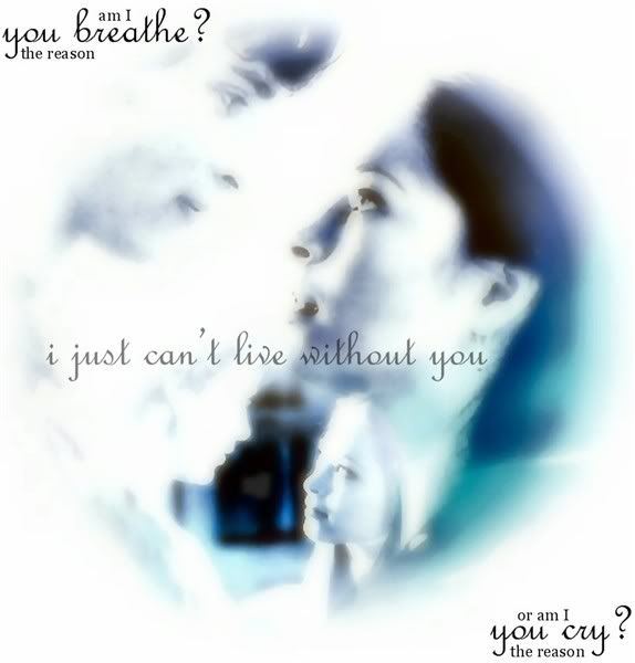
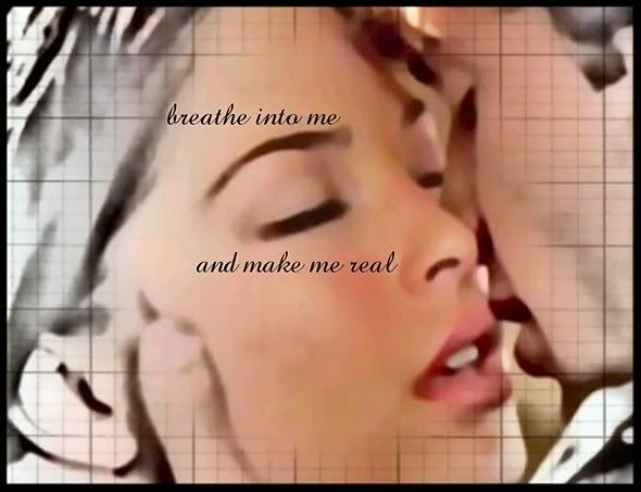
What's a vector? I've barely figured out the layering thing. and I don't really use filters. I don't think? these are the features I use on PSP the most: Crop Resize Layers (still learning on those) Gradients Enhance Photo: Clarify is my favorite thing to use. I also use Adjust; Softness; Soft Focus a lot. (what you guys thought was gausian blur on my work I think) and Fade Correction is a fun tool. I have brushes, but I don't use them that often. I do have set of wallpapers that I made where I did use the brushes quite a bit. oh, and sorry for posting so many at once. I wasn't sure what the limit was. |
|
|
|
|
2 User(s) are reading this topic (2 Guests and 0 Anonymous Users)
0 Members: